Let’s explore the possibilities of the awesome SpecFlow Behavior Driven Testing Framework with Xamarin.Forms!
I’m a huge enthusiast of writing clean and highly testable code, and in that pursuit, I believe Test Driven Development for the win! 😉 Oh also, UnitTesting for life yo! 😛
Problem with just UnitTests!
They’re very useful when we need to sure there’s nothing broken in the logical code, but the only problem is that, they’re way too technical. They don’t really make much of a sense to a non-technical person, since its all code and logic based and the out put is not really human friendly (for a non techie).
Why Human-Friendly testing?
Software Development process is not just a technical dev fellow write the code and deploy to the user process, its way more complicated and involves a lot of parties. Whether you like it or not modern day Software are purely driven by Business Requirements, which includes a lot of non-technical parties into the Software Development cycle. Business fellows, Testers, Analysts and Developers all come together to develop systems nowadays.
This is why we need a more human-friendly and human-readable way of executing the testing process, that can be shared among all the stake holders and could make sense to them from the beginning to the end of the SDLC.
This is where Behavior Driven Development comes into play, it defines a common ground that can be shared among all the stakeholders that are involved in a development of a software, from a techie to a non-techie, from Developers, Testers, QA Engineers, to Business Analysts and even directly to the Customer.
Behavior Driven Development!
BDD tests are written in a way that it is easily understood by everyone, even before the development life cycle begins, while making sure the requirements are specific and well defined. Every single feature is broken into scenarios with specific test steps that make sure behavior is executed as expected, thus behavior driven development 😉
These tests are written in a format called Gherkin, is a business readable and domain specific language created for writing BDD tests. Here’s a little example:
“Feature” tag explains the functionality of a feature, and a single Feature could contain many “Scenarios” that tests the functionalities related to that Feature. Each scenario has steps where you combine the actions using the Given, And, When, Then keywords. 🙂 Simple as that eh! 😀
We could also interpret it almost same as Test Driven Development based UnitTesting but with an extra awesome layer of icing called Behavior Driven Development!
Cucumber and SpecFlow!
Now in order to actually implement these BDD Tests using Gherkin syntaxes, we used a framework called Cucumber, which is a Ruby based framework!
But when it comes to .NET we have an awesome wrapper framework for Cucumber called SpecFlow, that provides us with all the goodness of BDD Testing.
SpecFlow is open source and provided under a BSD license. As part of the Cucumber family, SpecFlow uses the official Gherkin parser and supports the .NET framework, Xamarin and Mono.
SpecFlow seamlessly integrates with Visual Studio and provides all the functionality and features required to carry out your BDD life cycle.
Following a Pattern…
Although SpecFlow constructs its Tests based on Features, you could organize your Test cases as you wish, either based on Pages, Application Flows, or even Features themselves.
Page based pattern – based on behavior and functionalities available in each page in the application, such as example Home Page, Shopping Cart Page, Payment Page, and etc…
Application Flows – based on each individual feature flow of the application, such as Login Flow, Order Flow, Payment Flow, and etc…
Features – based on each individual feature flow of the application, such as Login Feature, Order Feature, Payment Feature, and etc… (quite a bit similar to App Flows)
You could also mix and match between those pattern, based on your requirements or the complexity of your application.
SpecFlow with Xamarin.Forms!
Since SpecFlow bring the beauty of Gherkin-BDD goodness to .NET we can directly use it in our Xamarin.Forms project solution as well any .NET project solution.
We’d basically be setting up our Xamarin.Forms project with a basic UnitTest project, and we’d add SpecFlow set up and configuration on top of it. In one of my previous blog posts I’ve explained how to set up Xamarin.Forms with UnitTesting project XAMVVM-02 UnitTesting with Xamarin.Forms!, hence I won’t be getting into that details, but rather focus on the set up of SpecFlow tid bits. So I would recommend taking a sneak peek at it before continuing here…
In a gist, we’ll create a UnitTesting project with SpecFlow set up and add our Xamarin.Forms project reference to it. Then we add Xamarin.Forms.Mocks library, for mocking Xamarin.Forms runtime during our test executions. Then we set up our Test App instantiation, with all the required dependencies, which is going to be used across all our test cases.
Once our Test project is ready, instead of writing usual unit test cases, we’d be writing SpecFlow test cases using Spec Feature files. Those Feature files have a C# code behind that’s bound to it which is where we’ll be implementing our test code logic and assertion.
That’s pretty much it! pretty straight forward eh! 😉 Let’s try it out…
Let’s get started…
So before we begin you need to make sure you have the SpecFlow for VS extension installed, if you haven’t, please install from the VS Marketplace which is completely free.

SpecFlow provides a wonderful documentation about how to get started: https://specflow.org/getting-started/ but it delivers for generic .NET projects, not specific for Xamarin. But I would still encourage you take a look through it first just to get some clarity!
Demo Overview!
Now that’s out of the way, let me tell you how I’m going to showcase the use of BDD SpecFlow UnitTesting in your Xamarin.Forms project.
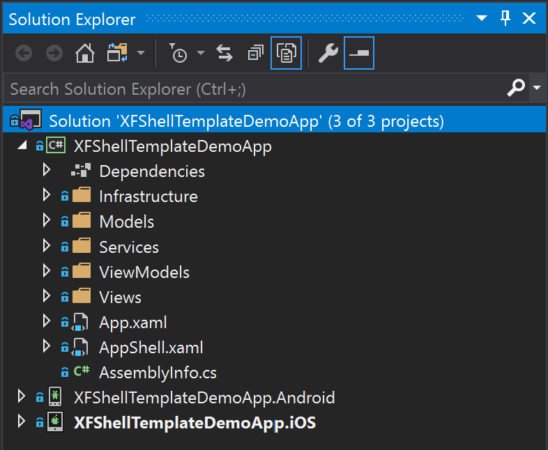
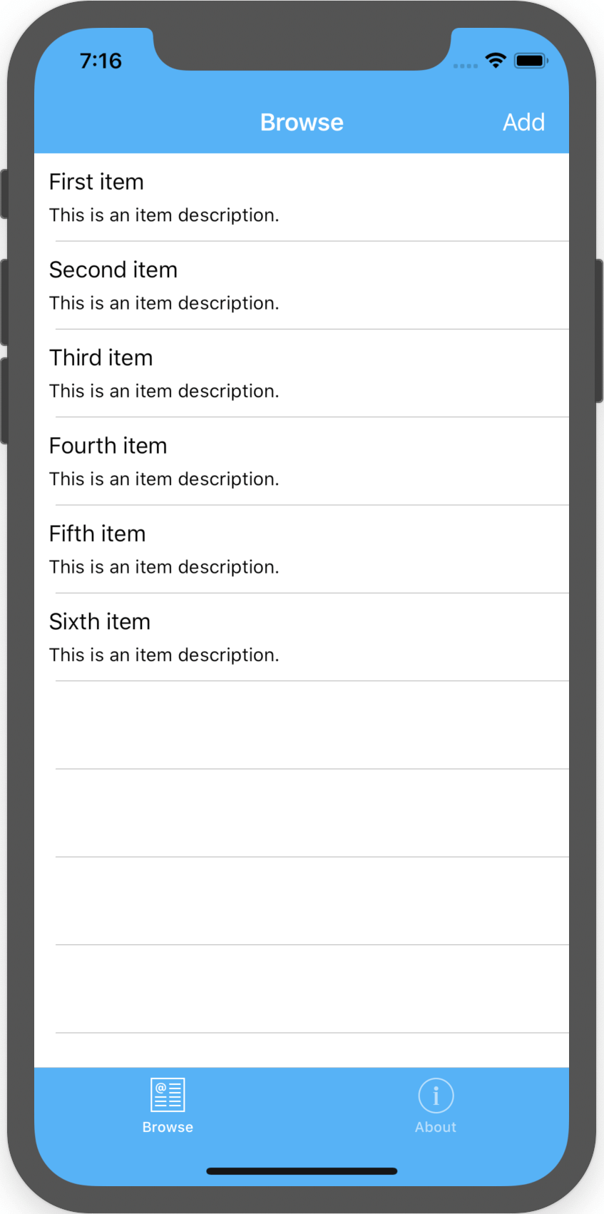
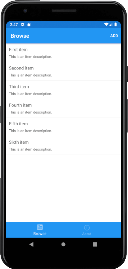
Just for showcasing of this awesomeness, I’ve prepared a simple Xamarin.Forms project application, where you can create simple notes, attach location data, attach created date time values and store them locally, allowing you to view them at any time in a list of items. Quite a simple text-pad-like app.
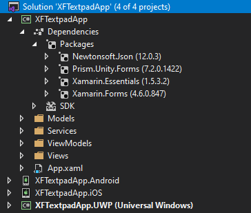
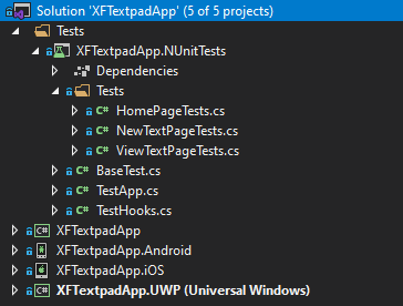
I’ve named this project solution as, XFTextpadApp and it uses Prism as the MVVM framework.
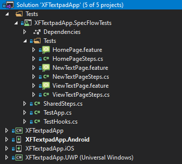
As you can see above is a view of the project structure with the complete MVVM set up. Let me also share a bit of showcasing of the app and its features to give a more in depth context.
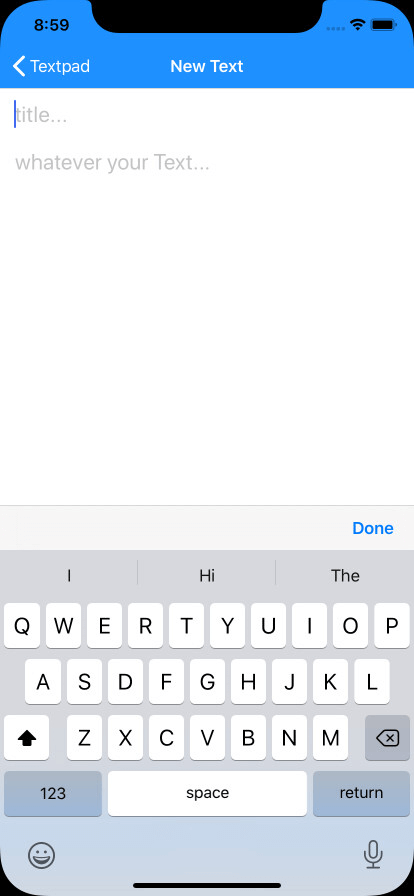
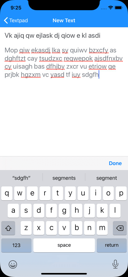
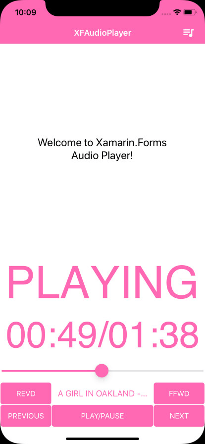
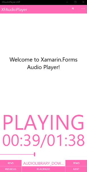
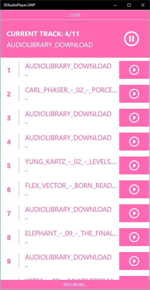
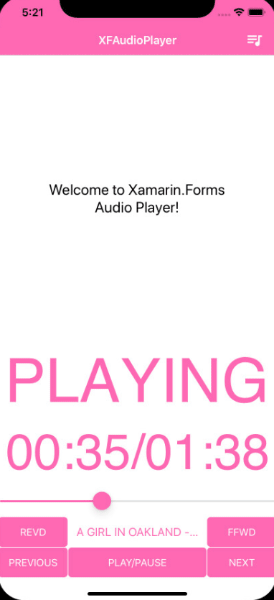
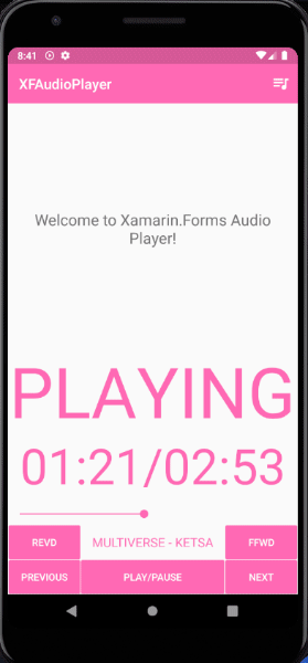
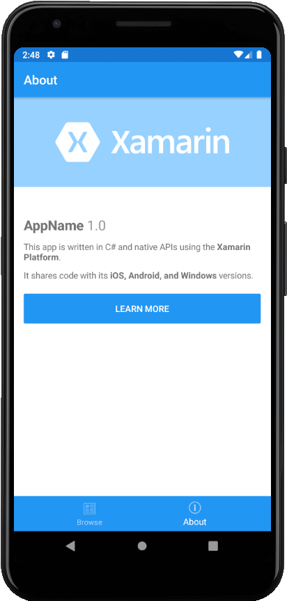
Here’s a little peek into features of this demo Xamarin.Forms Textpad app running on iOS!
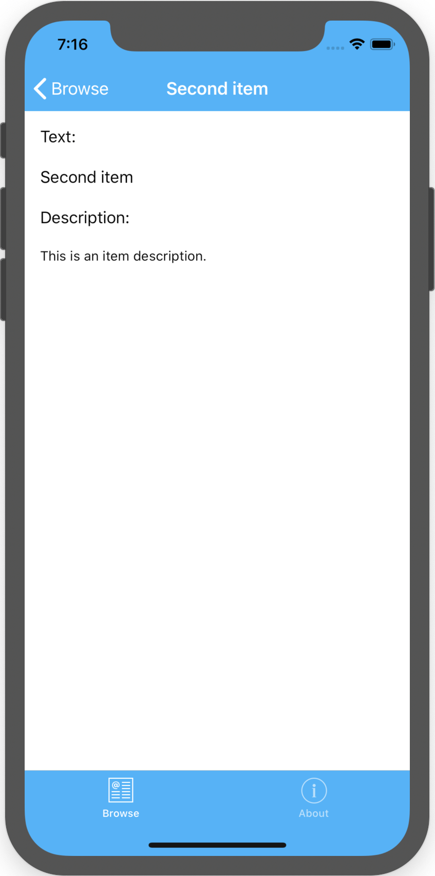
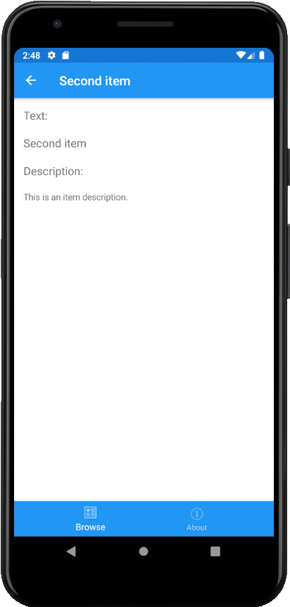
In the Home page you can view the List of Texts you have saved. By clicking on a Text item in the Home page list you can view that Text item in detail in the View Text page. Then once you click the “New Text” Button it will take you to the New Text page where you can create and save new Texts…
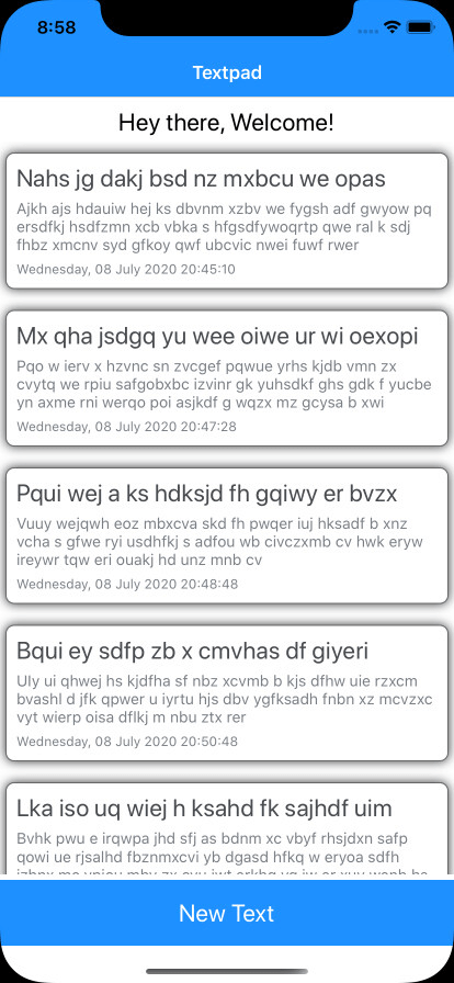


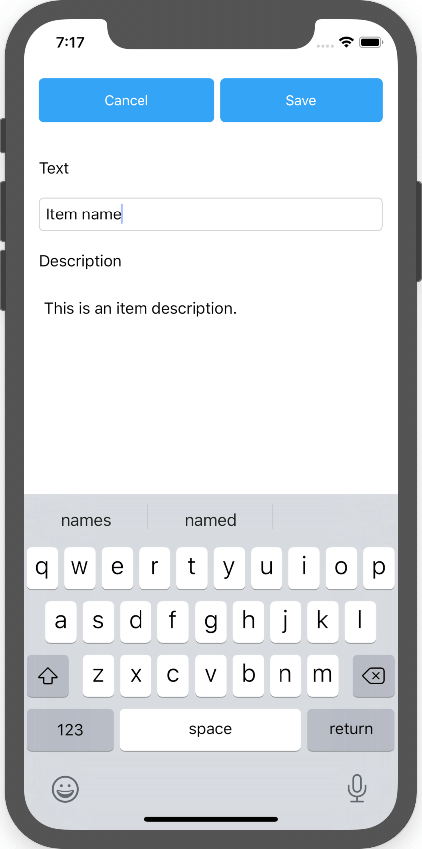
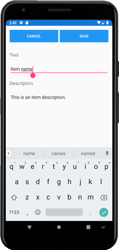
In the New Text page you can create new Texts with a Title and Description of your Text and click “Save” button to save it with the Location and Time data attached to it.
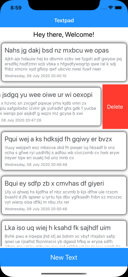
Then you will be navigated back to Home page. In the Home page Text list you can delete saved Text by using the context menu as well…
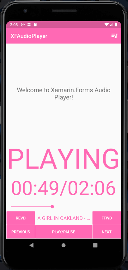
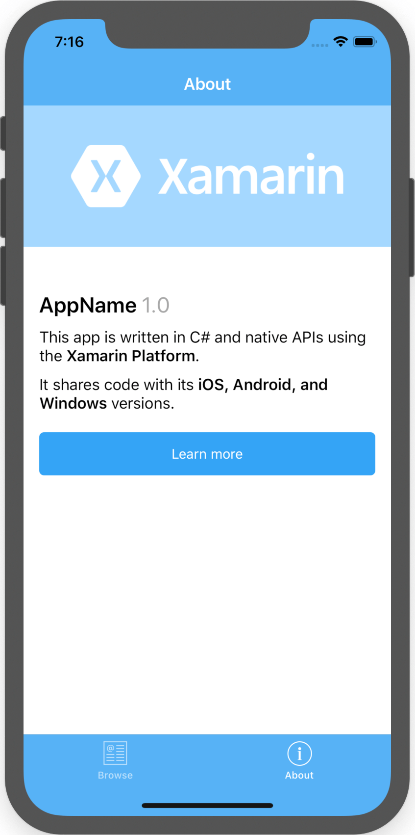
Thanks to Xamarin.Forms we can deploy it directly to iOS, Android, and UWP as well! 😉
Now the App project is ready, we need to add Test project to it.
Hands on time!
Let’s begin by adding the Test project to our Xamarin.Forms project, create a new folder in the solution, named as “Tests” and then right click on it -> Add -> Add New Project
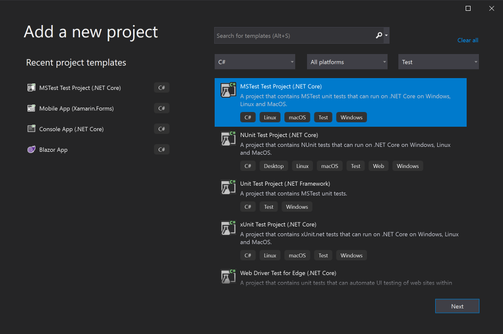
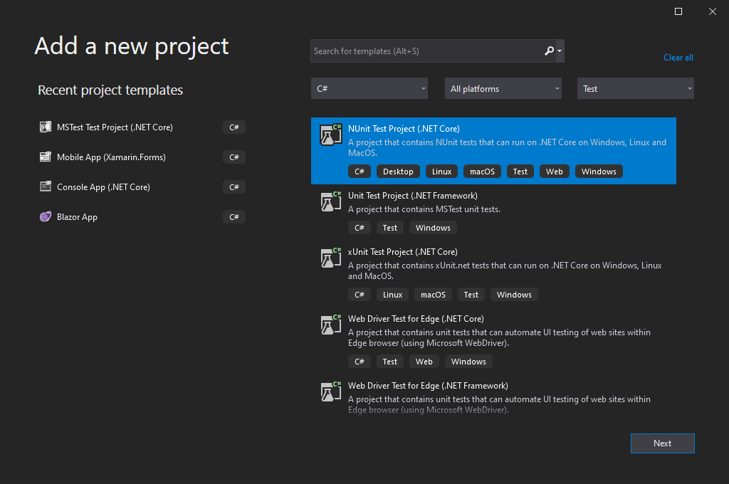
Now this is where the choice is absolutely up to you, as to which testing framework to choose from. Just for this demo, I’m gonna use MSTest Test framework, hence I will select MSTest Test Project (.NET Core) template and create our test project…
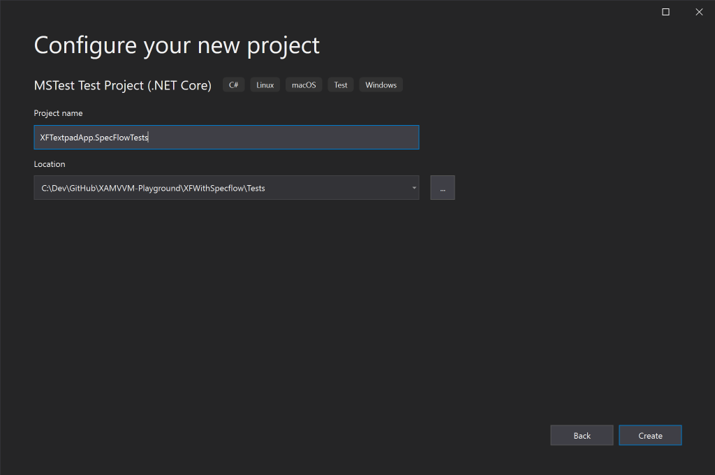
I will be naming the test project as, XFTextpadApp.SpecFlowTests making sure to stick to the standard naming practices! You might want to pay some attention to the Project Path there as well, where as to make sure we set the path to be inside the “Tests” folder that we created earlier.
Setting up SpecFlow!
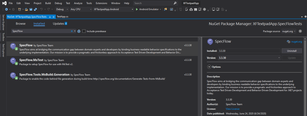
Next let’s set up SpecFlow in our Test project, by adding the following SpecFlow nugets using the Nuget Package Manager!
- SpecFlow
- SpecFlow.MsTest
- SpecFlow.Tool.MsBuild.Generation
Make sure to add them all in same version for compatibility reasons, as shown below.
One thing to note here that, I’ve added SpecFlow.MsTest package, while the official SpecFlow documentation recommends adding SpecRun.SpecFlow. The reason is, in order to use their recommended test runner, SpecFlow+ Runner (which is configured by SpecRun.SpecFlow), you need to have a registered SpecFlow account. Therefore I’m using the SpecFlow.MsTest test runner engine instead! 😉
If you need to access the full set of enterprise-grade large scale features of SpecFlow+, then you need to use their SpecFlow+ Runner.
Also if you’re using an alternate test framework like NUnit, or xUnit, then you need to use their own counterpart test runners here, such as SpecFlow.NUnit or SpecFlow.xUnit packages and so on. For more information here: https://specflow.org/documentation/Unit-Test-Providers/
Setting up the rest…
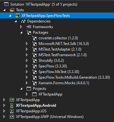
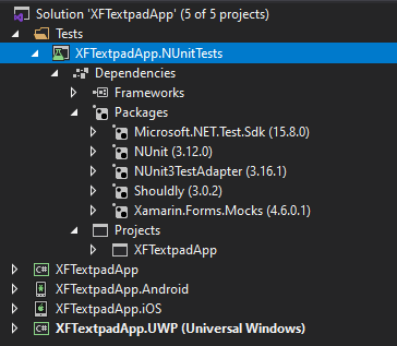
In order to complete rest of the set up, let’s add a reference of the host XFTextpadApp .NET standard project into our XFTextpadApp.SpecFlowTests project. Then we’re going to add our Xamarin.Forms Mocking library, Xamarin.Forms.Mocks.
Just to make sure we write some beautiful test code, let’s add Shouldly nuget as well. This is more of a personal choice 😉 or if you prefer you could use the default assertions of MSTest (MsTest.Framework.Assert), or which ever the test framework you have chosen to set up.
If all went well then you should see the Test project’s references set up as above. Now that’s out of the way, next on let’s get into coding!
Create app instance…
You could directly use the existing App class instance inherited from the Xamarin.Forms project within our Test project environment, or you can construct your own custom App instance that’s catered for the Test environment, which is what we’re going to do in this step…
Something to note here is that, the way you construct your Test App instance is completely dependent on how you have constructed your Xamarin.Forms application, so try to duplicate it as much as possible.
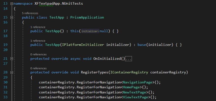
Let create a new class called TestApp in our XFTextpadApp.SpecFlowTests project root.
public class TestApp : PrismApplication
{
    public TestApp() : this(null) { }

    public TestApp(IPlatformInitializer initializer) : base(initializer) { }

    protected override async void OnInitialized()
    {
        ...

        await NavigationService.NavigateAsync("NavigationPage/HomePage");
    }

    protected override void RegisterTypes(IContainerRegistry containerRegistry)
    {
        containerRegistry.RegisterForNavigation<HomePage>();
        ...

        containerRegistry.GetContainer().RegisterType<HomePageViewModel>(new Unity.Lifetime.ContainerControlledLifetimeManager());
        ...
    }
}
Now, you need to make sure to register all your Pages, ViewModels and Services accordingly. Also notice that how I have set up the default start up navigation in the OnInitialized() method according to Prism.
Next the Hooks…
This is more like the helper class that we’ll be using to set up the necessary hooks for our SpecFlow test run time environment, such as instantiating the App instance object, and initialising MockForms. Here we’re going to keep a public static object of our App instance, which we will use all across out tests cases. Let’s create a class called TestHooks…
[Binding]
public class TestHooks
{
	public static TestApp App { get; private set; }

	[BeforeScenario]
	public void BeforeScenario()
	{
		Xamarin.Forms.Mocks.MockForms.Init();

		App = new TestApp();
	}

	[AfterScenario]
	public async void AfterScenario()
	{
		// After Scenario steps

		// 1. Clear App data in memory
		Application.Current.Properties.Clear();
		await Application.Current.SavePropertiesAsync();

		// ...
	}
}
SpecFlow provides Before and After Scenario handlers which we can use to perform operations as we see fit, hence I’m using [BeforeScenario] attribute with the BeforeScenario() method to initialise MockForms library and the app instance before each scenario. Scenario refers to a single test case, inside of a Feature in SpecFlow. Similarly [AfterScenario] attribute is used for cleaning up operations after scenario execution before. The [Binding] attribute is a marker informing SpecFlow that this class may contain hooks or step definitions, thus enabling the before and after handlers.
SpecFlow provides many different binding hooks like these that you can adopt for handling many different scenarios: https://specflow.org/documentation/Hooks/
You may have noticed the public static TestApp object here, which is the App instance that we’re going to use across all our test cases.
Alright, but we’re not done yet!
Creating the Features and Scenarios!
As I’ve explained before, in SpecFlow we create Features, then inside those Features we create Scenarios, in each Scenario we create Steps, and finally we bind those Steps to Step Definitions in C# code behind! Check out the extended explanation here: https://specflow.org/documentation/Using-Gherkin-Language-in-SpecFlow/
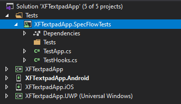
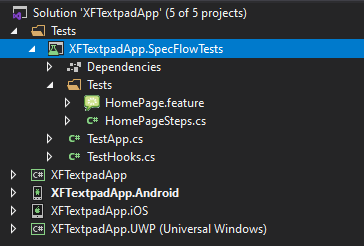
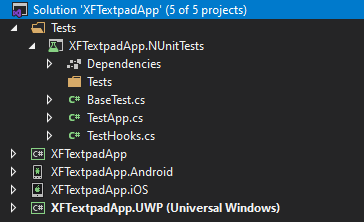
Now that all is set up and ready to go, let’s create our actual Tests. But first create a “Test” folder in the root of our XFTextpadApp.SpecFlowTests project.
If everything is well set up until now, then it should look like the above structure.
In the beginning I explained about following a pattern for organizing your SpecFlow Tests, and for this demo I will be following a Page context based pattern for my Tests.
So let’s consider our Home Page and one of its testable scenario such as,
Scenario:
First time I launch the app
I am Navigated to the Home page
I see an empty list of data
I see a label indicating empty data
Now let’s create our first Feature by, right click on the “Tests” folder -> Add -> New Item -> select SpecFlow in C# Items list -> select SpecFlow Feature File. Let’s name it as HomePage.feature and Add it.
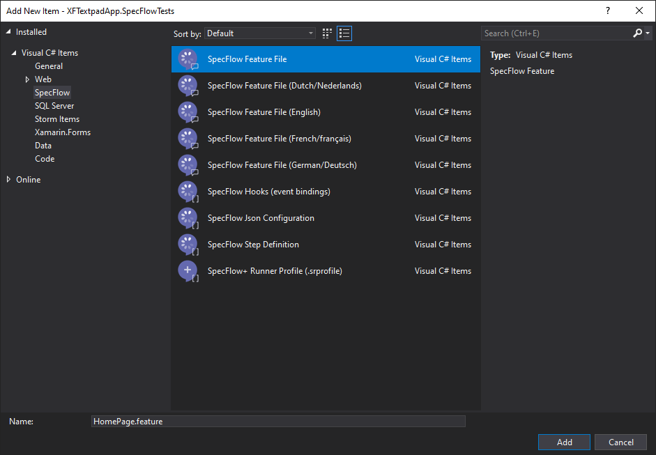
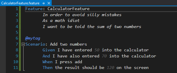
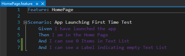
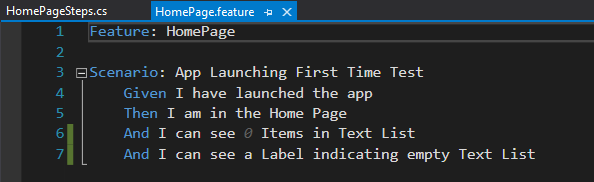
You should see the HomePage.feature file created in your project, with some default SpecFlow content in it. Let’s replace all the default content with the following,
Feature: HomePage

Scenario: App Launching First Time Test
          Given I have launched the app
          Then I am in the Home Page
          And I can see 0 Items in Text List
          And I can see a Label indicating empty Text List
So in here you can see how I’ve defined our Feature as the HomePage, and then created the first Scenario accordingly. There we just created our first Feature and Scenario! 😉
One thing to note here is that, once you type out those steps, they’re highlighted in purple color. This is because those steps are not bound to any steps definition.
Until we create a Step definition file and bind those steps to the C# code behind, they’d stay highlighted in purple. Remember I told you, each test scenario is a combination of Steps and their C# code behind definition?! 😉
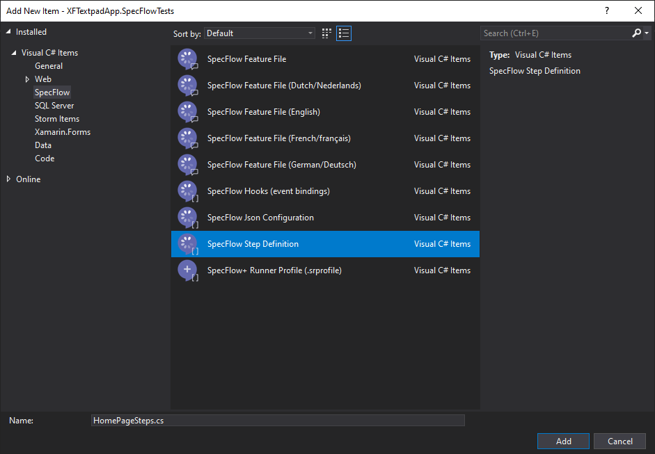
So next on, let’s create our Step definition file for our Feature by, right click on the “Tests” folder -> Add -> New Item -> select SpecFlow in C# Items list -> select SpecFlow Step Definition. Let’s name it as HomePageSteps.cs and Add it.
You will see the HomePageSteps.cs class generated with a bunch of templated code. Let’s remove all the auto generated code except for the following bits, with Constructor and private ScenarioContext object.
[Binding]
public sealed class HomePageSteps
{
	private readonly ScenarioContext _context;

	public HomePageSteps(ScenarioContext injectedContext)
	{
		_context = injectedContext;
	}
}
So this is the class where we will be creating our Step definitions for our Feature Scenarios. Notice the [Binding] attribute which marks this class as a candidate for step definitions. The constructor inject ScenarioContext provides you access for passing data between different Scenarios and Steps. More info: https://specflow.org/documentation/scenariocontext/
SpecFlow extension in Visual Studio allows us to generate the C# definitions for the scenario steps that are unbound. So let’s generate the step definitions for our HomePage.feature Feature and its Scenario that we created before.
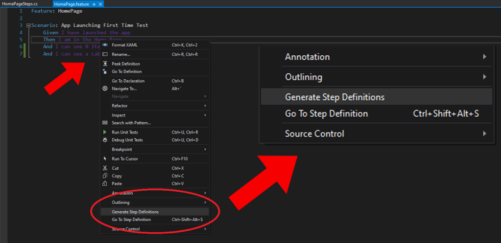
Open the HomePage.feature file and right click anywhere inside the feature file. Then select the menu option at the bottom, “Generate Steps Definitions“, which will popup the following,
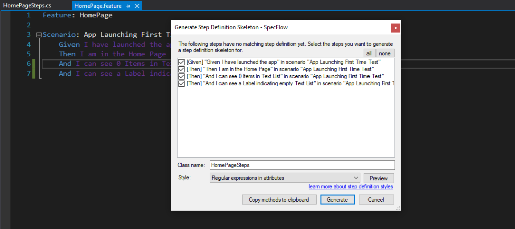
Here you can use the Copy methods to clipboard button and paste these generate C# definitions in your HomePageSteps.cs class file. If you select generate it will generate the whole steps file for you, and ask you to select the folder destination to save the file.
So after generating the step definitions our HomePageSteps.cs class file should be updated as shown below, (I’m show only one definition here in the code)
[Binding]
public sealed class HomePageSteps
{
	...

	[Given(@"I have launched the app")]
	public void GivenIHaveLaunchedTheApp()
	{
		ScenarioContext.Current.Pending();
	}

	...
}
By default the generated code will add the ScenarioContext.Current.Pending(); line for marking the step as pending. You can go ahead and remove that in all the steps and let’s complete our Test implementation…
[Binding]
public sealed class HomePageSteps
{
	public TestApp App => TestHooks.App;

	[Given(@"I have launched the app")]
	public void GivenIHaveLaunchedTheApp()
	{
		// Is the app init and running
		App.ShouldNotBeNull();
	}

	[Then(@"I am in the Home Page")]
	public void ThenIAmInTheHomePage()
	{
		var navigationStack = ((NavigationPage)App.MainPage).Navigation.NavigationStack;
		// Am I in the Home page
		navigationStack.Last().BindingContext.GetType().
		    Name.ShouldBe(nameof(HomePageViewModel));
	}

	[Then(@"I can see (.*) Items in Text List")]
	public void ThenICanSeeItemsInTextList(int itemCount)
	{
		// Checking the number of items in the List
		App.Container.Resolve<HomePageViewModel>().
		    TextList.Count.ShouldBe(itemCount);
	}

	[Then(@"I can see a Label indicating empty Text List")]
	public void ThenICanSeeALabelIndicatingEmptyTextList()
	{
		// Check if the Empty ListView Label Displayed
		App.Container.Resolve<HomePageViewModel>().
		    IsEmptyTextList.ShouldBe(true);
	}
}
So as you can see, we’re basically following a mix of ViewModel and UI Element objects to check for the requirement of each step in this code behind test code. Also I’ve taken the liberty to rename the parameter names such as “int itemCount” to my liking! 😉
One more thing you can notice is that, if you take a look at the HomePage.feature file, its Scenario steps will be highlighted in white color as follows, confirming that our Scenario Steps are now bound to C# code behind Step Definitions.
Aha! there you go, a happy happy feature file ready to go! 😀
So we created our HomePage Feature file and Steps files, and they’re sitting in harmony next to each other in our project. What’s next you ask?
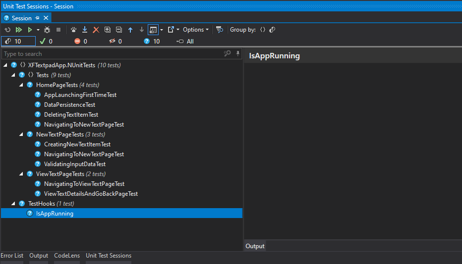
As of now, if everything is set up properly, you should see your first Feature Scenario ready and executing in Test Runners without any issue! 😉
Let’s run it yo!
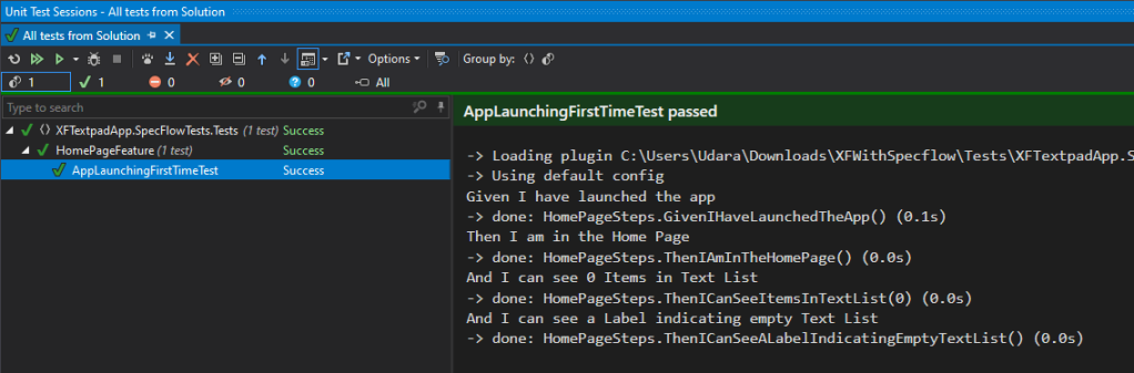
And it passes the test with beautiful green! lol 😀
Yes, more Scenarios!
Yes, like I mentioned before, you can add any number of of Scenarios in a given Feature, so let’s go ahead and add more scenarios to the HomePage Feature!
Feature: HomePage

Scenario: App Launching First Time Test
          ...

Scenario: Navigating to New Text Page Test
          Given I have launched the app
          Then I am in the Home Page
          And I click on "New Text" Button
          Then I am in the New Text Page

Scenario: Deleting Text Item Text
          ...
Simply a matter of following the same pattern, and binding to the Step definitions behind in code behind! Go crazy! 😉
Clean up with Sharing…
Now let’s take it up a notch, by sharing our Step Definitions, which will certainly increase the reusability of our test code and reduce repetition. SpecFlow uniquely facilitates this feature where, any given Step Definition is shared and accessible across the same namespace.
Let’s create a new class, SharedSteps.cs which will be used to hold all our common shared step definitions…
[Binding]
public class SharedSteps
{
	public TestApp App => TestHooks.App;

	[Given(@"I have launched the app")]
	public void GivenIHaveLaunchedApp()
	{
		...
	}

	[Then(@"I am in the ""(.*)"" Page")]
	public void ThenIAmOnThePage(string pageName)
	{
		...
	}

	...
}
We need to add the [Binding] attribute to mark the class for SpecFlow bindings, and then we include all the step definitions we need to share across all our Features under the same Test environment.
Passing Arguments…
As you noticed before, we can pass any number of arguments or parameters in a given step, as either integer or string values. If it’s an integer parameter you can directly pass it as is in the step, but if you want to pass a string parameter, then you need to surround it with upper quotes as shown below…
Scenario: Creating new Text Item Test
          ...
          Then I am in the "Home" Page
          And I can see 0 Items in Text List
          ...
          Then I am in the "NewText" Page
          And I add New "Test Title 1" and "Test Description 1"
          ...
The above is handled in the code behind step definition as follows,
[Then(@"I am in the ""(.*)"" Page")]
public void ThenIAmOnThePage(string pageName)
{
	...
}

[Then(@"I can see (.*) Items in Text List")]
public void ThenICanSeeTextItemInListView(int itemCount)
{
	...
}

[Then(@"I add New ""(.*)"" and ""(.*)""")]
public void ThenIAddNewAnd(string textTitle, string text)
{
	...
}
There you go pretty neat eh! but let’s take it up a notch, where what if we need to pass multiple values for each parameter in the step? Now that’s where Scenario Outline comes to rescue,
Scenario Outline: Creating new Text Item Test
                  ...
                  And I add New "<TextTitle>" and "<Text>"
                  ...

Examples:
	| TextTitle    | Text               |
	| Test Title 1 | Test Description 1 |
	| Test Title 2 | Test Description 2 |
	| Test Title 3 | Test Description 3 |
Using a Scenario Outline, you can simply provide multiple values for each parameter in the Example table. You can see in the above example, where I’m passing the parameters “TextTitle” and “Text” with multiple values into the Scenario. SpecFlow will handle this during test runtime as separate scenario executions with the dataset in each row. Clever trick! 😉
SpecFlow blog has a full fledge post on this, which I highly recommend you take a look: https://specflow.org/2019/improving-gherkin-specs-with-specflow-step-argument-transformations/
Just like that, SpecFlow is full of awesome features you can utilize build your Tests! 😀
Mock em!
Hence we’re using Xamrin.Forms.Mock, it should be able to handle all the Xamarin.Forms related behaviors and functionality in our Test environment directly, such as Navigation, UI Elements rendering and so on. If you have any platform specific features, then you need to mock those service instances in your testing environment.
I’ve one a similar case here in my demo with the ILocationService, which has a MockLocationService implementation in the Test environment.
If you need to mock any sample fake data, then you could use an awesome library like moq or any other alternative such as, Faker.net and Bogus which are also popular!
In a scenario where, you have actual API calls going in or out of your app, you shouldn’t use them in your test run time. You need to create mocked Services for those API bound calls, with fake data sets attached to them, as the standard practice for Testing.
Finalizing…
So all of this awesomeness is committed into my github repo:
Github repo:
github.com/UdaraAlwis/XFWithSpecFlow
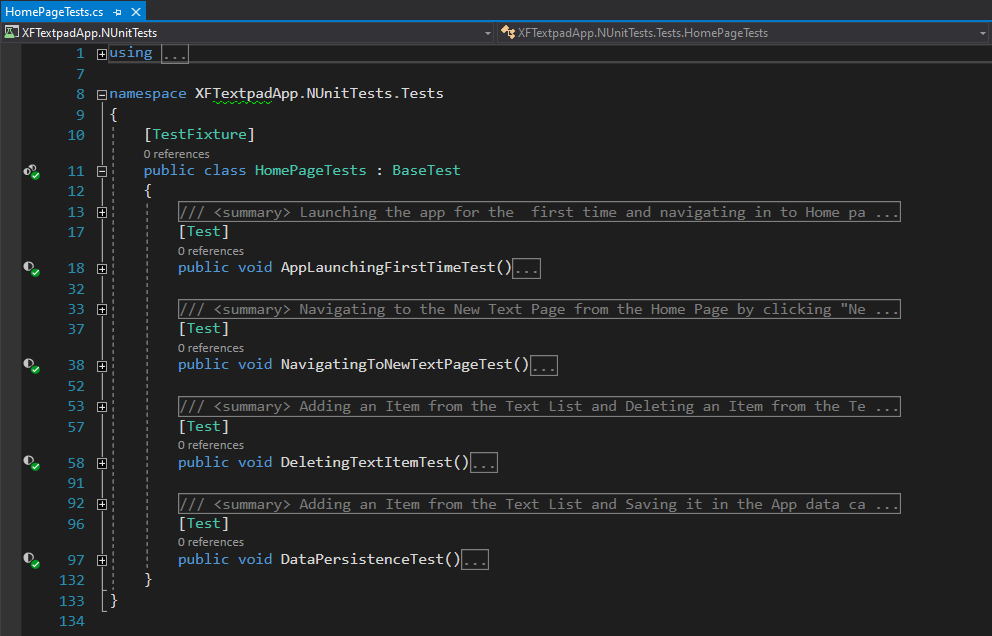
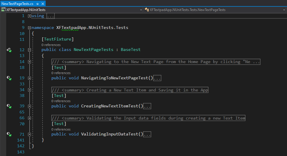
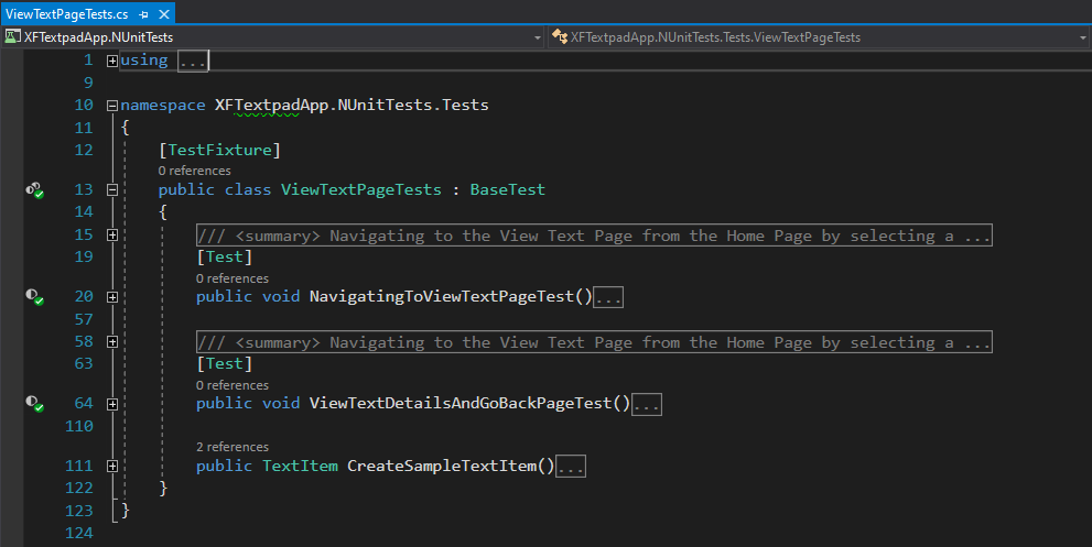
Since I took the Page based pattern for organising my SpecFlow tests, here’s the set of Features I ended up creating. Each Feature has its own Steps Definition class alongside them. There are multiple Scenarios in each Feature.
Under the Test folder I’ve placed all my SpecFlow Features, but you can restructure this hierarchy as you please, even include your own sub folders containing different sets of Features as well… 😉
You can see the SharedSteps class that I extracted for maintaining shared step definitions. So to sum it up, in my demo below are the SpecFlow Features that represents each page…
- Home Page : HomePageFeature
- Scenario: App Launching First Time Test
- Scenario: Navigating to New Text Page Test
- Scenario: Deleting Text Item Text
- Scenario: Data Persistence Test
- New Text Page: NewTextPageFeature
- Scenario: Navigating to New Text Page Test
- Scenario Outline: Creating new Text Item Test
- Scenario: Validating Input Data Test
- View Text Page: ViewTextPageFeature
- Scenario: Navigating to View Text Page Test
- Scenario: View Text Details and go back Test
Maintaining a good readability of your Feature Scenarios can definitely benefit you in the long run! 😉
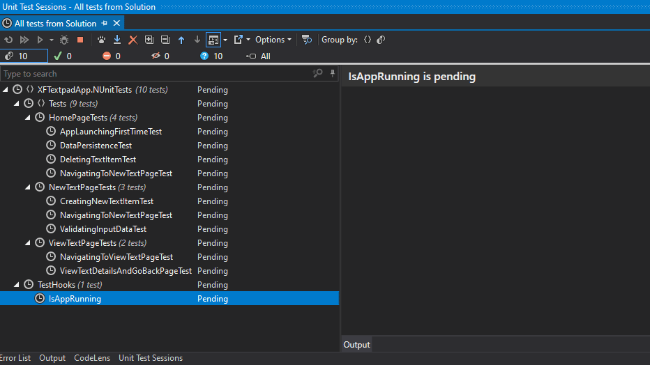
So with that, once you open up your Test Runner, either built in Visual Studio Test Runner or even a 3rd Part Tool like ReSharper Test Runner, all your tests should be discoverable as below…
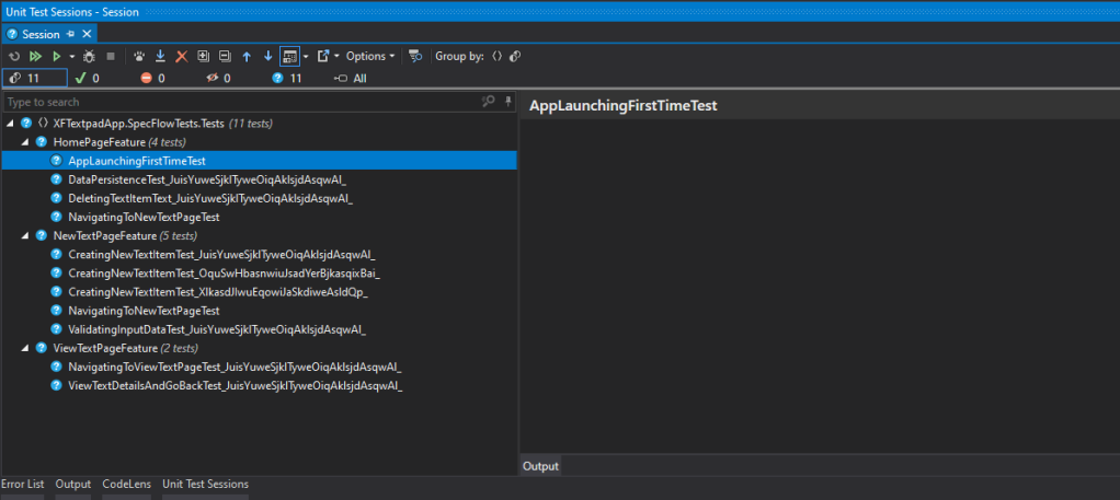
All the SpecFlow Features are shown with all the Test Scenarios in them, ready to be executed! 😉
Demo Time!
So let’s fire up these UnitTests…
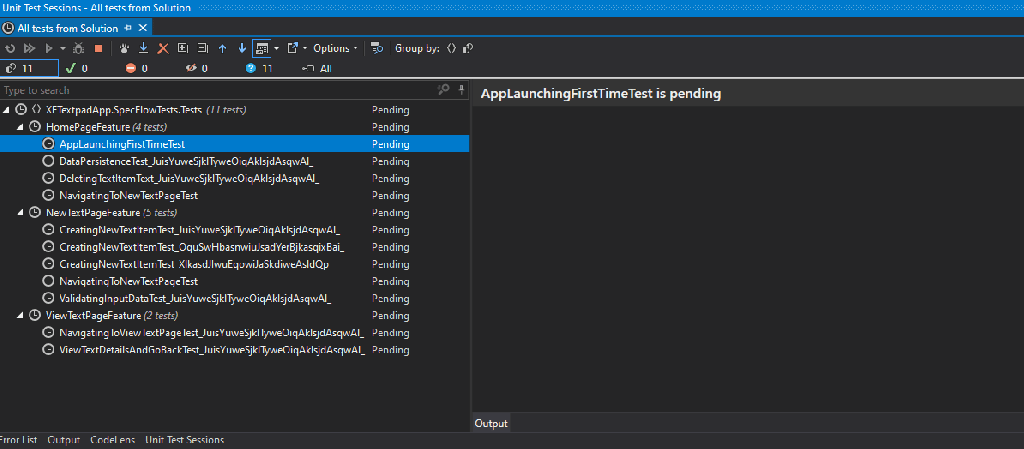
Woah! What a satisfying thing to watch eh! 😀 One of the best things about it is that, we can see each executed step in detail as human-friendly text. SpecFlow FTW!
Github repo:
github.com/UdaraAlwis/XFWithSpecFlow
Once again feel free to grab it on my github! 😉
SpecFlow mindset…
Integrating SpecFlow based Tests in our Xamarin.Form projects brings all the stakeholders together, by promoting Human friendly test language as living documentation.
This is how We do it – Defining these Features and Scenario Steps require a certain mindset, where we need to look at our application or software in an End User’s perspective. You can integrate SpecFlow as a form of Test Driven Development as well, which is what we’re doing at our company, where we extract the Features, Scenarios and their Steps based on the Requirement Specification, and we start building the Application from there on wards.
Perspective of the End User – In the surface it might look quite easy and straightforward to define these test cases step by step, but sometimes it’s not quite the same for a technical person, due to the heavy technicality they’re focused on and they tend to forget the perspective of the end User. As I’ve experienced in my career, adopting this whole Behavior Driven Development paradigm might be confusing for a DEV personnel sometimes. That’s why sometimes its best to get involvement from a QA or BA personnel in the whole preparation process.
Take it easy yo! – In my personal experience, its best to take it easy! Do not over-complicate, over-exaggerate or think in terms of technical aspect. Just think in the simplest of terms, of yourself as an end user, and look at the requirement that needs to be implemented as such. I too had to overcome this problem myself, since I was a long time developer and when I first tried to adopt myself into SpecFlow based testing, it was quite difficult, but eventually I got the hang of it.
Short and simple! – Keep it short and simple, and maintain clear separation between different steps. If you notice a certain step is getting too complicate or longer than usual, then break it down to several steps. The most important thing is to maintain simplicity, for anyone to easily read and understand.
It’s actually Fun! – It might seem like too much work in the beginning, but trust me, once you get the hang of it, its actually fun. It makes total sense to maintain behavior driven development practices with human-readable testing with all stakeholders of the project!
Conclusion!
SpecFlow brings the whole paradigm of Behavior Driven Development for .NET development, where by helping teams bind automation to feature files and share the resulting examples as Living Documentation across the team and stakeholders. You can easily adopt SpecFlow into Xamarin.Forms projects just the same as any other Testing Framework! SpecFlow provides a whole bunch of amazing features for facilitating these great testing capabilities, but I’ve only touched the tip of the ice berg in this article. Please explore more at: https://specflow.org/
Hope this documentation out of my own experience helps any of you fellow Xamarin.Forms devs out there! Share the love! 😀 Cheers yol!


 ÇøŋfuzëÐ SøurcëÇødë