
Welcome to the Part 2 of my Segmented Button Control in Xamarin.Forms, in which this time we’re going to take it to the advanced level and make it even cooler and more awesome!
If you missed the Part 1 of this article, please go on there and give it a read,A Segmented Button Control in pure Xamarin.Forms! Specially since this article is going to be heavily linked to it. So there we looked into how to create a simple yet awesome Segmeneted Control in pure Xamarin.Forms without any custom renderers or native code. And in this article we’ll be looking into how to make it even more awesome with a bit more advanced implementation. Keep in mind I’m not going to explain all the concept bits which I had discussed in the Part 1 but I will be mentioning about them to be referred to. So let’s begin!
Welcome to Part 2!
A Segmented Control, or as some call it Grouped Button Control, or Tabbed Button Control or some even call the Rocker Control, is what I’m gonna share with yol today, built 100% from Xamarin.Forms! Specially in this Part 2 article, we’re including the ability to add Segmented Buttons on the go and change the Color themes at run time, making it full dynamic.
We’re going to rely on the same basic concept’s we talked about in Part 1 article, only the implementation and handling of the behavior to include the new features are going to be different in this.
Sneak Peak
Here’s a sneak peak of what I built for Part 2 article…
iOS:

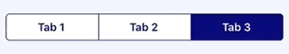
Android:


that’s what we gonna build yo! 😉
FULLY DYNAMIC | ADDING/REMOVE TABS | SWITCHING COLORS | SWITCHING TAB
Look at that awesomeness eh! Hold up, we’re about to get started…
This whole awesome project is hosted up in my Github repo: https://github.com/UdaraAlwis/XFSegmentedControl
Recipe time…
So this is basically going to be the same concepts we’ve used in the Part 1 therefore I’m not going to be repeating the same stuff I had explained in details in Part 1 Article. Please give a read to the “Recipe time…” section in it.
In here we’re going to separate the Tab Button element from the SegmentedControl, so that we can dynamically add the Tab Buttons dynamically at run time. We’re going to maintain an IEnumerable list in the SegmentedControl.
Also unlike last time we’re going to implement and properly handle the Color properties and SelectedTab index property, so that all those properties cab be changed dynamically as we wish.
Well that’s pretty much it, with a bit more details to be gotten into later.
Coding time…
So let’s begin with our separated TabButton element, which you could also identify as a “Segmented Button” element of our Segmented Button Control. This element includes with a simple Button, Label and BoxView inside of a Grid view, that makes it up just like the last article implementation.
<?xml version="1.0" encoding="UTF-8" ?>
<Grid
   x:Class="XFSegmentedControl.Advanced.Controls.TabButton"
   xmlns="http://xamarin.com/schemas/2014/forms"
   xmlns:x="http://schemas.microsoft.com/winfx/2009/xaml"
   IsClippedToBounds="True">
   <Button
      x:Name="TabButtonView"
      Margin="-2,-3,-2,0"
      Clicked="TabButton_OnClicked" />
   <Label
      x:Name="TabLabelView"
      FontAttributes="Bold"
      FontSize="Medium"
      HorizontalOptions="CenterAndExpand"
      InputTransparent="True"
      Text="Tab Text"
      VerticalOptions="CenterAndExpand" />
   <!--  Horizontal indicator for Android  -->
   <BoxView
      x:Name="HorizontalIndicator"
      HeightRequest="2"
      InputTransparent="True"
      IsVisible="False"
      VerticalOptions="End" />
   <!--  Vertical separator for iOS  -->
   <BoxView
      x:Name="VerticalSeparator"
      HorizontalOptions="Start"
      InputTransparent="True"
      IsVisible="False"
      VerticalOptions="FillAndExpand"
      WidthRequest="1" />
</Grid>
There’s the XAML with the basic Button and Label which handles the Text and click event of the TabButton and then the two BoxViews that we’re going to use to decorate for Android and iOS platform specific look and feel.
Check out the full source code here: TabButton.xaml
Next let’s take a look at the code behind awesomeness of our TabButton control.
public partial class TabButton : Grid
{
    public event EventHandler<EventArgs> TabButtonClicked;
    public string TabText { get; private set; }
    public int TabIndex { get; private set; }
    public Color PrimaryColor { get; private set; }
    public Color SecondaryColor { get; private set; }

    public TabButton(string tabText, int tabIndex, Color
       primaryColor, Color secondaryColor,
       bool isSelectedByDefault)
    {
        InitializeComponent ();

        // Set up default values from params
        ...

        // Set up default color values
        SetUpColorScheme();

        // set up selected status
        if (isSelectedByDefault)
            TabButtonView.SendClicked();
    }

    private void SetUpColorScheme()
    ...

    private void TabButton_OnClicked(
                  object sender, EventArgs e)
    {
        SetSelectedTabState();

        SendTabButtonClicked();
    }

    private void SetSelectedTabState()
    ...
    private void SetUnselectedTabState()
    ...

    /// <summary>
    /// Update the Tab Button status Selected/Unselected
    /// </summary>
    /// <param name="selectedTabIndex"></param>
    public void UpdateTabButtonState(int selectedTabIndex)
    {
        if (selectedTabIndex != TabIndex)
            SetUnselectedTabState();
        else
            SetSelectedTabState();
    }

    /// <summary>
    /// Update the Color status of the Tab Button
    /// </summary>
    /// <param name="primaryColor"></param>
    /// <param name="secondaryColor"></param>
    public void UpdateTabButtonColors(
           Color primaryColor, Color secondaryColor)
    ...
}
So in the code behind we’re handling all the functionality and look and feel appearance of the Tab Button segment or element. In the constructor itself we’re passing in the Color properties, Text, Index of the current Tab Button and the selected Status of this Tab Button, then we’re assigning them to the visual elements of the TabButton appropriately, whilst, storing the important values locally for later use.
The SetUpColorScheme() applies to color properties of the element, and I’ve moved that to a separate methods because we’re going to be allowing the user to update the color properties on the go. If you had noticed how we’re subscribing to the TabButton_OnClicked in our XAML code, there we’re handling it by calling the SetSelectedTabState() method and SendTabButtonClicked(), which will update the appearance of the current TabButton to the Selected State and then invoke the EventHandler for whichever the entity that’s subscribed to it from the outside.
Then the an important Public method, UpdateTabButtonState() which allows an external source to update the current Visual-Selected State of the TabButton. You can see how it calls upon the SetSelectedTabState() and SetUnselectedTabState() based on the passed in parameter selectedTabIndex.
Last but not least the UpdateTabButtonColors() allows us to update the Color theme of the TabButton on the go from an external source.
Check out the full source code here: TabButton.xaml.cs
Next we’re going to create the Parent custom control elements that’s going to be holding all of the TabButton elements together. Let’s call it AdvSegmentedControl, thus interpreting Advanced Segmented Control! 😉
<?xml version="1.0" encoding="UTF-8" ?>
<ContentView
   x:Class="XFSegmentedControl.Advanced.Controls.AdvSegmentedControl"
   xmlns="http://xamarin.com/schemas/2014/forms"
   xmlns:x="http://schemas.microsoft.com/winfx/2009/xaml"
   xmlns:system="clr-namespace:System;assembly=netstandard">
   <ContentView.Content>
      <Frame
         x:Name="FrameView"
         Padding="0"
         IsClippedToBounds="True">
         <!--  Platform specific customization values for the border  -->
         <Frame.HasShadow>
            <OnPlatform x:TypeArguments="system:Boolean">
               <On Platform="Android" Value="False" />
               <On Platform="iOS" Value="True" />
            </OnPlatform>
         </Frame.HasShadow>
         <Frame.CornerRadius>
            <OnPlatform x:TypeArguments="system:Single">
               <On Platform="Android" Value="0" />
               <On Platform="iOS" Value="5" />
            </OnPlatform>
         </Frame.CornerRadius>
         <Frame.HeightRequest>
            <OnPlatform x:TypeArguments="system:Double">
               <On Platform="Android" Value="50" />
               <On Platform="iOS" Value="35" />
            </OnPlatform>
         </Frame.HeightRequest>
         <!--  Platform specific customization values for the border  -->

         <!--  Holder of the Child Tab buttons  -->
         <Grid x:Name="TabButtonHolder" ColumnSpacing="0" />

      </Frame>
   </ContentView.Content>
</ContentView>
That’s pretty much it, I’m sure you’re already familiar with the styling of the Frame element from my previous post and the Grid named as TabButtonHolder is what we’re going to be using in the code behind to maintain the Child elements of TabButtons.
Next comes the Code behind of AdvSegmentedControl 😀
public partial class AdvSegmentedControl : ContentView
{
   BindableProperty PrimaryColorProperty
   ...
   BindableProperty SecondaryColorProperty
   ...
   BindableProperty SelectedTabIndexProperty
   ...
   BindableProperty TabButtonsSourceProperty
   ...
   static void OnTabButtonsPropertyChanged
   (BindableObject bindable, object oldValue, object newValue)
   {
      if (newValue != null)
      {
         // clear up existing childrens
         ((AdvSegmentedControl)bindable)
                    .TabButtonHolder.Children?.Clear();

         int index = 0;
         foreach (var item in (IEnumerable) newValue)
         {
            // create new Tab Button
            var newTab = new TabButton(
            item.ToString(),
            index,
            ((AdvSegmentedControl)bindable).PrimaryColor,
            ((AdvSegmentedControl)bindable).SecondaryColor,
            (index == ((AdvSegmentedControl)bindable)
                                       .SelectedTabIndex));

            newTab.TabButtonClicked += (sender, args) =>
            {
               ((AdvSegmentedControl)bindable).SelectedTabIndex
                  = ((TabButton)sender).TabIndex;
            };

            Grid.SetColumn(newTab, index++);

            // add the new tab to TabButtonHolder
            ((AdvSegmentedControl)bindable).
                  TabButtonHolder.Children.Add(newTab);
         }
      }
      else
      {
         // clear up existing childrens
         ((AdvSegmentedControl)bindable).
                  TabButtonHolder.Children?.Clear();
      }
   }

   public AdvSegmentedControl ()
   ...
}
So its all similar to the previous article’s implementation, all the properties and handling of the behavior, except now we’re maintaining a list of TabButton references in TabButtonsSource property, which is a list of strings that we could use as names for the Tabs, instead of having a hard coded static Tab buttons in our previous implementation. And we’re subscribing to it to handle the adding and removal of the Tabs or Segmented Buttons at run time on demand.
Inside the loop we’re creating new instances of TabButton and passing in the relevant properties that are assigned, then subscribing to the TabButtonClicked event, ending each loop cycle by adding the TabButton instance to the TabButtonHolder Grid.
Check out the full source code here: AdvSegmentedControl.xaml.cs
Now that’s pretty much it. Let’s consume this awesomeness of AdvSegmentedControl! 😉
Time for consumption…
Now that we are done with our awesome AdvSegmentedControl, next let’s consume it in anywhere we wish in our Xamarin.Forms app!
<controls:AdvSegmentedControl
    x:Name="segmentedControl"
    PrimaryColor="CornflowerBlue"
    SecondaryColor="White"
    SelectedTabIndex="2"
    SelectedTabIndexChanged="OnSelectedTabIndexChanged">
    <controls:AdvSegmentedControl.Padding>
        <OnPlatform x:TypeArguments="Thickness">
            <On Platform="Android" Value="0" />
            <On Platform="iOS" Value="10,0,10,10" />
        </OnPlatform>
    </controls:AdvSegmentedControl.Padding>
    <controls:AdvSegmentedControl.TabButtonsSource>
        <x:Array Type="{x:Type x:String}">
            <x:String>Monkeys</x:String>
            <x:String>Minions</x:String>
            <x:String>Penguins</x:String>
            <x:String>Foxes</x:String>
        </x:Array>
    </controls:AdvSegmentedControl.TabButtonsSource>
</controls:AdvSegmentedControl>
There you go a simple demonstration of how to consume this awesomeness! We’re using PrimaryColor, SecondaryColor properties to set the color theme and the SelectedTabIndex property allowing you to set the default selected Tab on appearing. We have added a list of Strings to our TabButtonsSource to populate the Tab Buttons or Segmented Buttons as we wish. Also we’re subscribing to the SelectedTabIndexChanged event to react to the changes of the selected Tab by the user (you know load some view or execute whatever the action you wish). Keeping in mind all those properties can be changed at run time and will reflect visually! how awesome is that! 😀
Let’s fire it up and see it in action! 😉
Fire it up!
Here we go…


There we go baby! iOS and Android running side by side…
Something more awesome…
So just to show how powerful my AdvSegmentedControl is, I cooked up bit of a cool demo right here. Oh I hope you still remember that little sneak peak I showed you at the beginning of the article! 😉
Let’s start off with iOS:

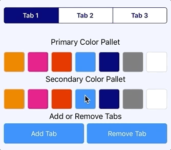
And Android:


TADAAA! 😀
FULLY DYNAMIC | ADDING/REMOVE TABS | SWITCHING COLORS | SWITCHING TAB
Check out the awesome demo code went into this from here: MoreDemoPage.xaml
Well your imagination is the limit fellas! 😀
This whole awesome project is hosted up in my Github repo: https://github.com/UdaraAlwis/XFSegmentedControl
Cheers! 😀 Keep on going my fellow devs!
Spread the love…


 ÇøŋfuzëÐ SøurcëÇødë