Category Archives: Xamarin iOS

Publishing the Nuget of my Color Picker Control for Xamarin.Forms!

Let me share the journey of me publishing the Nuget Package of my interactive Color Picker Control for Xamarin.Forms that I built using SkiaSharp.

So some time back I built an Interactive and responsive Color Picker Control for Xamarin.Forms (Android, iOS, UWP) with a whole bunch of awesome features. On a Canvas with a beautiful Color spectrum similar to a rainbow gradient effect spreading across, drag, drop, swipe and pan over the Canvas to pick the Color you need easily, in a fun-to-use interactive experience. Built from pure Xamarin.Forms based on SkiaSharp, lightweight and fast!

Backstory…

In my previous blog post I shared with you guys how I built my interactive Color Picker Control for Xamarin.Forms, https://theconfuzedsourcecode.wordpress.com/2020/02/26/i-built-an-interactive-color-picker-control-for-xamarin-forms/

Since then I had been adding a whole bunch of extra feature to this Color Picker Control I built, so I thought it was a good idea to publish it as a Nuget Package and share with everyone! 😀

So this time, let me share my journey of implementing more advanced features and publishing the Nuget Package of my Color Picker Control for Xamarin.Forms! 😉

Some thought…

So before I isolated my Color Picker Control into a stand alone reusable package, I wanted to make sure that I maintain my philosophy of building Plugins. This would definitely have a big impact on your Users who will will be using these Plugins to build their apps, therefore I’ll share the tick list that I consider as important as follows…

Plug and Play: The plugin should easy to set up with. Do not force Devs to set up any dependencies or property values by themselves. The properties and behaviors of the Plugin should have default values assigned to them.

Customization: It should be easy and straight forward for the Devs to customize the appearance or the behaviors of the Plugin. In some case this might be limited, but you must build the Plugin in a way it make it easy as much as possible.

Embedded: In the case of UI Element Plugins, you should make it easy to be embedded into any Layout structure, being able to inherit the Parent Layout’s behaviors and values, without overriding or disrupting them.

Keep it Light: Make the Plugin as lightweight as possible, give the Dev the chance to choose which assemblies to be included in the plugin. Remove unnecessary references or dependencies from your Plugin core, so it’s light weight as possible.

Performance First: It shouldn’t cause any performance bottleneck, therefore from scratch you must build the Plugin with performance in mind. Constantly check for performance improvements during the development of your Plugin.

So may be go over this list before you build or release a Plugin for the public! 😉 Alright, with all those principles in mind, let’s move ahead…

The Features!

So here are the features that are already available in the Color Picker Control that I built which I had shared from my previous blog post…

  • Picked Color: The Property that allows Users to retrieve the Color values that’s selected from the Color Picker. This value is only a Get Property.
  • Picked Color Changed Event: The Event that fires up every time the PickedColor Value is changed during Color selection. You can subscribe to this event and observe the behavior.

Since my venture into this Color Picker Plugin I had a few ideas in mind as improvements or rather add as extra features, rather than just being a UI Element which allows you to pick a color on a beautiful spectrum! 😉 So here are the extra features that I’ll be building up into it..

  • Change the Available Base Colors List: You can set the primary list of Colors where the gradient spectrum will be rendered from. So choose the base colors you want to be populated as you wish and it will be rendered on the Color Picker.
  • Change the Color List Flow Direction: You will be able to change the direction of the flow of the colors on the canvas, where it be Horizontal flow or a Vertical flow of the color spectrum. Further more Horizontally being starting off the flow from left to right, and Vertically being top to bottom.
  • Change the Color Spectrum Style: You will be able to change the style of the Color Spectrum gradient, the rendering combination of base colors (Hue), or lighter colors (Tint) or darker colors (Shade). You’ll be able to set it with different order as well, ex: Hue Colors, Shade Colors, Tint Colors or Tint Colors, Hue Colors, Shade Colors, etc..
  • Change the Appearance of the Pointer: The white color circle that is used as the Picker Pointer on the Canvas, should be able to customized based on its Diameter or Thickness of the Circle border. Another nice addition would be to allow user to set the position of the Pointer as they wish.

Alright, now that we listed down the new intended feature set that I’m planning to ship out with my Color Picker Control, let’s get down to building it… 😀

Sneak Peek!

Just to give a little glimpse of the awesomeness I ended up building and publishing… 😀 behold the Color Picker Control for Xamarin.Forms!

Pretty awesome eh! 😉 I have moved out of my previous repo to a new standalone repo in github, since I’m publishing this as a package. Therefore all the new development will be done in this repository.

Project hosted on github:
https://github.com/UdaraAlwis/XFColorPickerControl

So feel free to take a look in there before we continue… 😉

Time to Build!

Since I already explained in my previous blog post how I built my Color Picker Control from scratch step by step, I won’t be repeatedly going through same code bits in this post, but rather focus on the new changes and features only.
If you haven’t read that one yet, then I would recommend you take a peek there first, I built an Interactive Color Picker Control for Xamarin.Forms! And continue here…

I named the Solution as Udara.Plugin.XFColorPickerControl, and in return I intend to keep the Package reference with the same naming. I am using Visual Studio 2019 on Windows 10 here as my development environment.

I have created a VS Solution with a .NET Standard 2.0 Library which will hold the UI Control in place, with the naming ColorPicker. You can see I have added the dependencies of the Plugin, with Xamarin.Forms and SkiaSharp.Views.Forms packages. 😉

Notice the pure Xamarin.Forms DemoApp project inside the Demo folder that I have added to the same solution? That is for testing and showcasing the Plugin’s use, also as a reference point for anyone who wants to learn how to use the Plugin in many different ways, this attached DemoApp could come handy. 😀

The ColorPicker.xaml is the UI Element that users will be using under the namespace Udara.Plugin.XFColorPickerControl.ColorPicker in their XAML or C# code for building the UI. Here’s base skeleton implementation of the ColorPicker.xaml.cs, which all the core implementation will be taking place…

namespace Udara.Plugin.XFColorPickerControl
{
    [XamlCompilation(XamlCompilationOptions.Compile)]
    public partial class ColorPicker : ContentView
    {
        public ColorPicker()
        {
            InitializeComponent();
        }

        // Implementation goes here
    }
}

Next let’s get into the implementation of Features one by one as I discussed before…

Building the Features!

So I’m going to use the same code for the two features that I already implemented in my previous blog post, Picked Color and Picked Color Changed Event feature that’s represented by PickedColor Property and PickedColorChanged Event Handler.

[XamlCompilation(XamlCompilationOptions.Compile)]
public partial class ColorPicker : ContentView
{
	/// <summary>
	/// Occurs when the Picked Color changes
	/// </summary>
	public event EventHandler<Color> PickedColorChanged;

	public static readonly BindableProperty PickedColorProperty
		= BindableProperty.Create(
			nameof(PickedColor),
			typeof(Color),
			typeof(ColorPicker));

	/// <summary>
	/// Get the current Picked Color
	/// </summary>
	public Color PickedColor
	{
		get { return (Color)GetValue(PickedColorProperty); }
		private set { SetValue(PickedColorProperty, value); }
	}
	
	...
}

Now considering the rest of the features that I discussed in the beginning, all those features can be implemented and exposed via Bendable Properties, and handling the Property Changed events internally to react for any changes requested during run time.

[XamlCompilation(XamlCompilationOptions.Compile)]
public partial class ColorPicker : ContentView
{
    ...
 
    public static readonly BindableProperty PropertyNameProperty
        = BindableProperty.Create( 
        ... 
        
            validateValue: (bindable, value) =>
            {
                // validate value
                return (..);
            },
            
            propertyChanged: (bindable, value, newValue) =>
            {
                if (newValue != null)
                    // action on value change
                else
                    // handling null values
                    ((ColorPicker)bindable).PropertyNameProperty = default;
            });
        );
 
    public type PropertyName
    { ... }
 
    ...
}

All the Bindable Properties are safeguarded with validations as you see above. I have added an extra layer of protection against unnecessary null values being set up, by defaulting the property value to default of itself. You can check the full implementation of each of these Properties on the github repo itself. github.com/UdaraAlwis/XFColorPickerControl Let’s begin..

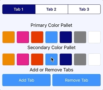
Feature: BaseColorList

Bindable Property, BaseColorList: Change the available base Colors on the Color Spectrum, of the Color Picker. This will take a List of strings of Color names or Hex values, which is held in an IEnumerable as show here, also I have set up the fallback default values with the rainbow color spectrum.

[XamlCompilation(XamlCompilationOptions.Compile)]
public partial class ColorPicker : ContentView
{
    ...

    public static readonly BindableProperty BaseColorListProperty
        = BindableProperty.Create( ... );

    public IEnumerable BaseColorList
    { ... }

    ...
}

This Property is then consumed during the SkiaSharp rendering cycle as follows, where as we’re using the Xamarin.Forms built in ColorTypeConverter to parse the string color values to actual Color objects and then to SKColor objects, which is then used to render the render the color spectrum on the Color Picker Control. 😀

...
    private void SkCanvasView_OnPaintSurface
                   (object sender, SKPaintSurfaceEventArgs  e)
    {
        ...
         
        // Draw gradient rainbow Color spectrum
        using (var paint = new SKPaint())
        {
            paint.IsAntialias = true;
 
            // Initiate the base Color list
            ColorTypeConverter converter = new ColorTypeConverter();
            System.Collections.Generic.List<SKColor> colors = 
                new System.Collections.Generic.List<SKColor>();
            foreach (var color in BaseColorList)
                colors.Add(((Color)converter.
		          ConvertFromInvariantString(color.ToString())).ToSKColor());
				
            ...
        }
    }
...

Pretty straight forward eh! Let’s see how you could use this as a developer.

How to use?

You can easily use this feature in XAML as follows, by accessing ColorPicker.BaseColorList property and setting up the list of color values you prefer as hex values or with pre-defined color value names.

<xfColorPickerControl:ColorPicker
	x:Name="ColorPicker"
	...	>
	<xfColorPickerControl:ColorPicker.BaseColorList>
		<x:Array Type="{x:Type x:String}">
			<!--  Yellow  -->
			<x:String>#ffff00</x:String>
			<!--  Aqua  -->
			<x:String>#00ffff</x:String>
			<!--  Fuchsia  -->
			<x:String>#ff00ff</x:String>
			<!--  Yellow  -->
			<x:String>#ffff00</x:String>
		</x:Array>
	</xfColorPickerControl:ColorPicker.BaseColorList>
</xfColorPickerControl:ColorPicker>

If you prefer in C# code, you can easily do as as well, a list of string values of the colors…

ColorPicker.BaseColorList = new List<string>()
{
	"#00bfff",
	"#0040ff",
	"#8000ff",
	"#ff00ff",
	"#ff0000",
};

Here’s some action…

Feature: ColorFlowDirection

The Bindable Property, ColorFlowDirection: Change the direction in which the Colors are flowing through on the Color Spectrum, of the Color Picker. This will allow you to set whether the Colors are flowing through from left to right, Horizontally or top to bottom, Vertically. I have defined an Enum type which will represent this type of course.

namespace Udara.Plugin.XFColorPickerControl
{
    public enum ColorFlowDirection
    {
        Horizontal,
        Vertical
    }
}

Let’s create our ColorFlowDirection Bindable Property based on that,

[XamlCompilation(XamlCompilationOptions.Compile)]
public partial class ColorPicker : ContentView
{
    ...

    public static readonly BindableProperty ColorFlowDirectionProperty
        = BindableProperty.Create( ... );

    public ColorFlowDirection ColorFlowDirection
    { ... }

    ...
}

The default value will be set as ColorFlowDirection.Horizontal, and if the User changes value during run time, it will fire up a new SkiaSharp rendering cycle of the Canvas, effectively rendering the spectrum accordingly to the new color value, which is handled in the rendering logic as below…

...
    private void SkCanvasView_OnPaintSurface
                   (object sender, SKPaintSurfaceEventArgs  e)
    {
        ...
        
            // create the gradient shader between base Colors
            using (var shader = SKShader.CreateLinearGradient(
                new SKPoint(0, 0),
                ColorFlowDirection == ColorFlowDirection.Horizontal ?
                    new SKPoint(skCanvasWidth, 0) : 
                    new SKPoint(0, skCanvasHeight),
                colors.ToArray(),
                null,
                SKShaderTileMode.Clamp))
            {
                paint.Shader = shader;
                skCanvas.DrawPaint(paint);
            }
            
        ...
    }
...

The trick here is to configure the SKShader.CreateLinearGradient() method’s start and end coordinate parameters, which governs the direction in which the gradient effect will be drawn with the list of colors, thus rendering the color list from left to right or top to bottom. As you can see for Horizontal effect, we use SKPoint (0,0) to SKPoint(<canvasWidth>, 0) by using the corner most value on the X axis for the end coordinates, the same pattern is used for Vertical effect with bottom most value on the Y axis.

Here how to consume this feature as a developer…

How to use?

You can easily use this feature in XAML, by accessing ColorPicker.ColorFlowDirection property and setting Horizontal or Vertical option as you prefer…

<xfColorPickerControl:ColorPicker
	x:Name="ColorPicker"
	ColorFlowDirection="Horizontal"
	...	>
</xfColorPickerControl:ColorPicker>

If you prefer in C# code, use the ColorFlowDirection.Horizontal or Vertical option…

ColorPicker.ColorFlowDirection =
	Udara.Plugin.XFColorPickerControl.ColorFlowDirection.Horizontal;

Here’s some action…

Feature: ColorSpectrumStyle

The Bindable Property, ColorSpectrumStyle: Change the Color Spectrum gradient style, with the rendering combination of base colors (Hue), or lighter colors (Tint) or darker colors (Shade). If you’re not familiar with these technical terms, here’s a clear illustration of comparison of Hue, Shade, and Tint of Colors.

We need to make sure our Color Picker is able to deliver to this kind of requirement, having darker or lighter colors of the given base colors on the Color Picker Spectrum. So I’ve created an Enum type which will consist of all the possible combinations of Hue, Shade and Tint colors based on the available Base Colors, that would facilitate this feature.

namespace Udara.Plugin.XFColorPickerControl
{
    public enum ColorSpectrumStyle
    {
        HueOnlyStyle,
        HueToShadeStyle,
        ShadeToHueStyle,
        HueToTintStyle,
        TintToHueStyle,
        TintToHueToShadeStyle,
        ShadeToHueToTintStyle
    }
}

Let’s create our ColorSpectrumStyle Bindable Property based on that,

[XamlCompilation(XamlCompilationOptions.Compile)]
public partial class ColorPicker : ContentView
{
    ...

    public static readonly BindableProperty ColorSpectrumStyleProperty
        = BindableProperty.Create( ... );

    public ColorSpectrumStyle ColorSpectrumStyle
    { ... }

    ...
}

I will be setting ColorSpectrumStyle.HueToShadeStyle as the default value for this property, any changes to this value during run time will kick start a new refresh draw on the Color Spectrum, which is handled in the rendering logic as below…

...
    private void SkCanvasView_OnPaintSurface
                   (object sender, SKPaintSurfaceEventArgs  e)
    {
        ...
         
        // Draw secondary gradient color spectrum
        using (var paint = new SKPaint())
        {
            paint.IsAntialias = true;
 
            // Initiate gradient color spectrum style layer
            var colors = GetSecondaryLayerColors(ColorSpectrumStyle);
			
            ...
        }
    }
...

Over here, we’re retrieving the list of colors based on the ColorSpectrumStyle value, which is a combination of Transparent, Black and White colors, which will be used to draw the secondary gradient layer. GetSecondaryLayerColors() will be returning the appropriate list of secondary colors that matches the ColorSpectrumStyle requested as follows.

...
    private SKColor[] GetSecondaryLayerColors(ColorSpectrumStyle colorSpectrumStyle)
    {
        ...
        
        if (colorSpectrumStyle == GradientColorStyle.DarkToColorsToLightStyle)
        {
            return new SKColor[]
            {
                SKColors.Black,
                SKColors.Transparent,
                SKColors.White
            };
        }
        
        ...
    }
...

I’m maintaining a simple If-else block chain which will check for the ColorSpectrumStyle value available and return the appropriate list of colors back. Quite straight forward! 😉

Now here’s how you use this awesome feature…

How to use?

You can easily use this feature in XAML, by accessing ColorPicker.ColorSpectrumStyle property and setting the appropriate Style option as you prefer…

<xfColorPickerControl:ColorPicker
	x:Name="ColorPicker"
	ColorSpectrumStyle="TintToHueToShadeStyle"
	...	>
</xfColorPickerControl:ColorPicker>

If you prefer in C# code…

ColorPicker.ColorSpectrumStyle =
	Udara.Plugin.XFColorPickerControl.ColorSpectrumStyle.TintToHueToShadeStyle;

Here’s some action…

Feature: PointerRing Styling

As you can see there’s a pretty neat Pointer Ring that’s pointing the picked color position on the Color Picker, it would be nice to be able to customized this too eh! 😉

Therefore I have introduced four features for this,

  • PointerRingDiameterUnits
  • PointerRingBorderUnits
  • PointerRingPositionXUnits
  • PointerRingPositionYUnits

Alright, let’s walk through them one by one..

Feature: PointerRingDiameterUnits

The Bindable Property, PointerRingDiameter: Changes the Diameter size of the Pointer Ring on the Color Picker. It accepts values between 0 and 1, as a representation of numerical units which is compared to the 1/10th of the longest length of the Color Picker Canvas. By default this value is set to 0.6 units.

[XamlCompilation(XamlCompilationOptions.Compile)]
public partial class ColorPicker : ContentView
{
    ...
 
    public static readonly BindableProperty PointerRingDiameterUnitsProperty
        = BindableProperty.Create( ... );
 
    public double PointerRingDiameterUnits
    { ... }
    
    ...
}

This will be calculated against the longest length of Color Picker’s Canvas, whether it be Width or Height. The reason for adding another 1/10th of the value is to maintain the maximum size of the Pointer Ring, avoiding ridiculous sizing of the element. lol So the Precise calculation is as, Canvas Size (Height or Width) x PointerRingDiameterUnits x (1/10)
This value will render exactly to the same proportion against different screen sizes and DPs.

...
    private void SkCanvasView_OnPaintSurface
                   (object sender, SKPaintSurfaceEventArgs  e)
    {
        ...
         
        // Painting the Touch point
        using (var paint = new SKPaint())
        {
            ...
 
            var canvasLongestLength = (skCanvasWidth > skCanvasHeight) 
                    ? skCanvasWidth : skCanvasHeight;

            // Calculate 1/10th of the units value for scaling
            var pointerRingDiameterUnitsScaled = (float)PointerRingDiameterUnits / 10f;
            // Calculate against Longest Length of Canvas 
            var pointerRingDiameter = (float)canvasLongestLength 
                                                    * pointerRingDiameterUnitsScaled;

            // Outer circle of the Pointer (Ring)
            skCanvas.DrawCircle(
                _lastTouchPoint.X,
                _lastTouchPoint.Y,
                (pointerRingDiameter / 2), paintTouchPoint);

            ...
        }
    }
...

I’ve set up the skCanvas.DrawCircle() with the (pointerRingDiameter / 2) since it accepts radius value only for drawing the circle.

How to use?

You can easily use this feature in XAML, by accessing ColorPicker.PointerRingDiameterUnits property and setting the value against your Color Picker’s Width and Height.

<xfColorPickerControl:ColorPicker
    x:Name="ColorPicker"
    PointerRingDiameterUnits="0.6"
    ...    >
</xfColorPickerControl:ColorPicker>

If you prefer in C# code…

ColorPicker.PointerRingDiameterUnits = 0.6;

Here’s some action…

Feature: PointerRingBorderUnits

The Bindable Property, PointerRingBorderUnits: Changes the Border Thickness size of the Pointer Ring on the Color Picker. It accepts values between 0 and 1, as a representation of numerical units which is calculated against the diameter of the Pointer Ring. By default this value is set to 0.3 units.

[XamlCompilation(XamlCompilationOptions.Compile)]
public partial class ColorPicker : ContentView
{
    ...
 
    public static readonly BindableProperty PointerRingBorderUnitsProperty
        = BindableProperty.Create( ... );
 
    public double PointerRingBorderUnits
    { ... }
    
    ...
}

This calculation executes against the Pointer Ring’s pixel diameter value as, (Pointer Ring Diameter in Pixels) x PointerRingBorderUnits, since this is dependent on the Pointer Ring’s diameter, we thickens the border inside that circle only. Basic technique here is to draw a Circle inside the Parent Circle, with the picked pixel point’s color, emulating the visual of a Ring.

...
    private void SkCanvasView_OnPaintSurface
                   (object sender, SKPaintSurfaceEventArgs  e)
    {
        ...
         
        // Painting the Touch point
        using (var paint = new SKPaint())
        {
            ...
 
            // Draw inner circle with picked color
            paintTouchPoint.Color = touchPointColor;

            // Calculate against Pointer Circle
            var pointerRingInnerCircleDiameter 
                          = (float)pointerRingDiameter 
                              * (float)PointerRingBorderUnits; 

            // Inner circle of the Pointer (Ring)
            skCanvas.DrawCircle(
                _lastTouchPoint.X,
                _lastTouchPoint.Y,
                ((pointerRingDiameter 
                        - pointerRingInnerCircleDiameter) / 2), paintTouchPoint);
            ...
        }
    }
...

I’ve set up the skCanvas.DrawCircle() with the calculation, ((pointerRingDiameter – pointerRingInnerCircleDiameter) / 2) since it accepts radius value only for drawing the circle.

How to use?

You can easily use this feature in XAML, by accessing ColorPicker.PointerRingBorderUnits property and setting the value against PointerRingDiameterUnits you have used.

<xfColorPickerControl:ColorPicker
    x:Name="ColorPicker"
    PointerRingBorderUnits="0.3"
    ...    >
</xfColorPickerControl:ColorPicker>

If you prefer in C# code…

ColorPicker.PointerRingBorderUnits = 0.3;

Here’s some action…

Feature: PointerRingPosition<X,Y>Units

The Bindable Property, PointerRingPosition<X,Y>Units: Changes the Pointer Ring’s position on the Color Picker Canvas programmatically. There are of two bindable properties PointerRingPositionXUnits and PointerRingPositionYUnits, which represents X and Y coordinates on the Color Picker Canvas. It accepts values between 0 and 1, as a presentation of numerical units which is calculated against the Color Picker Canvas’s actual pixel Width and Height. By default both the values are set to 0.5 units, which positions the Pointer Ring in the center of the Color Picker.

[XamlCompilation(XamlCompilationOptions.Compile)]
public partial class ColorPicker : ContentView
{
    ...
 
    public static readonly BindableProperty PointerRingPositionXUnitsProperty
        = BindableProperty.Create( ... );
 
    public double PointerRingPositionXUnits
    { ... }
	
    public static readonly BindableProperty PointerRingPositionYUnitsProperty
        = BindableProperty.Create( ... );
 
    public double PointerRingPositionYUnits
    { ... }
 
    ...
}

This calculation executes against the Color Picker Canvas’s actual pixel Width and Height as, (Color Picker Canvas Width in Pixels) x PointerRingPositionXUnits and (Color Picker Canvas Height in Pixels) x PointerRingPositionYUnits
Up on invoke of the PropertyChanged on those Properties, we make a call to the following SetPointerRingPosition() with the new X and Y position units requested from User.

...
    private void SetPointerRingPosition
                      (double xPositionUnits, double yPositionUnits)
    {
        // Calculate actual X Position
        var xPosition = SkCanvasView.CanvasSize.Width
                                 * xPositionUnits; 
        // Calculate actual Y Position
        var yPosition = SkCanvasView.CanvasSize.Height
                                 * yPositionUnits; 

        // Update as last touch Position on Canvas
        _lastTouchPoint = new SKPoint(Convert.ToSingle(xPosition), Convert.ToSingle(yPosition));
        SkCanvasView.InvalidateSurface();
    }
...

We’re calculating the actual X and Y coordinates against the Canvas pixel size and setting up the _lastTouchPoint with those values, for keeping the Pointer Ring position on canvas in sync with touch inputs positioning and programmatical positioning, then at the end we fire up the SkiaSharp rendering cycle with SkCanvasView.InvalidateSurface();

Handling Pointer Ring Position on Initialization!

We need to handle the positioning of the Pointer Ring on the initialisation or on the rendering of the element during run time. We can achieve this by a one-time execution with a boolean flag, that executes this logic. So upon the first SkiaSharp canvas rendering cycle, we hook up to the PointerRingPositionXUnits and PointerRingPositionYUnits properties and render the Pointer Ring Position to the set value.

...    
    private bool _checkPointerInitPositionDone = false;

...
    private void SkCanvasView_OnPaintSurface
                   (object sender, SKPaintSurfaceEventArgs  e)
    {
        ...
          
        if (!_checkPointerInitPositionDone)
        {
            var x = ((float)skCanvasWidth * (float)PointerRingPositionXUnits);
            var y = ((float)skCanvasHeight * (float)PointerRingPositionYUnits);

            _lastTouchPoint = new SKPoint(x, y);

            _checkPointerInitPositionDone = true;
        }
    }
...

We use _lastTouchPoint variable which is used by the drawing functions for rendering the Pointer Ring on Color Picker’s Canvas.

How to use?

You can easily use this feature in XAML, by accessing ColorPicker.PointerRingPositionXUnits property and ColorPicker.PointerRingPositionYUnits setting the values against your Color Picker’s Width and Height.

<xfColorPickerControl:ColorPicker
    x:Name="ColorPicker"
    PointerRingPositionXUnits="0.3"
    PointerRingPositionYUnits="0.7"
    ...    >
</xfColorPickerControl:ColorPicker>

If you prefer in C# code…

ColorPicker.PointerRingPositionXUnits = 0.3;
ColorPicker.PointerRingPositionYUnits = 0.7;

Here’s some action…

UWP Bug Fix!

One issue I noticed was on UWP run time, where the SkiaSharp’s Canvas touch event behaves differently than iOS and Android. The touch event would get activated even if you hover over the canvas using your mouse pointer, and this was causing the PickedColor property to fire up.
The Touch event should occur only if you actually click on the canvas and drag and drop on the Canvas, so in order to fix this I used the InContact property SKTouchEventArgs inside the touch event to validate on UWP run time.

...
    private void SkCanvasView_OnTouch
                (object sender, SKTouchEventArgs e)
    {
        // to fix the UWP touch behavior
        if (Device.RuntimePlatform == Device.UWP)
        {
            // avoid mouse over touch events
            if (!e.InContact)
                return;
        }

        _lastTouchPoint = e.Location;
        
        ...
    }
...

This fixed the bug on UWP, making sure the touch event is validated before executing the rest of the logic.

Nugetizing!

Alright then, its time to set up our beautiful Color Picker Control for Xamarin.Forms as a Nuget Package using Visual Studio. I’m going first set the Nuget package properties first, then build the package, and finally publish it to Nuget, allowing it to be shared with everyone out there! 😀

Set up package properties…

You could do this straight from Visual Studio Project Properties, or directly from a Nuspec file added to the project itself. For now I would prefer setting up properties in VS Project -> Properties – Package tab, making sure to add all the necessary properties and information about the package as shown below…

Make sure to click on “Generate Nuget package on build” tick, which will enable all the property fields. You could also do this by editing .csproj file of the package project as well, if you require any fine tuned editing…

Now we’re ready to build the package of our Udara.Plugin.XFColorPicker library.

Building the Package…

We need to create the Publish Profile for the package.
Right click on Library project node -> Publish

If this was your first time, it will navigate you to create new Publish Profile tab as shown below…

It is easier to set up a Publish Profile, since you don’t have to manually change your build configuration to Release and then launch a build. Therefore I have set it up now, and next time I publish it will straightaway handle all the configuration for you! 😀

Click Publish, and it nicely builds…

Once we navigate to the folder location mentioned in the above build output…

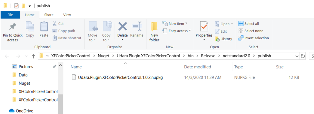
There we have our nupkg package file, which we can then use to directly upload to Nuget!

Upload to Nuget…

Grab that nupkg file and drag and drop into the upload page of nuget.org and you’re done!

Here you’ll be able to add a short marked down documentation for the users, I would highly recommend you do that since it will increase the support and visibility.

Well that’s all it takes, and the package will be available in a few hours on Nuget!

Updating Package…

Now how do we update our package? if you have noticed around nuget, there’s no update option in in the page where you manage the package. You can update your package by using the NuGet command-line utility or directly uploading an increment build, in which I have opted for the end option to keep it easy.

So when you want to push an update to your package, make sure to update the package properties in Visual Studio to reflect the next immediate version, as shown below where I’m updating from version 1.0.2 to version 1.0.3…

Also do no forget the assembly versioning as well…

Now build your package and directly go to nuget upload page, drag and drop the file…

Make sure to add the nuget documentation and Submit!

Done and dusted, just like that, the updating is done! 😀

Published on nuget:
nuget.org/Udara.Plugin.XFColorPickerControl/

Now anyone can use my Color Picker Control for Xamarin.Forms by setting up this nuget package in their project…
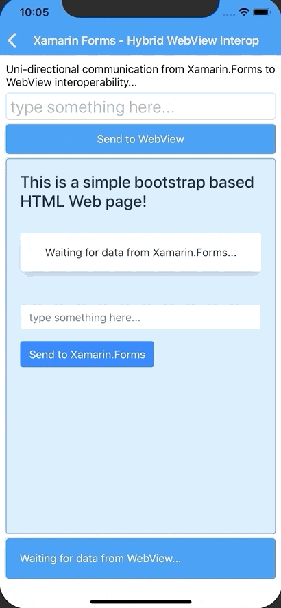
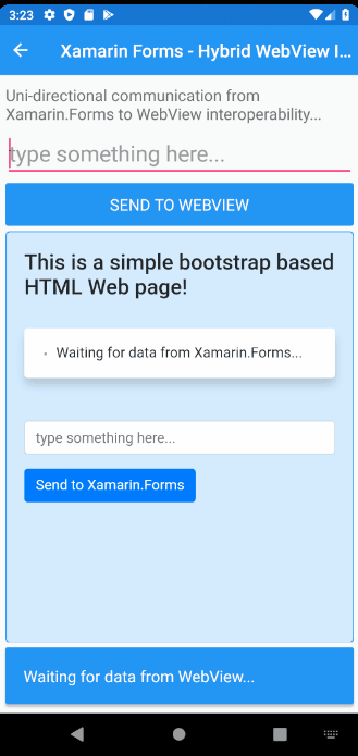
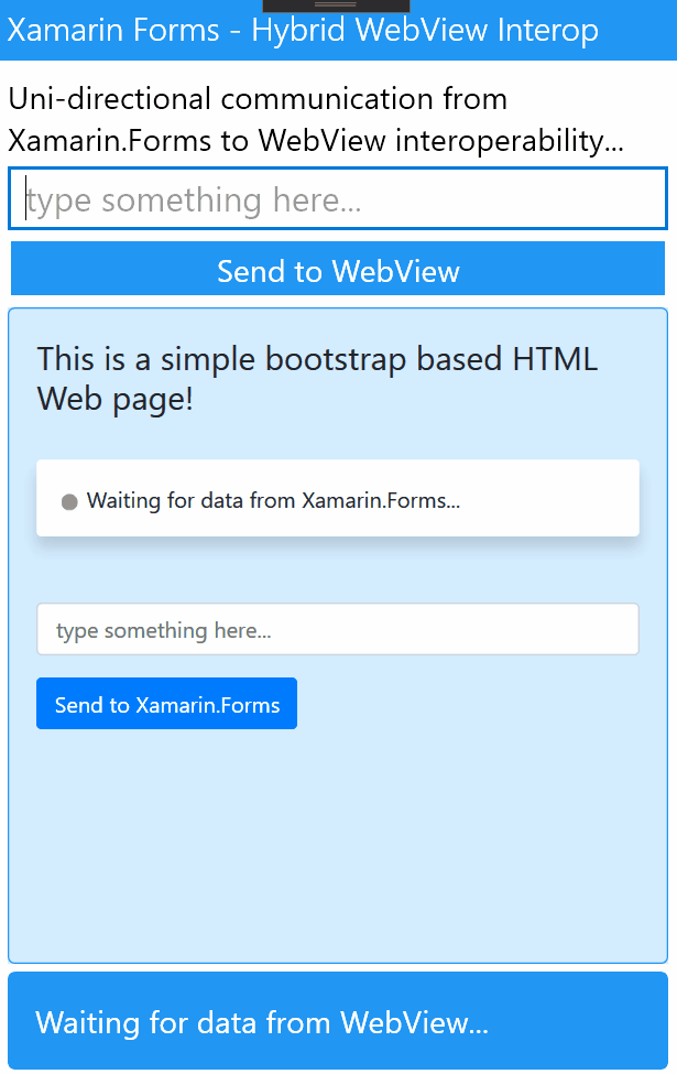
Demoing it up!

As you saw at the beginning I have attached a Demo project into the same parent Solution of Udara.Plugin.XFColorPickerControl, which I have used for testing during development, and to maintain as a demonstration of all the awesome features this plugin provides! 😉

Since this plugin is meant to be compatible on a cross platform environment its impeccable do continuous testing on all the platforms. Anyhow here’s a sneak peek of the demo app…

I have created separate pages to demonstrate awesomeness of each special feature…

BaseColorList Demo:

Android, UWP and iOS…

ColorFlowDirection Demo:

Android, UWP and iOS…

ColorSpectrumStyle Demo:

Android, UWP and iOS…

PointerRingStyling Demo:

Android, UWP and iOS…

Since it’s a pure Xamarin.Forms and can be deployed directly to all three platforms, Android, iOS and Windows UWP, you can do the same with my plugin. Feel free to take a look at the demo app in case if you need trouble shooting.

Conclusion!

There you have it my Color Picker Control for Xamarin.Forms, now published to nuget as a package, with a whole bunch of awesome features, and anyone can easily use it in their own Xamarin.Forms projects! 😀 Pheww… What a joy! Sharing something you’ve been working so hard for a long time. So feel free to give a try, contribute, and any feedback is always welcome…

hosted on github:
github.com/UdaraAlwis/XFColorPickerControl

published on nuget:
nuget.org/Udara.Plugin.XFColorPickerControl/

Well that was fun! So keep in mind I’m going to be implementing more and more features for this plugin in future, and might end up changing some of those features or implementations as well. This blog post will not be constantly updated against them, so many sure to keep in touch with the docs in the github repo itself for future references.

Imagination is the limit yol! 😉

Share the love! 😀 Cheers!

UPDATE: Guess what yol? My little Color Picker Control got featured at the .NET Conf: Focus on Xamarin event by Microsoft!

WOOT! WOOT! Thanks @James Montemagno!

I built an Interactive Color Picker Control for Xamarin.Forms!

Let me share my adventure of building an awesome interactive and responsive Color Picker UI Control for Xamarin.Forms with the help of a little SkiaSharp magic! 😉

To blow your mind, imagine something similar to the Color Picker your have in Ms Paint, HTML Web Color Picker or Google Search Web Color Picker…

Think of how interactive and fun to use those UI Elements are, with their drag and drop pointers on the color spectrum which picks up the color from wherever you drop it.

Why can’t we have the same easy to use fun interactive experience in our Xamarin.Forms apps?

Color Picker control is something that’s missing out of the box in Xamarin.Forms, even when it comes to 3rd party controls out there, neither of them are interactive or responsive, let along any fun to use all. lol 😀

Backstory…

Some time back, I ventured in a project where it required me to build a Color Picking UI element, where it would be easy to use for the user to have a similar experience to what we have with Ms Paint, or Web Color Picker UI elements. So I started off by looking at existing 3rd party library controls out there, which ended up me being disappointed seeing all the controls are just static boring color selection lists of grid style elements.

So I started building my own interactive fun-to-use Color Picker from scratch modeled after the Color Picker UI controls we have in Ms Paint, HTML Web Color Picker, etc… The awesomeness of this would allow you to touch, swipe and pan across a beautiful spectrum of color scheme and pick the color you desire! 😀

So… What?

So what we really need to build in this case is, create a Canvas with a full Color spectrum similar to a rainbow gradient effect spreading across, while allowing the User to touch at any given pixel point, up on which an event will trigger capturing the Color value of that pixel point. Also we should be able to highlight that touch triggered pixel point, giving the feedback to the User.

How? in a Gist…

Frankly this is not possible at all, out of the box in Xamarin.Forms, but with the help of a little SkiaSharp magic, this would be possible! SkiaSharp is the awesome 2D graphics rendering library that let’s you do all kinds of cool stuff on top of Xamarin.Forms. So basically we’re going to draw the full Color spectrum with a rainbow-gradient style spreading across a 2D canvas with the help of SkiaSharp.

We will define the list of main colors we need to include across the Canvas, while defining the Gradient fading effect between them. Then with regards to Touch, we need to enable this on the SkiaSharp canvas, and subscribe to the touch handling events.

Then given the User triggers a touch even on the Canvas, we will pick up those coordinate values on the canvas, and pick the Color values of the Pixel at that point on the Canvas. Voiala! We got the Color value picked by the User! 😉 Then as a responsive feedback we will draw highlighting circle around that pixel point coordinates on the Canvas. 😀

Well there you have it, quite straight forward eh! 😉

Sneak Peak!

Just to give a little sneak peak, here’s what I build… 😀 Behold the Interactive Color Picker Control for Xamarin.Forms!

Pretty awesome eh! Xamarin.Forms + SkiaSharp magic! 😉

Project hosted on github:  
https://github.com/UdaraAlwis/XFColorPickerControl 

Alright then let me show you how I built it…

Let’s start building!

Let’s begin by adding SkiaSharp to our Xamarin.Forms project. Open up Nuget Package Manager on your Xamarin.Forms solution node and add SkiaSharp.View.Forms Nuget to your .NET Standard project node and platform nodes as shown below…

That’s it, no extra set up is needed… 😉

Next we need to create our Custom Control, which I’m going to name as ColorPickerControl!

The ColorPickerControl!

It’s better to keep this in a dedicated folder in the .NET Standard project, inside a “Controls” folder, for the sake of clarity! 😉 So let’s create our ColorPickerControl as a type ContentView XAML element in the Controls folder…

<?xml version="1.0" encoding="utf-8" ?>
<ContentView
    x:Class="XFColorPickerControl.Controls.ColorPickerControl"
    xmlns="http://xamarin.com/schemas/2014/forms"
    xmlns:x="http://schemas.microsoft.com/winfx/2009/xaml"
    xmlns:d="http://xamarin.com/schemas/2014/forms/design"
    xmlns:mc="http://schemas.openxmlformats.org/markup-compatibility/2006"
    mc:Ignorable="d">

    <!-- Content of the Control -->

</ContentView>

Then as of the code behind, let’s set up a PickedColor Property that holds the value of the Color that User picks during the run time, and an event that fires itself up on that action, PickedColorChanged event!

[XamlCompilation(XamlCompilationOptions.Compile)]
public partial class ColorPickerControl : ContentView
{
	public event EventHandler<Color> PickedColorChanged;

	public static readonly BindableProperty PickedColorProperty
		= BindableProperty.Create(
			nameof(PickedColor),
			typeof(Color),
			typeof(ColorPickerControl));

	public Color PickedColor
	{
		get { return (Color)GetValue(PickedColorProperty); }
		set { SetValue(PickedColorProperty, value); }
	}

	public ColorPickerControl()
	{
		InitializeComponent();
	}
}

Alright next on to setting up the SkiaSharp bits in our Control…

The SkiaSharp magic!

SkiaSharp’s magical Canvas called SKCanvasView is what we’re going to use to Draw our Rainbow Color Spectrum and handle all the Touch event bits… So let’s begin by adding the SKCanvasView to our ColorPickerControl XAML and also the SkiaSharp.Views.Forms reference in the XAML itself..

<ContentView
    ...
    xmlns:skia="clr-namespace:SkiaSharp.Views.Forms;assembly=SkiaSharp.Views.Forms"
	...
	>

    <skia:SKCanvasView
        x:Name="SkCanvasView"
        EnableTouchEvents="True"
        PaintSurface="SkCanvasView_OnPaintSurface"
        Touch="SkCanvasView_OnTouch" />

</ContentView>

Code on Github: /XFColorPickerControl/Controls/ColorPickerControl.xaml

As you can see on my SKCanvasView element, I have enabled touch events with EnableTouchEvents property and subscribed to Touch event with SkCanvasView_OnTouch. Subscribing to PaintSurface allows us to draw full blown 2D graphics on the Canvas, which is why we have created the event SkCanvasView_OnPaintSurface event.

So let’s handle all those events in the code behind of our ColorPickerControl…

[XamlCompilation(XamlCompilationOptions.Compile)]
public partial class ColorPickerControl : ContentView
{
	...
	
	private void SkCanvasView_OnPaintSurface
                      (object sender, SKPaintSurfaceEventArgs e)
	{
		var skImageInfo = e.Info;
		var skSurface = e.Surface;
		var skCanvas = skSurface.Canvas;

		var skCanvasWidth = skImageInfo.Width;
		var skCanvasHeight = skImageInfo.Height;

		skCanvas.Clear(SKColors.White);

		...
	}
	
	private void SkCanvasView_OnTouch
                      (object sender, SKTouchEventArgs e)
	{
		...
	}
}

Code on Github: /XFColorPickerControl/Controls/ColorPickerControl.xaml.cs

So we’re setting up the basic values we need to use inside SkCanvasView_OnPaintSurface with the skImageInfo, skSurface, skCanvas, which will be very useful in our next set of code snippets!

This is where our core implementation is going to be taking place, let me get into details of each code snippet one by one, but you can always go back to the full code on github and take a look by yourself… 😉 Let’s continue…

The Touch!

Let me begin diving in with the SkCanvasView_OnTouch event method implementation, which handles the touch events occurs on the SkiaSharp Canvas we added into our Control.

We need to keep a track on each Touch event that occurs, so we will store that in a local variable _lastTouchPoint which is of type SKPoint. Since we need to only consider the touch events that occur inside the canvas region, we’re validating each touch coordinate (X,Y) that comes into the event.

...
	private void SkCanvasView_OnTouch
	               (object sender, SKTouchEventArgs e)
	{
		_lastTouchPoint = e.Location;

		var canvasSize = SkCanvasView.CanvasSize;

		// Check for each touch point XY position to be inside Canvas
		// Ignore any Touch event ocurred outside the Canvas region 
		if ((e.Location.X > 0 && e.Location.X < canvasSize.Width) &&
			(e.Location.Y > 0 && e.Location.Y < canvasSize.Height))
		{
			e.Handled = true;

			// update the Canvas as you wish
			SkCanvasView.InvalidateSurface();
		}
	}
...

Based on the validated touch event coordinate, we’re firing up the SkiaSharp Canvas drawing cycle, SkCanvasView.InvalidateSurface(), where we will handle, picking up the color on the touch point and redrawing the canvas to highlight the touch point coordinates on the Canvas.

The Rainbow Color Spectrum!

So this right here is the most critical functionality that we need to implement, drawing the beautiful rainbow gradient color spectrum on our SkiaSharp Canvas. We’re going to draw the following list of colors across the spectrum, which values I picked up with the help of Google Web Color Picker..

Red | Yellow | Green (Lime) | Aqua | Blue | Fuchsia | Red
undefined

This will take place in our SkCanvasView_OnPaintSurface event method that we created in the previous step, where we create the Paint object that’s going to draw the color spectrum on the Canvas, along with the gradient fading effect between all the colors using SKShader object.

...
	private void SkCanvasView_OnPaintSurface
	               (object sender, SKPaintSurfaceEventArgs  e)
	{
		// Draw gradient rainbow Color spectrum
		using (var paint = new SKPaint())
		{
			paint.IsAntialias = true;

			// Initiate the primary Color list
			// picked up from Google Web Color Picker
			var colors = new SKColor[]
			{
				new SKColor(255, 0, 0), // Red
				new SKColor(255, 255, 0), // Yellow
				new SKColor(0, 255, 0), // Green (Lime)
				new SKColor(0, 255, 255), // Aqua
				new SKColor(0, 0, 255), // Blue
				new SKColor(255, 0, 255), // Fuchsia
				new SKColor(255, 0, 0), // Red
			};

			// create the gradient shader between Colors
			using (var shader = SKShader.CreateLinearGradient(
				new SKPoint(0, 0),
				new SKPoint(skCanvasWidth, 0),
				colors,
				null,
				SKShaderTileMode.Clamp))
			{
				paint.Shader = shader;
				skCanvas.DrawPaint(paint);
			}
		}
	}
...

As you can see we are defining the list of Colors with SKColor objects, that’ll populate the rainbow color spectrum on our Canvas. Then we use SKShader.CreateLinearGradient() method to build the gradient shader using the list of colors, and then we draw it on the Canvas using skCanvas.DrawPaint().

Keep a note how SKPoint() objects define the starting and ending coordinates on the Canvas which the shader will spread through, thus we’re taking skCanvasWidth picking the corner most value on the X axis. 😉

The Darker Gradient Strip!

Next we need to draw the darker shadow gradient strip on the Canvas allowing Users to pick the Darker Colors of the primary colors we defined.

We’re going to paint the darker color regions by drawing another layer on top of the previous drawn layer creating the illusion of darker regions of each color.

This will take place in our SkCanvasView_OnPaintSurface but below the code snippet that I showed before. Very much similar to the previous snippet, we’re doing almost the same thing but adding a darker gradient region at the bottom of the Canvas.

...
	private void SkCanvasView_OnPaintSurface
	               (object sender, SKPaintSurfaceEventArgs  e)
	{
		...
		
		// Draw darker gradient spectrum
		using (var paint = new SKPaint())
		{
			paint.IsAntialias = true;

			// Initiate the darkened primary color list
			var colors = new SKColor[]
			{
				SKColors.Transparent,
				SKColors.Black
			};

			// create the gradient shader 
			using (var shader = SKShader.CreateLinearGradient(
				new SKPoint(0, 0),
				new SKPoint(0, skCanvasHeight),
				colors,
				null,
				SKShaderTileMode.Clamp))
			{
				paint.Shader = shader;
				skCanvas.DrawPaint(paint);
			}
		}
	}
...

Here we’re drawing the darkening gradient layer starting from Transparent color to Black color across the Y axis, thus we’re taking skCanvasHeight picking the corner most value on the Y axis similar to what we did before. 😉

Here they are side by side, before and after drawing darker gradient strip… 😀

The Lighter Gradient Strip!?

This this is bit of an extra cherry on top, as you may have seen some of those Color Pickers include picking Lighter versions of the Colors. We can easily do this by adding a White color object to the list of colors in the code snippet I shared above.

...         
	...
		 ...
			// Initiate the darkened primary color list
			var colors = new SKColor[]
			{
				SKColors.White,
				SKColors.Transparent,
				SKColors.Black
			};  
		 ...
	...
...	

This will draw the secondary layer with White | Transparent | Black gradient effects on top of the full color spectrum layer.

There you go, with the Lighter color gradient strip. Although I wouldn’t include this in my demo app code 😛 Just coz I don’t like it! lol

Picking the Color on Touch!

This is the most crucial bit of this Control, also the most time consuming implementation I had to go through during my trial and error experimentation to get this working! 😮

We are going to be using the _lastTouchPoint SKPoint object, that we created before, in order to access the coordinate data of the touch point on Canvas. Then we look for extract the pixel color values on that coordinate on the Canvas, given that the Canvas is already rendered with the Color spectrum.

This will take place in our SkCanvasView_OnPaintSurface event method, below the color spectrum drawing code snippet.

Experimentation Phase…

Picking a pixel on the rendered Canvas layer is not a straight forward task, the idea here is to capture a quick snapshot of the Canvas graphic layer and convert that into a bitmap image, and use that image to pick the pixels from using the touch coordinates.

As you can see from below, the first implementation I put together which captures a snapshot of the Canvas surface layer and load it into a SKBitmap image, then I retrieve the Pixel data on that image using bitmap.GetPixel() by passing in the touch point values.

...
	private void SkCanvasView_OnPaintSurface
				   (object sender, SKPaintSurfaceEventArgs  e)
	{
		...
		
		// Picking the Pixel Color values on the Touch Point

		// Represent the color of the current Touch point
		SKColor touchPointColor;

		//// Inefficient: causes memory overload errors
		//using (var skImage = skSurface.Snapshot())
		//{
		//	using (var skData = skImage.Encode(SKEncodedImageFormat.Webp, 100))
		//	{
		//		if (skData != null)
		//		{
		//			using (SKBitmap bitmap = SKBitmap.Decode(skData))
		//			{
		//				touchPointColor = bitmap.GetPixel(
		//									(int)_lastTouchPoint.X, (int)_lastTouchPoint.Y);
		//			}
		//		}
		//	}
		//}
		
		...
	}
...

Later it started causing performance issues due to calling Snapshot() method during each rendering cycle, which is a very heavy process, and even sometimes overloads the memory.

Better Solution…

So after a bit more exploration with trial and error, I managed to build a solution based on a Xamarin Forum response that I found to a similar requirement I had…
https://forums.xamarin.com/discussion/92899/read-a-pixel-info-from-a-canvas

What if instead of taking a snapshot, we use SKImageInfo object of the Canvas instance and extract a SKBitmap image and read the pixel color data of the touch point coordinates. This is way more efficient and consumes much less memory for execution… 😉

...
	private void SkCanvasView_OnPaintSurface
				   (object sender, SKPaintSurfaceEventArgs  e)
	{
		...
		
		// Picking the Pixel Color values on the Touch Point

		// Represent the color of the current Touch point
		SKColor touchPointColor;

		// Efficient and fast
		// https://forums.xamarin.com/discussion/92899/read-a-pixel-info-from-a-canvas
		// create the 1x1 bitmap (auto allocates the pixel buffer)
		using (SKBitmap bitmap = new SKBitmap(skImageInfo))
		{
			// get the pixel buffer for the bitmap
			IntPtr dstpixels = bitmap.GetPixels();

			// read the surface into the bitmap
			skSurface.ReadPixels(skImageInfo,
				dstpixels,
				skImageInfo.RowBytes,
				(int)_lastTouchPoint.X, (int)_lastTouchPoint.Y);

			// access the color
			touchPointColor = bitmap.GetPixel(0, 0);
		}
		
		...
	}
...

As you can see we’re using skSurface.ReadPixels() to load the pixel data on the coordinates, and finally loading the exact pixel data into touchPointColor as a SKColor object type. 😀

So now we picked the Color from a given touch point on the Canvas, let’s move to the next bit…

The Touch Feedback!

This is the part where we provide on touch feedback for the User by highlighting the touch point on the Canvas up on each touch event. As you noticed we’re firing up the OnPaintSurface event upon each touch event of the Canvas, hence we can draw the highlighting region on the Canvas right here as a feedback loop.

We’re simply going to create a SKPaint object, with White color and use skCanvas.DrawCircle() to draw a circle around the touch point coordinates on the Canvas. Then as an added extra, I’m drawing another circle on top of it with the picked color, so that we can emphasize on the pixel color of the touch point. 😉

...
	private void SkCanvasView_OnPaintSurface
				   (object sender, SKPaintSurfaceEventArgs  e)
	{
		...
		
		// Painting the Touch point
		using (SKPaint paintTouchPoint = new SKPaint())
		{
			paintTouchPoint.Style = SKPaintStyle.Fill;
			paintTouchPoint.Color = SKColors.White;
			paintTouchPoint.IsAntialias = true;

			// Outer circle (Ring)
			var outerRingRadius = 
				((float)skCanvasWidth/
                    (float)skCanvasHeight) * (float)18;
			skCanvas.DrawCircle(
				_lastTouchPoint.X,
				_lastTouchPoint.Y,
				outerRingRadius, paintTouchPoint);

			// Draw another circle with picked color
			paintTouchPoint.Color = touchPointColor;

			// Outer circle (Ring)
			var innerRingRadius = 
				((float)skCanvasWidth/
                    (float)skCanvasHeight) * (float)12;
			skCanvas.DrawCircle(
				_lastTouchPoint.X,
				_lastTouchPoint.Y,
				innerRingRadius, paintTouchPoint);
		}
		
		...
	}
...

As you can see _lastTouchPoint X and Y coordinates to draw the circle, and we’re calculating the radius value for both circles by adjacent to Canvas width and height, so it renders nicely on any device scale.

And then to the final step, returning back the Color that we Picked from our ColorPickerControl!

Return the Picked Color!

Now we need to return back the Color value that the User picked, to the subscribers or whoever’s listening to the PickedColor property and PickedColorChanged event.

...
	private void SkCanvasView_OnPaintSurface
				   (object sender, SKPaintSurfaceEventArgs  e)
	{
		...
		
		// Set selected color
		PickedColor = touchPointColor.ToFormsColor();
		PickedColorChanged?.Invoke(this, PickedColor);
		
		...
	}
...

It’s as simple as setting the Value and firing up the Event with the new Color value parameter…

Alright, that’s it! We’ve finished building our awesome ColorPickerControl! 😀

Let’s try it out!

Since we created it as a standalone UI Control you can use this little awesomeness anywhere in your Xamarin.Forms project as you would with any UI element as easy as below…

<controls:ColorPickerControl 
	x:Name="ColorPicker"
	PickedColorChanged="ColorPicker_PickedColorChanged" />

So let’s try adding this to a ContentPage with a nice little Frame element around it with a fixed Height and Width…

<Frame
	x:Name="ColorPickerFrame"
	CornerRadius="8"
	HeightRequest="200"
	HorizontalOptions="Center"
	WidthRequest="350">
	<controls:ColorPickerControl 
		x:Name="ColorPicker"
		PickedColorChanged="ColorPicker_PickedColorChanged" />
</Frame>

This will give a nice little frame around the Color picker control, then on to the code behind…

private void ColorPicker_PickedColorChanged
			(object sender, Color colorPicked)
{
	ColorPickerHolderFrame.BackgroundColor = colorPicked;
}

PickedColorChanged provide you the picked Color value, so you can do what you wish with it!

Fire it up!

Time to fire it up yo! 😀 I’ve prepared a little demo app with my awesome ColorPickerControl for Xamarin.Forms, deployed for Android, iOS and UWP…

Android, iOS and UWP side by side working like a charm! 😀

Project hosted on github:  
https://github.com/UdaraAlwis/XFColorPickerControl 

The possibilities are endless, just a matter of your own creativity! 😉

Conclusion…

An interactive and responsive Color Picker is something that’s missing from Xamarin.Forms out of the box, even when it comes existing to 3rd party controls, there’s no such that fills the requirement, similar to MS Paint Color Picker, or HTML Web Color Pickers.

You can do all kinds of cool interactive 2D graphics rendering stuff with SkiaSharp on Xamarin.Forms, and thanks this, I managed to build a full fledged interactive and fun-to-use Color Picker UI Control, which is lacking in Xamarin.Forms ecosystem right now.

I’m planning to release a nuget package with this control quite soon, with a whole bunch of extra cool features embedded in 😉 So keep in touch!

Imagination is the limit yol! 😉

Share the love! 😀 Cheers!

Building a bi-directional interop bridge with WebView in Xamarin.Forms!

Let’s build an advanced communication bridge into your Xamarin.Forms WebView, talk to it, and let it talk back to us at will!? 😉 lol Yes let me show you how to pass data from Javascript environment to C# .NET run time in the Web page rendered inside your Xamarin.Forms WebView!

I’m talking about building a bi-directional communication tunnel with HTML/Javascript inside your WebView in Xamarin.Forms yo! 😀 buckle up your seatbelts!

So in my previous article, Talking to your WebView in Xamarin.Forms! I talked about, how to build a uni-directional C# .NET to Javascript environment in Xamarin.Forms WebView.

WebView in Xamarin.Forms..

In this article I’m going to take another step forward and allow the same functionality to occur the other way around as well… We’re talking about a two-way invoking between .NET run time and javascript run time in a Xamarin.Forms WebView!

Unfortunately this cannot be done by default in WebView.

Behold, Hybrid WebView!

This right here is a bit more advanced extension of the WebView with a bit of Xamarin Native magic! 😉 In order to establish an invoke bridge directly from HTML Javascript sandbox that its running inside the WebView, out to the .NET runtime, we need something more natively handled in Xamarin!

Basically we’re going to implement a device native script handler for the WebView which is going to handle the bridging between the Javascript and the .NET runtime handshake, in return giving us the opportunity to invoke calls from javascript into the .NET run time the Xamarin.Forms is execution on! 😉

Well that’s a very simplistic explanation, but there’s a whole article about it on Microsoft Xamarin Docs, Customizing a WebView if you’re interested! Since its already there, I wouldn’t be going into complete details of it, rather I would be explaining the improved implementation I have done on top of it for the Hybrid WebView.

Over there it focuses on loading Embedded HTML content, but I will extend my implementation to support for dynamic HTML content, allowing you to handle javascript loaded from a Web Source and support even run time generated javascript.

Invoking C# from Javascript in the WebView!

In order to do this, in par with Xamarin.Forms WebView, we need to implement a Custom Renderer for WebView, which we will refer to as HybridWebView.

HybridWebViewRenderer will be created across all the native platforms we intend to use our HybridWebView, in Android, iOS and Windows native environments each equipped with its own javascript handler to build a bridge on to our .NET run-time. 😉

We access the native WebViewRenderer properties and basically implement a special handler to listen to a certain pre-defined Javascript method execution. In this method which we add into the javascript that is rendered inside the WebView, we will define the parameters we need to use, in that way we can pass any number of parameters and data types as we want.

We’re going to intercept the execution of this javascript method inside our Hybrid WebViewRender, and then redirect it on to the .NET method we’ve subscribed to. So in the Hybrid WebView definition we will have an Action method that we bind to in our Xamarin.Forms level which we will subscribe to wherever we’re using this magical bits! 😉

Let the coding begin!

Let’s begin with HybridWebView Control in Xamarin.Forms! Here we;re adding an Action that we will subscribe to in order to receive data from Javascript invokes inside the WebView rendered content.

HybridWebView

namespace XFWebViewInteropDemo.Controls
{
    public class HybridWebView : WebView
    {
        private Action<string> _action;

        public void RegisterAction(Action<string> callback)
        {
            _action = callback;
        }

        public void Cleanup()
        {
            _action = null;
        }

        public void InvokeAction(string data)
        {
            if (_action == null || data == null)
            {
                return;
            }
            _action.Invoke(data);
        }
    }
}


InvokeAction is the method that will be used by the Native Renderer object to direct the invokes from javascript executions. Using the RegisterAction we can dynamically register the Action we need to subscribe to.  You can add any number of parameters as you wish in here, but you need to make sure to handle them in the native renderer as well.

Native Renderers…

We’re going to build native renderers for each platform we’re targeting, Android, iOS, and UWP (Windows). Basically all the renderers follow the same basic concept as we discussed before, but each of their implementation is going to be different based on the platform.

We need to make sure to handle the subscribe and unsubscribe of the Element Native properties and events properly in the renderer’s OnElementChanged() event.

We’re going to inject the javascript method that we’re going to listen to in the renderers as following.

private const string JavaScriptFunction = "function invokeCSharpAction(data){....}";


We will be defining this in each renderer, according to the native platform. Every time a invokeCSharpAction() javascript method executes inside the WebView, it will get fetched by the Renderer and the following method call will occur.

((HybridWebView)Element).InvokeAction(value);


Up to the HybridWebView’s Action subscription on Xamarin.Froms run time, allowing our Action to fire up and retrieve the data coming in from javascript.

Alright now let’s get into details of each native renderer.

Android Renderer!

We’re going to use the Android’s WebViewRenderer to subclass our HyrbidWebViewRenderer.

github: /XFWebViewInteropDemo.Android/Renderers/HybridWebViewRenderer.cs

Like we discussed before for Android, we have the following script injection defined,

private const string JavascriptFunction = "function invokeCSharpAction(data){jsBridge.invokeAction(data);}";


For Android we need some extra bits of implementation, by creating a JavascriptWebViewClient that will set up listening to the execution of javascripts inside the WebView.

Then we have to create a JsBridge, which handles the interfacing with Javascripts, and fires up InvokeAction() method to redirect the execution flow up to the Xamarin.Forms level handlers.

Both those custom objects need to be set up in the HybridWebView in the renderer Element upon instantiation.

Control.SetWebViewClient
(new JavascriptWebViewClient($"javascript: {JavascriptFunction}"));
Control.AddJavascriptInterface
(new JsBridge(this), "jsBridge");


Once all that set up, and you build the Android project straight away, you might be getting a build error as following. (unless you’ve set this fix up before in your project)

Its caused by the JsBridge class we implemented with an Export attribute for the invokeAction method for our renderer, to export this into a native java method. So we need to add the Mono Android Export library.

You can fix this by going to Android Project -> References -> Add References -> Select Assemblies tab on the left panel -> tick on Mono.Android.Export Reference from the list of References.

Click Ok and rebuild, you’re all set! 😉

That’s pretty much it for the Android Renderer. Next on to iOS…

iOS Renderer!

For iOS we are going to use WkWebViewRenderer as the base renderer for our HybridWebView and in addition we have to implement IWKScriptMessageHandlder interface to handle the custom javascript execution monitoring that we target to handle.

github: /XFWebViewInteropDemo.iOS/Renderers/HybridWebViewRenderer.cs

We set up a WKWebViewConfiguration object in the constructor and we get access to the property WKWebViewConfiguration.UserContentController which allows us to set up our native bridge to Javascript execution firing up inside the WebView.

public HybridWebViewRenderer(WKWebViewConfiguration config) : base(config)
{
    _userController = config.UserContentController;
    var script = new WKUserScript(new NSString(JavaScriptFunction),
                   WKUserScriptInjectionTime.AtDocumentEnd, false);
    _userController.AddUserScript(script);
    _userController.AddScriptMessageHandler(this, "invokeAction");
}


Then for iOS, we have the following script injection defined using webkit API, accessing the invokeAction script that we attached and finally calling on the postMessage() method with the data parameter.

private const string JavaScriptFunction = "function invokeCSharpAction(data){window.webkit.messageHandlers.invokeAction.postMessage(data);}";


IWKScriptMessageHandler provides us with DidReceiveScriptMessage() method which we use to transfer the data up to the Xamarin.Forms level handler using, HybridWebView.InvokeAction(data).

Quite simple ans straight forward eh! next to Windows, or UWP as you might prefer.. 😉

UWP Renderer!

We use the Xamarin native WebViewRenderer for UWP or Windows platform.

github: /XFWebViewInteropDemo.UWP/Renderers/HybridWebViewRenderer.cs

The native default renderer grants us access to these two events NavigationCompleted and ScriptNotify. We need to make sure to subscribe to those events in our HybridWebViewRenderer in Windows as follows.

Control.NavigationCompleted += OnWebViewNavigationCompleted;
Control.ScriptNotify += OnWebViewScriptNotify;


NavigationCompleted, allows is to easily inject our javascript handler function, which is defined as follows for UWP or Windows,

private const string JavaScriptFunction = "function invokeCSharpAction(data){window.external.notify(data);}";


And then ScriptNotify, provides us the chance to redirect back the execution to Xamarin.Forms level handler using HybridWebView.InvokeAction(data).

Bingo, that completes the UWP or Windows Renderer!

Now that we’ve finished the setting up of our HybridWebView and its Native Renderer for Android, iOS and Windows, its time to consume it and taste it out! 😉

Let’s try it out!

Here’s we shall begin by consuming it in a XAML page in Xamarin.Forms!

<controls:HybridWebView
	x:Name="webViewElement"
	HorizontalOptions="FillAndExpand"
	VerticalOptions="FillAndExpand" />

github: /XFWebViewInteropDemo/HybridWebViewDemoPage.xaml

And then don’t forget to Subscribe to retrieve the data coming in from javascript inside our WebView using RegisterAction() method we created!

...
    // Subscribe for the data coming in from Javascript
    webViewElement.RegisterAction(DisplayDataFromJavascript);
}

private void DisplayDataFromJavascript(string data)
{
    Device.InvokeOnMainThreadAsync(() =>
    {
        ...
        // Do whatever you want with the data
        ...
    });
}
...

github: /XFWebViewInteropDemo/HybridWebViewDemoPage.xaml.cs

I’m just going to use the Main UI Thread’s help to execute any UI related stuff. And here’s a little demo HTML that I’m setting up in our Hyrbid WebView.

webViewElement.Source = new HtmlWebViewSource()
{
    Html =
        $@"<html>" +
        "<head>" +
            ...
            "<script type=\"text/javascript\">" +
                "function invokexamarinforms(){" +
                "    try{" +
                "        var inputvalue = 
document.getElementById(\"textInputElement\").value;" +
                "        invokeCSharpAction(inputvalue + '. This is from Javascript in the WebView!');" +
                "    }" +
                "    catch(err){" +
                "        alert(err);" +
                "    }" +
                "}" +
            "</script>" +
            ...
        "</head>" +

        "<body>" +
            "<div>" +
                "<input type=\"text\" id=\"textInputElement\" placeholder=\"type something here...\">" +
                "<button type=\"button\" onclick=\"invokexamarinforms()\">Send to Xamarin.Forms</button>" +
            "</div>" +
        "</body>" +

        "</html>"
};

github: /XFWebViewInteropDemo/HybridWebViewDemoPage.xaml.cs

As you can see I have a javascript function, invokexamarinforms() that will get invoked from a button call in the body. Once this method executes, it calls on the invokeCSharpAction() method that we defined in our Hybrid WebViews Native renderers.

In my javascript snippet I’m surrounding this call with a try catch in order to make sure the Native Renderer is properly implemented or not. Making sure this method is properly executes is a crucial step during debug if you run into any issues.

So let’s try out that sample code bits in action!

Time for some action! 😉

Hit that F5 yo! (well.. if you’re in Visual Studio! lol)

Side by side iOS, Android and UWP working like charm! 😉

As you can see in my simple Xamarin.Forms demo, I am demonstrating a simple C# .NET to Javascript call with data and Javascript to C# .NET call with data, a true bi-directional communication bridge!

Here we are typing some text in the Xamarin.Forms Entry element and sending it into the HTML inside the WebView. And then typing some text in the HTML Text Input element inside the WebView and click on HTML Button, and sending it to the Xamarin.Forms Label to be displayed, works like a charm!

I have shared the demo app code in my github as usual: github.com/XFWebViewInteropDemo

A little chat conversation between Javascript to C# and vise-versa! 😉

Yeah just a fun little demo I have added to the same repo in github! 😀

Extra tips!

Yep it’s that time, for some extra tips based on my experience with Xamarin.Forms Hybrid WebView! Although the extra tips that I already discussed in my previous article Talking to your WebView in Xamarin.Forms! still applies for this as well since we’re still extending from default Xamarin.Forms WebView, but apart from that…

Web Source, Embedded, Code HTML!? all same!

Doesn’t matter whatever the source of the HTML you’re setting in the Hybrid WebView, be it a web source directly from a URL, or loading an embedded HTML File, or even a code generated dynamic HTML content, it doesn’t make a difference.

The only thing that matters is the invokeCSharpAction() in your rendered HTML, so that the native renderers can pick it up and forward the execution to Xamarin.Forms .NET handlers!

Yes! extra parameters!

Even though I’m showcasing only a single parameter during this demo article, from javascript to C# .NET run time, you can easily extend this same implementation to pass any number of parameters as you wish! As I explained in the article make sure to define it in the following bits,

HybridWebView.InvokeAction(string data1, string data2)

Something to keep in mind is that you can only pass a single parameter into the invokeCSharpAction(data).  So in your javascript make sure to merge all the parameters into a single value and have a pipe delimiter (ex: |) like separator for them (ex: data1|data2) that you’re before to the invokeCSharpAction(data) method, which you will break it up on arrival in the native renderer and pass them up to the InvokeAction(data1, data2).

var dataBody = data;
var dataArray = dataBody.Split("|");
var data1 = dataArray[0];
var data2 = dataArray[1];

((HybridWebView)Element).InvokeAction(data1, data2);

Finally wire it all up, you’re good to go! 😉 I might share another article with some cool implementation with this in near future! 😀

Conclusion

You can easily build a communication bridge from C# .NET to javascript environment in Xamarin.Forms WebView! but the other way is not really possible out of the box!

That’s why we’re implementing this Hybrid WebView Control which allows us build a communication bridge from javascript to C# .NET environment directly during run time! 😉

So this concludes my bi-directional communication tunnel with HTML/Javascript inside your WebView in Xamarin.Forms yo!

Well that’s pretty much it!

Share the love! Cheers! 😀

Xamarin.Forms Native HttpClientHandler for HttpClient…

Let’s make sure our Xamarin.Forms apps are properly configured with Native HttpClientHandler for optimum performance and better network security..

If you’re using the HttpClient for making Web API calls outside your app, you probably using the HttpClientHandler to set up various kinds of configuration for the HttpClient instance.

Now this HttpClient and Native HttpClientHandler applies directly for both Xamarin Native and Xamarin.Forms apps…

Although in this article I’m focusing on Xamarin.Forms, the same configuration set up can be used for any Xamarin Native apps as well.  By default in Xamarin you can use either the Managed HttpClientHandler which is fully maintained by .NET mono run time or the Native HttpClientHandler that maps itself to the Native run time configuration.

Why Native HttpClientHandler?

Thanks to the awesomeness of the Xamarin and the powerful Xamarin.Forms ability to map itself efficiently to the Native device environment, provides you with this facility to use the device Native Network Layer’s configuration in your Apps as well.

  • Using the Native HttpClientHandler provides you with a lot of advantages in terms of Network Communication Layer, which maps itself completely to the native properties and behaviors.
  • It provides your App with the in built default System native Security such as Transport Layer Security, TLS 1.2 features. This is basically built in for both Android and iOS system devices by default, which then we can leverage automatically on to our Xamarin.Forms app as well during run time.
  • This gives the user a peace of mind, in terms of the security of the network communication in the app while also giving the user the free of choice to let the app inherit itself the system configured security settings.
  • Defaulting to the Native Network configuration we can make sure our app is fine tuned for Security and Performance on the device native level and you do not have to spend extra time managing those bits manually.
  • Another great advantage is not needing to manually handle device Proxy Settings, allowing your Xamarin.Forms app to communicate through the device’s default network tunnel.

Well that’s pretty much a good list of reasons to make sure to set up our Xamarin.Forms apps to use the Native HttpClientHandlers eh! 😉

So what are they?

So below are the Native HttpClientHandlers available in Xamarin run time for each Platform, which applies for Xamarin.Forms as well.

AndroidClientHandler -AndroidClientHandler is the new handler that delegates to native Java code and Android OS instead of implementing everything in managed code. This option has better performance and smaller executable size.

NSUrlSessionHandler -The NSURLSession-based handler is based on the native NSURLSession framework available in iOS 7 and newer. This options has better performance and smaller executable size, supports TLS 1.2 standard.

WinHttpHandler -WinHttpHandler is implemented as a thin wrapper on the WinHTTP interface of Windows and is only supported on Windows systems. Provides developers with more granular control over the application’s HTTP communication than the default HttpClientHandler class.

So here as you can see, using the device native HttpClientHandlers provides you with the best of performance and security for your app compared to opting to use the Managed HttpClientHandler where you have to manually handle those optimizations yourself.

Although I must make a note here, in Windows or UWP Xamarin apps the default set up is the .NET Managed HttpClientHandler because the underlying native environment is Windows itself. But opting to use WinHttpHandler provides arguably better advantage according to many documentation, and also it’s in the same .NET stack! 😉

What no to do?

So before we get into “the how?”, let’s first make sure the bits not to do in our app project!

– not use “Managed”

So when it comes to Xamarin.Forms, by default when you create your project in Visual Studio the Native project nodes Properties are set up to use the Native HttpClient Handlers already. You can see this in both Android and iOS Project settings,

  • Android project node -> Properties -> Android Options -> Click “Advanced”
  • iOS project node -> Properties -> iOS Build

Do not set it to option to “Managed” HttpClientHandler in either of those settings, which will opt you out of Native HttpClientHandler.

– not use “new HttpClientHanlder()” 

If the above Settings check success, the next thing to consider is not instantiating HttpClientHanlder on its own as below,

HttpClientHandler httpClientHandler = new HttpClientHandler();
...
// setting up httpClientHandler settings
...
...
HttpClient httpClient = new HttpClient(httpClientHandler);


This is something you should not do, which will override your Native project property set up regarding the HttpClientHandler, and opt your HttpClient to use Managed HttpClientHandler instead, resulting you losing all the native goodness!

Next let’s see what to do?

What to do?

Here are the things you need to make sure to do instead.

– not using HttpClientHandler!?

Consider not using HttpClientHandler at all with your HttpClient, then you’re basically good to go, as long as you have set it up in your App Project Native settings. Not a joke though! lol 😛

Just use plain HttpClient instance out of the box! but make sure to do the following as well.

– set Native HttpClientHandler!

Go to the following settings in each of your Xamarin.Forms Native project nodes,

  • Android project node -> Properties -> Android Options -> Click “Advanced”

  • iOS project node -> Properties -> iOS Build

Make sure to set the Native Android and NSUrlSessionHandler those settings, to opt to use AndroidClientHandler and iOS NSUrlSessionHandler for your HttpClientHandler by default.

Well UWP or Windows project nodes doesn’t have such settings as it by defaults use .NET Managed HttpClientHandler.

A little demo!

Now if its all good, you should be able to see the following behaviors in action,

So this is a little Xamarin.Forms demo that I prepared to demonstrate the behaviors of Native HttpClientHandlers on Android, iOS and Windows UWP.

Here I’m demonstrating the Network access (blue color access granted and red color access blocked in run time) for a list of scenarios,

Now you can see how each device Native environment handles those endpoint calls, basically only allowing access to trusted secure web endpoints in the native network tunnel to go through.

Well that was quite simple eh! but we all know the real life requirements wouldn’t be so simple, what if we need to use the HttpClientHandler in code?

Yes we need access to the Native HttpClientHandler in code!

So then let me walk you through handling an advance implementation of the native HttpClientHandler with more customization added in code! 😉 

How to? Advanced set up of Native HttpClientHandler!

Yes as you can see in the Project Settings, it doesn’t really give you much options to customize your Native HttpClientHandler settings, or even override some of its behaviors at all. In a real life scenarios you would definitely need some more access to your HttpClientHandler use in code.

Compared to the Managed .NET HttpClientHandler where you easily have access to all its properties and behaviors.

But it is crucial for us to stick to the Native HttpClientHandler, so the solution would be to implement an access to the Native HttpClientHandler in our Xamarin.Forms code.

– Under the hood!?

Thanks to the awesomeness of Xamarin we have full access to those Native HttpClientHandlers in code as well, so that we can use them as however as we like. Let’s take a look under the hood of these Native bits shall we,

Android:

iOS:

Windows:

Now you can see that all these Native Handlers are extending from either HttpClientHandler or the HttpMessageHandler,

Drilling down further into HttpClientHandler we can see that its extending itself from HttpMessageHandler.

– Using em in code!

Let’s start by using our AndroidClientHandler in code to be used with HttpClient instance.

var androidClientHandler = new AndroidClientHandler();
... 
// setting up native httpClientHandler settings
...
...
HttpClient httpClient = new HttpClient((HttpMessageHandler)androidClientHandler);


And for iOS with the NSUrlSessionHandler.

var iosClientHandler = new NSUrlSessionHandler();
... 
// setting up native httpClientHandler settings
...
...
HttpClient httpClient = new HttpClient((HttpMessageHandler)iosClientHandler);


Then for Windows or UWP, opt to our WinHttpHandler.

var uwpClientHandler = new WinHttpHandler();
... 
// setting up native httpClientHandler settings
...
...
HttpClient httpClient = new HttpClient((HttpMessageHandler)uwpClientHandler);

On Windows or UWP make sure to install nuget package: System.Net.Http.WinHttpHandler to use WinHttpHandler which is a far better native option than default HttpClientHandler.

As you can see we’re casting them to HttpMessageHandler as a common ground object, since they all inherit from that base.

Now that we’ve got access to them in code, we can access all their properties and behaviors, and even override to customize them as we wish to.

– build the bridge to Xamarin.Forms!

Since the above bits are not directly accessible from Xamarin.Forms, we need to build the bridge that will allow us to access the Native HttpClientHandler instance in Xamarin.Forms environment directly.

Since I already created a common ground instance across all the native environments with the casting to HttpMessageHandler, this is much easier. Now there are plenty of ways leverage the access to this object up towards Xamarin.Forms layer, but here I’m going to showcase rather a simple implementation.

code on github repo: XFNativeHttpClientHandler/Services/HttpClientService.cs

Here I have a simple Service implementation in Xamarin.Forms where it maintains a Singleton object of itself, which contains a HttpClient object and HttpClientHandler object.

Given the HttpClientHandler is provided, I am instantiating my HttpClient() on demand during the run time as you can see below.

private HttpClientService()
{
    HttpClient = HttpClientHandler != null ?
        new HttpClient((HttpMessageHandler)HttpClientHandler) 
      : new HttpClient();
}

public static HttpClientService Instance
{
    get
    {
        lock (Padlock)
        {
            return _instance ?? 
                  (_instance = new HttpClientService());
        }
    }
}


So the setting up of the HttpClientHandler property happens in the each Native level’s execution start up point.

On Android: MainActivity.cs

protected override void OnCreate(Bundle savedInstanceState)
{
    ...
    
    var androidClientHandler = new HttpClientHandler();
    Services.HttpClientService.HttpClientHandler =               
                                     androidClientHandler;
    
    ...
}


On iOS: AppDelegate.cs

public override bool FinishedLaunching(UIApplication app, NSDictionary options)
{
    ...
    
    var iosClientHandler = new NSUrlSessionHandler();
    Services.HttpClientService.HttpClientHandler = iosClientHandler;

    ...
}


On Windows (UWP): MainPage.xaml.cs

public MainPage()
{
    ...

    var uwpClientHandler = new WinHttpHandler();
    Services.HttpClientService.HttpClientHandler = uwpClientHandler;

    ...
}


That’s it for the set up, then let’s use it in Xamarin.Forms code:

var result = await HttpClientService.Instance.
		HttpClient.GetAsync("https://google.com/");


Now this should provide you with a Xamarin.Forms Solution allowing you to be able to access all the Properties and Behaviors of Native HttpClientHandlers!

Yay! Access in Code!

So the whole point of access these Native HttpClientHandlers in code was to be able to customize their settings and behaviors according to our requirements eh! 😀

Go ahead and access those properties and behaviors that you wish to use…

Here’s me demonstrate a simple scenario, how to override HTTPS Certificate Validation while using our Native HttpClientHandlers!

Full gist: https://gist.github.com/UdaraAlwis/0787f74796d22c294b91be81ff162347

Things Keep in mind!

So when you’re accessing the Native HttpClientHandlers in code there are some things you need to absolutely keep in your mind, to make sure the performance and security is not compromised.

– Custom bits, only Native level!

All the custom configuration that you need to do should be done in Native Xamarin level code, accordingly to native properties and behaviors.

– One time init() only!

You should instantiate your Native HttpClientHandler instances from Native level only once, and they shouldn’t be altered later for consistency during run time across your app.

– HttpMessageHandler, keep it as it is!

Keep the HttpMessageHandler instance that we up-cast from the Native HttpClientHandler instances as it is after instantiation, to make sure you’re not overriding any native properties and behaviors that we set up or inherited prior.

– Release Build, watch out!

When you’re using the Xamarin Platform specific Project Settings, make sure those settings are propagated to Release mode as well. In .csproj file has separate configurations for Debug and Release build configurations, so make sure keep an eye out for those configuration during Release builds as well.

Conclusion

Whenever you need to use the HttpClientHandler along side HttpClient, in your Xamarin.Forms or Native Xamarin Apps, its best to use the Native HttpClientHandler. This can be easily configured in each Native Project Settings or we can even instantiate them in code to be used across our Xamarin.Forms app environment as I’ve explained in this article.

I have shared the demo app code in my github as usual: github.com/XFNativeHttpClientHandler

Well that’s it! 😉

Share the love! Cheers!

Prepping your Xamarin.Forms App for Penetration Testing!

Let’s make sure your Xamarin.Forms App is ready for Penetration Testing, or widely known as PEN Testing! Focused on the Network Communication Layer, so that we can have a peace of mind for ourselves without being annoyed by our QA and Security Analysis team! 😉 lol

In any Mobile App Development project, we need to thoroughly test our Mobile Apps for vulnerabilities and security of user data. That is why these penetration testing processes are very important, we need to make sure that we deliver a mobile application as hardened and safe guarded as possible for our Users.

Now this post is not about securing or hardening the security of your mobile app, but rather how to prepare your Xamarin.Forms built app for QA and PEN Testing procedures.

But why, Xamarin.Forms?

Xamarin.Forms does an incredible job at producing a almost native-like level Mobile Application at the end of development. But given the unique nature of Xamarin.Forms, the .NET framework that we work with, sometimes developers take it for granted, giving all the responsibility to the framework, and we miss some bits that we need to pay attention to in oppose to native mobile development.

We need to make sure our App is compatible with the QA and PEN Testing procedures. Most of the QA and PEN testing revolves around the Native Mobile App environment. But sometimes those typical native mobile app testing processes aren’t compatible with what we work on out of the box of default .NET builds of Xamarin.Forms!

PEN Testing of a Mobile App…

Now there are many different kinds of QA procedures and PEN Test cases, such as local DB analysis, MiTM packet analysis, etc. In order to support those different PEN Test procedures, some times we need to provide separate builds with different configurations of your app to our PEN Test team. Such as disabling SSL Pinning in the app so that they can execute MiTM packet analysis testing on our app, and there could be many different scenarios as such.

So I’m going to share with you some of the important key points that you need to make sure you have configured in your Xamarin.Forms project, specifically in your Network Communication Layer and for some of those custom builds that you might have to provide for the PEN Testing process.

HttpClient Handler setup..

While Xamarin does provide a full fledged Managed HttpClient and Handler, it is best to set up the HattpClient’s handlers to the device native handlers. This will make sure better performance and better native system level security for your app.

On your Xamarin.Forms project solution, go to the Android project node -> Properties -> Android Options -> Click “Advanced” button and take a look at HttpClient implementation and SSL/TLS implementation.

Make sure to set them up as above using the native Android handler, and Default (Native TLS 1.2+) Transport Layer Security for all the web calls. This will make sure all our web endpoint calls will be handled by those configurations which are best suited for performance and security of the native android system.

Then for the iOS, On your Xamarin.Forms project solution, go to the iOS project node -> Properties -> iOS Build and take a look at HttpClient implementation.

Make sure its set to NSUrlSession handler, which will provide your iOS app with native iOS level security and better performance for web endpoint calls. Also this means your app won’t support devices before iOS version 7, so better check your app requirements as well.

HttpClient setup in Xamarin.Forms!

It is very crucial that you imperilment the use of HttpClient in your Xamarin.Forms app properly with performance and security in mind. It would be best to register the instance of HttpClient as a Singleton, and refer to that singular instance for all your web endpoint calls. This will not only make it easy for debugging, also easy for configuring your API/Web endpoint execution layer’s implementation.

And set up a HttpClientHandler to be passed into your HttpClient instance during the instantiation, so that we can include all the custom configuration easily.

Unless its a must, make sure to use the Native HttpClientHandlers for your HttpClient, which will increase the performance and native security features for your app.

  • Android: AndroidClientHandler
  • iOS: NSUrlSessionHandler
  • UWP: WinHttpHandler

Instead using the .NET Managed HttpClientHandler, use the above instances mapped up to your Xamarin.Forms shared environment. Here’s something that might be useful: Xamarin and the HttpClient For iOS, Android and Windows

Do not re-instantiate the same HttpClientHandler nor HttpClient instance during run time and keep those different configuration separately for each HttpClient by registering multiple types with a pre-defined use case. Such as AuthClient for handling authentication and ApiClient for normal endpoint calls.

Although there are third party HttpClient libraries such as ModernHttpClient, that provide better features for these specific scenarios, so you could even try one of them! 😉

Disable SSL Certificate Validation..

In case if you needed to disable HTTPS / SSL Certificate validation for your PEN Test procedures such as Man-in-The-Middle packet trace analysis, then we can easily disable this by overriding the Certificate validation execution in the HttpClientHandler and assigning that to HttpClient.

var handler = new HttpClientHandler();
handler.ServerCertificateCustomValidationCallback =
	(message, certificate, chain, sslPolicyErrors) => true;

HttpClient = new HttpClient(handler);


The above applies of course if you have set up Managed HttpClientHandler in your Xamarin.Android and Xamarin.iOS settings instead of using the native handlers.

If you have set up your projects with Native HttpClientHandler then you can easily disable HTTPS Certificate validation by following ways.

For Android, create a Custom derived implementation of AndroidClientHandler as follows,

public class CustomAndroidClientHandler : AndroidClientHandler
{
	protected override async Task<HttpResponseMessage> SendAsync(HttpRequestMessage request, CancellationToken cancellationToken)
	{
		request.Version = new System.Version(2, 0);
		return await base.SendAsync(request, cancellationToken);
	}

	protected override SSLSocketFactory ConfigureCustomSSLSocketFactory(HttpsURLConnection connection)
	{
		return SSLCertificateSocketFactory.GetInsecure(0, null);
	}

	protected override IHostnameVerifier GetSSLHostnameVerifier(HttpsURLConnection connection)
	{
		return new BypassHostnameVerifier();
	}
}

internal class BypassHostnameVerifier : Java.Lang.Object, IHostnameVerifier
{
	public bool Verify(string hostname, ISSLSession session)
	{
		return true;
	}
}

Based on: https://nicksnettravels.builttoroam.com/android-certificates/

for iOS, subscribe to TrustOverride and return true to override certificate validation.

var iosClientHandler = new NSUrlSessionHandler();
iosClientHandler.TrustOverride += (sender, trust) =>
{
	return true;
};


For UWP: subscribe to ServerCertificateValidationCallback and return true to override certificate validation.

var uwpClientHandler = new WinHttpHandler() 
{ 
	ServerCertificateValidationCallback = 
		(message, certificate2, arg3, arg4) =>
		{
			return true;
		}
};


As you can see in all the snippets above we’re overriding HTTPS Certificate Validation process manually. Now this is not a build to be pushed for Production, make sure to produce this build as a Test only build for PEN testing. So I would suggest keep this configuration in a separate branch build and opt back to the main branch for production release.

Enable Self-Signed SSL Certificates..

Instead of disabling entire SSL Certificate validation process, we could narrow down the override to a certain SSL Certificates, such as a Self-Signed Certificate endpoints that our PEN Testers might be using.

Although there are many ways to do this, basically we include the given self-signed certificate data in the app’s configuration, or override the validation with it’s key. I would recommend going into the following tutorials for it hence it covers a wide aspect of it for both iOS and Android.

Self Signed iOS Certifcates and Certificate Pinning in a Xamarin.Forms application

Self Signed Android Certificates and Certificate Pinning in Xamarin.Forms

So kudos to nicksnettravels blog! 😉 They’ve got great stuff in there!

Enable non-HTTPS!

As you know by default Android (since Android P) and iOS platforms doesn’t allow insecure non-HTTPS calls to be made from our apps,

Now we might have to disable this during development until the back end server is TSL enabled or even for a PEN test case with a custom build.

Let’s disable this on Android by using android:networkSecurityConfig in your AndroidManifest.xml with a reference to the @xml/network_security_config which we’ll create next.

<manifest ... >
    <application
        android:networkSecurityConfig="@xml/network_security_config"
        ... >
        <!-- Place child elements of <application> element here. -->
    </application>
</manifest>


Add a new folder called “xml” in your Resources folder and add a new xml file with the name network_security_config.xml this will hold the key to disable or enable HTTPS connections restriction as you wish.

<?xml version="1.0" encoding="utf-8" ?>
<network-security-config>
  <domain-config cleartextTrafficPermitted="true" />
</network-security-config>


You can set cleartextTrafficPermitted to false later during production build.

And on iOS add the following configuration in the info.plist file.

<key>NSAppTransportSecurity</key>
<dict>
    <key>NSAllowsArbitraryLoads</key>
    <true/>
</dict>


Oh once again, make sure to disable this during PROD builds!

System Proxy Settings support!

Something to keep in mind is that you don’t need to worry about System Proxy settings as long as you’re using the Native HttpClientHandlers as they would by default use the system preferences under the hood, but if you’re using Managed .NET HttpClientHandlers then you need to handle the System native Proxy Settings.

You can do this by creating a Platform specific Service that will extract the System Proxy Settings, and you can use that when you’re instantiating HttpClientHanlder. This article provides a great example for it: HttpClient and Proxy

Is all good? 😉

Now before you ship out your build for the PEN test you can make sure everything is in place according to your specific requirements.

BadSSL (https://badssl.com/) is a great web tool to check whether your app is able to access non-https endpoints or self-signed certificate endpoints and so on based on your PEN Test requirement. You can call upon those test endpoints directly from your app to make sure they’re accessible or not.

Network monitoring tools like Fiddler and Charles Proxy, allows you to set up dummy local proxy servers that you can test with in order to make sure your app supports proxy communication or in that case App’s compatibility with using System proxy settings. You could even monitor the data streams going in and out of the app, and see if they’re properly secured with encryption.

So for this demo I prepared a little sample app which showcases the use of non-HTTPS, Self-Signed endpoints access, and Proxy settings reading capabilities. Check out below Android, iOS and UWP run times…

As you can see it’s able to go through all the defined scenarios I mentioned before. For this demo app I’m using all Native HttpClientHandlers, so I’m using the exact code snippets I’ve shared in this blog post. Now let me try to emulate some failure scenarios where its missing some configuration I shared in this post.

Full demo code: github.com/UdaraAlwis/XFPenTestPrepDemo


1st I’m emulating the instance where Self-Signed HTTPS endpoints unauthorized to execute as well as Non-HTTPS endpoints blocked by default System Security layer. 2nd one shows where the Self-Signed HTTPS is diabled but non-HTTPS endpoints allowed and so on to the 3rd scenario.

Well that’s it. Hope this helps you to configure your app properly with security in mind and provide builds for the PEN Test processes according to the requirements. 🙂

Share the love! Cheers! 😀

Stunning app Themes in Xamarin.Forms Shell projects!

Wanna build some awesome themes into your Xamarin.Forms Shell project? Change the App themes during the run time dynamically? Save the theme properties in User Settings? Then you’re at the right place! 😉

Themes in Xamarin.Forms Apps…

Given Xamarin.Forms is such an incredible cross platform mobile framework, it provides a lot of awesome features out of the box, but unfortunately it doesn’t straight away provide App Theme feature in your face. 😛  but…

It’s got all the bells and whistles you need to implement an awesome App Theme set up with ease, in combination of awesome Dynamic Binding, Static Binding and Style Properties giving you full control of how to handle implementing Themed Styles into your app. You just gotta put together all those bits and you can easily build App Themes functionality into the app.

This is actually quite powerful given the cross platform nature of Xamarin.Forms! Now there are plenty of documentation, articles and sample demos regarding this, so I’m not going to be repeating on that topic, but if you’re interested try out this office doc article from Microsoft: Theming a Xamarin.Forms Application Now that gives a very good step by step explanation on the topic for anyone to easily get started, but anyhow focusing back on this article…

Enters, Xamarin.Forms Shell Apps…

Then enters the recently introduced Xamarin.Forms Shell, a new paradigm of Xamarin.Forms App development. Now when I got started with this new awesomeness, I couldn’t find any direct articles or samples on how to implement App Themes in a Xamarin.Forms Shell projects.

So I had to figure it out myself, and that’s why I thought of sharing my experience with you guys. Now now, don’t get me wrong, since we’re still in the same context of Xamarin.Forms, the App Theming strategy is still the same as the official doc I shared about, but I may have found a better way and a bit of improvements on top of that. 😉

So let’s get started… Stunning app Themes in Xamarin.Forms Shell projects!

How to? in a nutshell!

Basically in a nutshell we’re going to define a set of Themes with Color Properties inside them that holds Color values unique to each Theme. Then we will build all a complete collection of Styles targeting all the components in our app such as Button, Labels and so on. Now in this case we need to stick to Dynamic Binding since we’re going to be switching between Themes during run time, so use of Xamarin.Forms DynamicResource binding all the way ah! 😉

Next we make sure all our UI elements are bounded to those Styles that we created before and still making sure to stick to Dynamic Binding. Now that we have established the binding chain from Theme Properties to Styles to UI Elements, we need to set up the default Theme to load in the ApplicationResources XAML node.

Once all that’s set up we shall be implementing a simple mechanism  to save the User’s App Theme preferences, with features such as Saving and Reloading those preferences on demand.

And that’s it! 😀

Sneak Peak!

Here’s a little sneaky peaky demo magic on Android and iOS.. 😉

If you’d like a sneak peak into the code before I get into the code details, you can find the whole demo project here in my github repo: https://github.com/UdaraAlwis/XFShellAdvThemeing

So in my demo code, I have used the default out of the box Xamarin.Forms Shell project template you get in Visual Studio 2019 latest update, so that you can easily familiarize yourself with the code and adopt the same implementation in your own code.

Set up of the project!

Let’s get started with the set up of the Project, but first should take a look into the structure we’re going to be implementing, where we need to first focus on the following aspects.

  • List of Themes for the App
  • List of properties in a given Theme
  • Styles built using the properties of Themes
  • Helper extension to change App Theme
  • Saving the User’s App Theme preferences

Now keeping those main aspects in mine, I’m going to assume that you have already set up your basic Xamarin.Forms Shell app project. I’m going to name my little demo as XFShellAdvThemeing, denoting Xamarin.Forms Shell Advanced Theme-ing! 😉

Alright there goes our Xamarin.Forms Shell App project, with strong base of MVVM baked in! You may have noticed I have added “Themes” folder, which will hold the App Themes that we’re going to create. And then a “Helpers” which will hold a simple extension method that we’re going to built for switching the App Theme selection by the user during run time.

Building the App Themes…

Time to define the App Themes, so first of all we need to be specific about what properties we are going to be using to each Theme, be it colors, fonts, images and so on, you need to be specific, and make sure all the Theme definitions follow the exact same format.

on github: /XFShellAdvThemeing/Models/Theme.cs

Here I have defined the list of Themes that I’m going to include in my App, and as for having the type of Enum, is for to be used later in the code to populate the data to the User. So make sure to add a record here every time you add a new Theme to your app.

This step is very crucial because you shouldn’t neglect this and try to change the app theme properties half way into the app development. If you’re working with a team,

…you need to define with the team designers together how the Themes of the app should behave, and what elements should be controlled over them.

For this demo I’m going to define the following list of properties inside each Theme.

  • Main Colors:
    • Primary Color
    • Accent Color
    • Secondary Color
  • Page Colors:
    • Page Background Color
    • Navigation Bar Color
  • Text Colors
    • Primary Text Color
    • Secondary Text Color
    • Tertiary Text Color

As you can see I have taken into consideration of having 3 set of main Colors, and as a back up since I’m going to be using native Navigation bar, a property to control its colors and the Page background as they render next to each other. Then finally the Colors for the Text inside the app.

Its very crucial you develop this kind of design centric thinking when you’re developing any mobile app…

So let’s create our beautiful little XAML snippets inside the Themes folder that are going to hold all the properties of each App Theme.

Just simply add a XAML page into the Themes folder and rename the parent node to ResourceDictionary of type and update the same in the code behind as well.

on github: /XFShellAdvThemeing/Themes/DarkTheme.xaml

There my first theme, LightTheme which holds the color values I need to customize in my app for Theme-ing! 😉 Feel free to add as many themes as you like following the same structure.

Defining the Styles…

Now these bits are the middle man between your UI elements and the Theme definitions. As I explained before we are going to create Styles targeting all the types of UI Elements that we’re using in the app, so that we can “Style” them with those! 😉 get it!? lol

on github: /XFShellAdvThemeing/App.xaml

You can define these Styles as a Global App resources or in Page levels as you wish, but I have added them into my App.xaml for this demo, such as Styles targeting Buttons, Labels, etc.

As you can see we are using DynamicResource binding to hold on to the Theme property values, so that we can update our Style property values dynamically in run time.

Now you might wonder why I have referenced Themes/LightTheme.xaml in the  global Resource Dictionary, well… that is to set the default theme as the Light App Theme that I just defined above. You can keep it as it is or watch me switch the App Theme dynamically during run time below… 😉

You also need to directly reference your Shell bound UI Elements using the Theme properties we defined earlier. Here I have added to to the same App.xaml global scope instead of keeping it in the AppShell.xaml scope, just for organizing the styles in one place.

Switching App Theme Dynamically…

Now of course we need to allow our App to be able to switch the Theme dynamically during run time according to User’s choice or some configuration built in. We can easily do this in Xamarin.Forms, using MergedDictionaries property by removing the existing Theme in memory Resources and switching to our choice of Theme Resources.

I have created a simple Helper extension, with the method SetAppTheme() which accepts the type of Them Enum value you need to use and returns the boolean result.

on github: /XFShellAdvThemeing/Helpers/ThemeHelper.cs

Like I said before this is where out little Helper extension comes into play, so just add this little snippet into your Helpers folder.

Based on the Theme Enum identifier value, we will be instantiating the Theme object, assigning it to the Resources in memory as you see above.

Now that’s all cool and stuff, but how about persisting this preferred theme selection?

Saving to User Preferences!

This can easily be done with the help of Xamarin.Essentials, which allows us to save Application context key values pairs using the Preferences API. Now I believe in Visual Studio when you create a new Xamarin.Forms Shell project by default it comes pre-installed with Xamarin.Essentials, otherwise make sure to add it to your project from nuget.

We are going to save the Selected App Theme settings with the key name “CurrentAppTheme” as below.

on github: /XFShellAdvThemeing/Views/ThemeSelectionPage.xaml.cs

And make sure to load it back to the app during the App’s launch event and call up on our little magic extension ThemeHelper.SetAppTheme() as shown here..

on github: /XFShellAdvThemeing/App.xaml.cs

You need to call that in the App() constructor invoke, so that we can load the saved App Theme settings instead of loading the default one that we set up in App.xaml resources.


Bingo! nice little App Theme Selection Page to our Xamarin.Forms Shell App! 🙂

Time for some action!

Here it is side by side iOS and Android,


Themes with more than Colors?

Now our App Themes aren’t always going to be as simple as a bunch of Color properties right?! It could even contain Fonts, Text Sizes, Images, Icons and so on. But if you’re wondering if that’s even possible in Xamarin.Forms, yes absolutely you can!

It’s basically no different than defining a Color property in your Theme.xaml file, just add the XAML node to the file and you’re good to go!

Make sure to give it a Key name value though, and reference it in your Styles as usual where applicable.

You can follow the same pattern for any kind of Theme property you want to add and basically you’re good to go! 😉

Github Repo: github.com/UdaraAlwis/XFShellAdvThemeing

Any property that you can reference usually from your XAML, you can easily include them in your App Theme and link the binding through Styles to your UI elements straight away.

Some Tips!

Here are some tips and tricks that might come in handy for you, during the whole shabang of “Theme-ing” your Xamarin.Forms Shell app projects.

More Unification! Less Repetition!

Make sure to avoid adding repetitive theme properties into the Theme XAML definitions, by unifying the Colors, Fonts, Icons you use in your app. As an example if you define a Text Color property in your Theme, make sure to use that only for Text Coloring Elements and Styles, try not to use them for other aspects.

So you can easily manage those properties in future and they’d be easy to understand for anyone to extend the properties. This is quite crucial when you maintain massive App Projects, and it wouldn’t affect the capability to grow the App code altogether.

Stubborn Native Elements?! Yikes!

Now as you probably know or don’t Xamarin.Forms doesn’t let you change the color values of your App’s few very native elements during run time. Such as,

– iOS/Android System Status Bar Colors

– Android UI Elements that contains horizontal bar such as Entry, Picker, etc. (Unless you’re using Xamarin.Forms Material Visual)

They require native Android/iOS level access to change during run time. So you need to have Custom Renderers or Native Bound Services that can be communicated through Xamarin.Forms layer during run time. Well that’s a blog post for another time! 😉

So here’s how it could be easily solved as you can see below,

My suggestion would be to maintain values of those UI elements as compatible as possible that could be matched with the Theme Colors you currently use. Such as light Gray, White or Black mostly.

You can easily set them up from Resources/values/styles.xml in your Android project.

And on iOS project’s Info.plist configuration.

And that’s pretty much it!

Share the love! 😀 Cheers!

Using iOS 12 OTP Security Code AutoFill in Xamarin.Forms!

Let’s try new iOS 12 Security Code AutoFill feature in Xamarin.Forms!

The new iOS 12 update has brought a whole bunch of awesome updates, although which were mostly already was available on Android years back.

One of those features is getting rid of the old annoying OTP code filling process in iOS apps, where as every time you have to insert an OTP code into the app you have to quit the app and go to the messages and copy and past the OTP manually into the app.

But with iOS 12 update they have made it easier by allowing Apps to auto read OTP messages without going back and forth into the Message app or copy and pasting. iOS now automatically suggest the top most available OTP message in the inbox for your OTP Text fields in the Keyboard suggestion bar.

(Source: beebom.com)

Well its not practically auto-read but still much convenient than before 😉 lol

What happens is that when an OTP message receives into the Message Inbox, iOS runs a simple text matching algorithm that determines if that message is a valid OTP message or not and based on that keep a track of it in the memory, then when the user clicks on the OTP AutoFill enabled text field in an app, iOS keyboard popup that OTP as a suggestion in the keyboard. So that your users can fill up the OTP into the app without leaving the app or going back into the Messaging app. Pretty convenient!

iOS 12 update in Xamarin!

Following the new iOS 12 update, Xamarin has immediately released the support for it within weeks, so make sure to update your XCode and Xamarin nuget packs, to get your hands dirty with it!

Let’s try it in Xamarin.Forms!

Since iOS 12 is now fully supported on Xamarin, we can access those features in our Xamarin.Forms projects as well, by accessing the Xamarin native project levels. So before we get started please make sure you have updated your Xamarin iOS packages.

iOS provides a new property called UITextContentType.OneTimeCode for the TextContentType property of UITextField in Xamarin.

We’re gonna do this using a custom renderer allowing us to access the UITextField’s native properties, which is the native counterpart of Xamarin.Forms.Entry in iOS.

So let’s start by creating the Custom Control: OTPAutoFillControl

/// <summary>
/// OTP AutoFill Control for Xamarin.Forms
/// </summary>
public class OTPAutoFillControl : Entry
{

}


Then’ let’s createthe Custom Renderer!

[assembly: ExportRenderer(typeof(OTPAutoFillControl), typeof(OTPAutoFillControlRenderer))]
namespace XFOTPAutoFillControl.iOS
{
  public class OTPAutoFillControlRenderer: EntryRenderer
  {
    protected override void OnElementChanged(ElementChangedEventArgs<Entry> e)
    {
      base.OnElementChanged(e);

      if (e.NewElement != null)
      {
        Control.TextContentType = UITextContentType.OneTimeCode;
      }
    }
  }
}


There we go, setting up our Xamarin.Forms.Entry’s native counterpart UITextField for the OTP Auto-Fill feature in iOS 12.

Alright that’s it you’re all good to go.

<local:OTPAutoFillControl
	Grid.Row="2"
	FontSize="Large"
	HorizontalOptions="Center"
	Keyboard="Numeric"
	Placeholder="XXXXXX" />


Now use our OTPAutoFillControl anywhere in your Xamarin.Forms app, deploy to an iOS 12 Device, then retrieve an OTP message, and see the magic happens! 😉

How simple eh! 😀 yep even I was surprised at first.

Check out my github repo sample:
github.com/Xamarin-Playground/XFOTPAutoFillControl

iOS still doesn’t give out much awesome features or god-mode control of the device, but still this by far a really nice and easy to use feature from a developer’s perspective!

Few things to keep in mind!

First thing, iOS 12 – OTP Auto-Fill feature works perfectly in Xamarin Native and Xamarin.Forms because of the native magic of Xamarin. You have nothing to worry!

Then keep in mind, there’s a certain pattern of OTP messages iOS 12 supports for now, not to worry, its mostly standard ones such as below,

(Source: Apple Dev Conference WWDC 2018)

So please do keep an eye out for the OTP message structure if you run into any issues using this feature, otherwise it should work right out of the box like a charm! 😀

Now if you like to learn more about the iOS 12 developer’s update, check out their WWDC 2018 conference:

or wanna learn more of the new OTP AutoFill or Password generate in native iOS, check out these gems:

There you go!

Spread the love! 😀

Advanced Segmented Button Control in pure Xamarin.Forms!

Welcome to the Part 2 of my Segmented Button Control in Xamarin.Forms, in which this time we’re going to take it to the advanced level and make it even cooler and more awesome!

If you missed the Part 1 of this article, please go on there and give it a read,A Segmented Button Control in pure Xamarin.Forms! Specially since this article is going to be heavily linked to it. So there we looked into how to create a simple yet awesome Segmeneted Control in pure Xamarin.Forms without any custom renderers or native code. And in this article we’ll be looking into how to make it even more awesome with a bit more advanced implementation. Keep in mind I’m not going to explain all the concept bits which I had discussed in the Part 1 but I will be mentioning about them to be referred to. So let’s begin!

Welcome to Part 2!

A Segmented Control, or as some call it Grouped Button Control, or Tabbed Button Control or some even call the Rocker Control, is what I’m gonna share with yol today, built 100% from Xamarin.Forms! Specially in this Part 2 article, we’re including the ability to add Segmented Buttons on the go and change the Color themes at run time, making it full dynamic.

We’re going to rely on the same basic concept’s we talked about in Part 1 article, only the implementation and handling of the behavior to include the new features are going to be different in this.

Sneak Peak

Here’s a sneak peak of what I built for Part 2 article…

iOS:


Android:


that’s what we gonna build yo! 😉

FULLY DYNAMIC | ADDING/REMOVE TABS | SWITCHING COLORS  | SWITCHING TAB

Look at that awesomeness eh! Hold up, we’re about to get started…

This whole awesome project is hosted up in my Github repo:  https://github.com/UdaraAlwis/XFSegmentedControl 

Recipe time…

So this is basically going to be the same concepts we’ve used in the Part 1 therefore I’m not going to be repeating the same stuff I had explained in details in Part 1 Article. Please give a read to the “Recipe time…” section in it.

In here we’re going to separate the Tab Button element from the SegmentedControl, so that we can dynamically add the Tab Buttons dynamically at run time. We’re going to maintain an IEnumerable list in the SegmentedControl.

Also unlike last time we’re going to implement and properly handle the Color properties and SelectedTab index property, so that all those properties cab be changed dynamically as we wish.

Well that’s pretty much it, with a bit more details to be gotten into later.

Coding time…

So let’s begin with our separated TabButton element, which you could also identify as a “Segmented Button” element of our Segmented Button Control. This element includes with a simple Button, Label and BoxView inside of a Grid view, that makes it up just like the last article implementation.

<?xml version="1.0" encoding="UTF-8" ?>
<Grid
   x:Class="XFSegmentedControl.Advanced.Controls.TabButton"
   xmlns="http://xamarin.com/schemas/2014/forms"
   xmlns:x="http://schemas.microsoft.com/winfx/2009/xaml"
   IsClippedToBounds="True">
   <Button
      x:Name="TabButtonView"
      Margin="-2,-3,-2,0"
      Clicked="TabButton_OnClicked" />
   <Label
      x:Name="TabLabelView"
      FontAttributes="Bold"
      FontSize="Medium"
      HorizontalOptions="CenterAndExpand"
      InputTransparent="True"
      Text="Tab Text"
      VerticalOptions="CenterAndExpand" />
   <!--  Horizontal indicator for Android  -->
   <BoxView
      x:Name="HorizontalIndicator"
      HeightRequest="2"
      InputTransparent="True"
      IsVisible="False"
      VerticalOptions="End" />
   <!--  Vertical separator for iOS  -->
   <BoxView
      x:Name="VerticalSeparator"
      HorizontalOptions="Start"
      InputTransparent="True"
      IsVisible="False"
      VerticalOptions="FillAndExpand"
      WidthRequest="1" />
</Grid>


There’s the XAML with the basic Button and Label which handles the Text and click event of the TabButton and then the two BoxViews that we’re going to use to decorate for Android and iOS platform specific look and feel.

Check out the full source code here: TabButton.xaml

Next let’s take a look at the code behind awesomeness of our TabButton control.

public partial class TabButton : Grid
{
    public event EventHandler<EventArgs> TabButtonClicked;
    public string TabText { get; private set; }
    public int TabIndex { get; private set; }
    public Color PrimaryColor { get; private set; }
    public Color SecondaryColor { get; private set; }

    public TabButton(string tabText, int tabIndex, Color 
       primaryColor, Color secondaryColor, 
       bool isSelectedByDefault)
    {
        InitializeComponent ();

        // Set up default values from params
        ...
       
        // Set up default color values
        SetUpColorScheme();

        // set up selected status
        if (isSelectedByDefault)
            TabButtonView.SendClicked();
    }

    private void SetUpColorScheme()
    ...

    private void TabButton_OnClicked(
                  object sender, EventArgs e)
    {
        SetSelectedTabState();

        SendTabButtonClicked();
    }

    private void SetSelectedTabState()
    ...
    private void SetUnselectedTabState()
    ...

    /// <summary>
    /// Update the Tab Button status Selected/Unselected
    /// </summary>
    /// <param name="selectedTabIndex"></param>
    public void UpdateTabButtonState(int selectedTabIndex)
    {
        if (selectedTabIndex != TabIndex)
            SetUnselectedTabState();
        else
            SetSelectedTabState();
    }

    /// <summary>
    /// Update the Color status of the Tab Button
    /// </summary>
    /// <param name="primaryColor"></param>
    /// <param name="secondaryColor"></param>
    public void UpdateTabButtonColors(
           Color primaryColor, Color secondaryColor)
    ...
}


So in the code behind we’re handling all the functionality and look and feel appearance of the Tab Button segment or element. In the constructor itself we’re passing in the Color properties, Text, Index of the current Tab Button and the selected Status of this Tab Button, then we’re assigning them to the visual elements of the TabButton appropriately, whilst, storing the important values locally for later use.

The SetUpColorScheme() applies to color properties of the element, and I’ve moved that to a separate methods because we’re going to be allowing the user to update the color properties on the go. If you had noticed how we’re subscribing to the TabButton_OnClicked in our XAML code, there we’re handling it by calling the SetSelectedTabState() method and SendTabButtonClicked(), which will update the appearance of the current TabButton to the Selected State and then invoke the EventHandler for whichever the entity that’s subscribed to it from the outside.

Then the an important Public method, UpdateTabButtonState() which allows an external source to update the current Visual-Selected State of the TabButton. You can see how it calls upon the SetSelectedTabState() and SetUnselectedTabState() based on the passed in parameter selectedTabIndex.

Last but not least the UpdateTabButtonColors() allows us to update the Color theme of the TabButton on the go from an external source.

Check out the full source code here: TabButton.xaml.cs

Next we’re going to create the Parent custom control elements that’s going to be holding all of the TabButton elements together. Let’s call it AdvSegmentedControl, thus interpreting Advanced Segmented Control! 😉

<?xml version="1.0" encoding="UTF-8" ?>
<ContentView
   x:Class="XFSegmentedControl.Advanced.Controls.AdvSegmentedControl"
   xmlns="http://xamarin.com/schemas/2014/forms"
   xmlns:x="http://schemas.microsoft.com/winfx/2009/xaml"
   xmlns:system="clr-namespace:System;assembly=netstandard">
   <ContentView.Content>
      <Frame
         x:Name="FrameView"
         Padding="0"
         IsClippedToBounds="True">
         <!--  Platform specific customization values for the border  -->
         <Frame.HasShadow>
            <OnPlatform x:TypeArguments="system:Boolean">
               <On Platform="Android" Value="False" />
               <On Platform="iOS" Value="True" />
            </OnPlatform>
         </Frame.HasShadow>
         <Frame.CornerRadius>
            <OnPlatform x:TypeArguments="system:Single">
               <On Platform="Android" Value="0" />
               <On Platform="iOS" Value="5" />
            </OnPlatform>
         </Frame.CornerRadius>
         <Frame.HeightRequest>
            <OnPlatform x:TypeArguments="system:Double">
               <On Platform="Android" Value="50" />
               <On Platform="iOS" Value="35" />
            </OnPlatform>
         </Frame.HeightRequest>
         <!--  Platform specific customization values for the border  -->

         <!--  Holder of the Child Tab buttons  -->
         <Grid x:Name="TabButtonHolder" ColumnSpacing="0" />

      </Frame>
   </ContentView.Content>
</ContentView>


That’s pretty much it, I’m sure you’re already familiar with the styling of the Frame element from my previous post and the Grid named as TabButtonHolder is what we’re going to be using in the code behind to maintain the Child elements of TabButtons.

Next comes the Code behind of AdvSegmentedControl 😀

public partial class AdvSegmentedControl : ContentView
{
   BindableProperty PrimaryColorProperty
   ...
   BindableProperty SecondaryColorProperty
   ...
   BindableProperty SelectedTabIndexProperty
   ...
   BindableProperty TabButtonsSourceProperty
   ...
   static void OnTabButtonsPropertyChanged
   (BindableObject bindable, object oldValue, object newValue)
   {
      if (newValue != null)
      {
         // clear up existing childrens
         ((AdvSegmentedControl)bindable)
                    .TabButtonHolder.Children?.Clear();

         int index = 0;
         foreach (var item in (IEnumerable) newValue)
         {
            // create new Tab Button
            var newTab = new TabButton(
            item.ToString(),
            index, 
            ((AdvSegmentedControl)bindable).PrimaryColor, 
            ((AdvSegmentedControl)bindable).SecondaryColor,
            (index == ((AdvSegmentedControl)bindable)
                                       .SelectedTabIndex));

            newTab.TabButtonClicked += (sender, args) =>
            {
               ((AdvSegmentedControl)bindable).SelectedTabIndex
                  = ((TabButton)sender).TabIndex;
            };
            
            Grid.SetColumn(newTab, index++);

            // add the new tab to TabButtonHolder
            ((AdvSegmentedControl)bindable).
                  TabButtonHolder.Children.Add(newTab);
         }
      }
      else
      {
         // clear up existing childrens
         ((AdvSegmentedControl)bindable).
                  TabButtonHolder.Children?.Clear();
      }
   }

   public AdvSegmentedControl ()
   ...
}


So its all similar to the previous article’s implementation, all the properties and handling of the behavior, except now we’re maintaining a list of TabButton references in TabButtonsSource property, which is a list of strings that we could use as names for the Tabs, instead of having a hard coded static Tab buttons in our previous implementation. And we’re subscribing to it to handle the adding and removal of the Tabs or Segmented Buttons at run time on demand.

Inside the loop we’re creating new instances of TabButton and passing in the relevant properties that are assigned, then subscribing to the TabButtonClicked event, ending each loop cycle by adding the TabButton instance to the TabButtonHolder Grid.

Check out the full source code here: AdvSegmentedControl.xaml.cs

Now that’s pretty much it. Let’s consume this awesomeness of AdvSegmentedControl! 😉

Time for consumption…

Now that we are done with our awesome AdvSegmentedControl, next let’s consume it in anywhere we wish in our Xamarin.Forms app!

<controls:AdvSegmentedControl
    x:Name="segmentedControl"
    PrimaryColor="CornflowerBlue"
    SecondaryColor="White"
    SelectedTabIndex="2"       
    SelectedTabIndexChanged="OnSelectedTabIndexChanged">
    <controls:AdvSegmentedControl.Padding>
        <OnPlatform x:TypeArguments="Thickness">
            <On Platform="Android" Value="0" />
            <On Platform="iOS" Value="10,0,10,10" />
        </OnPlatform>
    </controls:AdvSegmentedControl.Padding>
    <controls:AdvSegmentedControl.TabButtonsSource>
        <x:Array Type="{x:Type x:String}">
            <x:String>Monkeys</x:String>
            <x:String>Minions</x:String>
            <x:String>Penguins</x:String>
            <x:String>Foxes</x:String>
        </x:Array>
    </controls:AdvSegmentedControl.TabButtonsSource>
</controls:AdvSegmentedControl>


There you go a simple demonstration of how to consume this awesomeness! We’re using PrimaryColor, SecondaryColor properties to set the color theme and the SelectedTabIndex property allowing you to set the default selected Tab on appearing. We have added a list of Strings to our TabButtonsSource to populate the Tab Buttons or Segmented Buttons as we wish. Also we’re subscribing to the SelectedTabIndexChanged event to react to the changes of the selected Tab by the user (you know load some view or execute whatever the action you wish). Keeping in mind all those properties can be changed at run time and will reflect visually! how awesome is that! 😀

Let’s fire it up and see it in action! 😉

Fire it up!

Here we go…


There we go baby! iOS and Android running side by side…

Something more awesome…

So just to show how powerful my AdvSegmentedControl is, I cooked up bit of a cool demo right here. Oh I hope you still remember that little sneak peak I showed you at the beginning of the article! 😉

Let’s start off with iOS:


And Android:


TADAAA! 😀

FULLY DYNAMIC | ADDING/REMOVE TABS | SWITCHING COLORS  | SWITCHING TAB

Check out the awesome demo code went into this from here: MoreDemoPage.xaml

Well your imagination is the limit fellas! 😀

This whole awesome project is hosted up in my Github repo:  https://github.com/UdaraAlwis/XFSegmentedControl 

Cheers! 😀 Keep on going my fellow devs!

Spread the love…

Simple Segmented Button Control in pure Xamarin.Forms!

A Segmented Control, or as some call it Grouped Button Control, or Tabbed Button Control or some even call the Rocker Control, is what I’m gonna share with yol today, built 100% from Xamarin.Forms!

Yeah such a platform specific UI element, right out of Xamarin.Forms without a single line of native code, how’s that even? Well if you’ve been following my blog for a while, you know that I’m all about pushing them limits of any given platform and achieve the impossibru! 😉

Whut whut in Xamarin.Forms?

So there’s many different interpretations of this UI elements and also different use cases. Specifically you can see this in native Tabbed Page views in both Android and iOS. And in native platforms they actually have their own Segmented button controls, that allows you to have a set of buttons in a single segment, that allows you to have a selected state, which will let you perform a certain operation, change a value or load a certain View to another element.

So when it comes to Xamarin.Forms, there’s no out of the box UI element that provides this view, unless you use Xamarin.Forms TappedPage control, in which case is impractical if you’re not in need of a Tabbed Page, or worse case in a Content element area where you absolutely can’t use a Page element.

Le Solucioano!

So here’s my solution for this, a Segmented Control in pure Xamarin.Forms, that allows you to have the same exact look and feel and behavior of a native Segmented Control, or a Tabbed Button Control or a Rocker Control or whatever. Lol

Specially no custom renderers, no native code or whatever, just simple and pure Xamarin.Forms! 😉

Sneak Peak

Here’s a sneak peak of what I built, on iOS..

And on Android..

Look at the eh, just like a native control with all the looks and feels and behaviours…

This whole awesome project is hosted up in my Github repo : https://github.com/UdaraAlwis/XFSegmentedControl 

Recipe time…

Buckle up, contains a whole bunch of me hacking around pushing the limits of Xamarin.Forms to achieve some impossibru! 😉

So first thing, we need to keep in mind the aspect of having the same look and feel of a native Segmented control, in aspect of both Android and iOS, therefore we’re going to be using a lot of platform specific properties in XAML and code behind.

We are going to have two Buttons inside a Layout, to emulate the two segmented Buttons. The layout is going to be a Xamarin.Forms Frame, since it has the property CornerRadius, which is vital to gain the curved corners appearance for iOS, and Border property, which we can use to draw the border around the element for iOS. As of Android we can disregard both of those properties. Also don’t forget about the IsClippedToBounds property which all the Layout elements has in Xamarin.Forms, allowing you to crop out of bounds elements inside the layout, which will allow us to have that curved corners in iOS without the button borders popping out of it.

So you might say as of the Button we could use a Label or something and then use a Tap Gesture to handle the click event. Nope! I like the perfection of whatever I’m building! 😉 Therefore we’re going to use actual Xamarin.Forms Button control, now hold on…

Now speaking of the Buttons, we can’t use Buttons with text inside, since the default behaviour of a button restricts the visibility of Text inside it. Therefore we’re going to use a little hack I have always used, that is placing one element over another inside a Grid view. So we are going to use a Button without text inside of it, and then a Label on top of it that represents the Text of the Segmented Button. So you’re probably worries about the Button click behaviour since we’re laying out a Label on top of it, but hello don’t worry, that’s where InputTransparent comes into rescue, passing down the touch even down to the Button straight away! So on selection of the Button we shall do the necessary changes to show the IsSelected status.

We are going to assign name identifiers to our elements in this control to handle some of the code behind magic as well, in case you wondered when you see the code! 😀

Also not to mention that we’re going to maintain properties inside the custom control, like Colors, Text, Selected Button Index properties and also an EventHandler to inform the changes of the Segment button selection.

Well that’s pretty much it, with a bit more details to be gotten into later.

XAML time…

We’re going to create a custom control elements that’s going to be independent and reusable anywhere in the project. Let’s call it SimSegmentedControl, thus denoting “Simple Segmented Control”!

<?xml version="1.0" encoding="UTF-8" ?>
<ContentView
    x:Class="XFSegmentedControl.Simple.Controls.SimegmentedControl"
    xmlns="http://xamarin.com/schemas/2014/forms"
    xmlns:x="http://schemas.microsoft.com/winfx/2009/xaml"
    xmlns:system="clr-namespace:System;assembly=netstandard">
    <ContentView.Content>
	
	<!--  Rest of content goes here (Next code snippet) -->
	
    </ContentView.Content>
</ContentView>


Now let’s get into the inside elements of our SimSegmentedControl, which is basically the Frame Layout that I explained before.

<Frame
    x:Name="FrameView"
    Padding="0"
    IsClippedToBounds="True">
    <!--  Platform specific customization values for the border  -->
    <Frame.HasShadow>
        <OnPlatform x:TypeArguments="system:Boolean">
            <On Platform="Android" Value="False" />
            <On Platform="iOS" Value="True" />
        </OnPlatform>
    </Frame.HasShadow>
    <Frame.CornerRadius>
        <OnPlatform x:TypeArguments="system:Single">
            <On Platform="Android" Value="0" />
            <On Platform="iOS" Value="5" />
        </OnPlatform>
    </Frame.CornerRadius>
    <Frame.HeightRequest>
        <OnPlatform x:TypeArguments="system:Double">
            <On Platform="Android" Value="50" />
            <On Platform="iOS" Value="35" />
        </OnPlatform>
    </Frame.HeightRequest>
    <!--  Platform specific customization values for the border  -->

    
    <!--  Segmented Buttons go in here (Next code snippet)  -->
    
</Frame>


As you can see I have added a whole bunch of platform specific customization values for Android and iOS to achieve the design we’re targeting for, such as CornerRadius and Height.

Then let’s add our Segmented Button elements, just to make it easier let’s identify each of them as “Tab Button” element.

<Grid ColumnSpacing="0">

    <!--  Tab button 1  -->
    <Grid Grid.Column="0" IsClippedToBounds="True">
        <Button
            x:Name="Tab1ButtonView"
            Margin="-2,-3,-2,0"
            Clicked="Tab1Button_OnClicked" />
        <Label
            x:Name="Tab1LabelView"
            FontAttributes="Bold"
            FontSize="Medium"
            HorizontalOptions="CenterAndExpand"
            InputTransparent="True"
            Text="Tab 1"
            VerticalOptions="CenterAndExpand" />
        <BoxView
            x:Name="Tab1BoxView"
            HeightRequest="2"
            InputTransparent="True"
            IsVisible="False"
            VerticalOptions="End" />
    </Grid>
    <!--  Tab button 1  -->

    <!--  Tab button 2  -->
    <Grid Grid.Column="1" IsClippedToBounds="True">
        <Button
            x:Name="Tab2ButtonView"
            Margin="-2,-3,-2,0"
            Clicked="Tab2Button_OnClicked" />
        <Label
            x:Name="Tab2LabelView"
            FontAttributes="Bold"
            FontSize="Medium"
            HorizontalOptions="CenterAndExpand"
            InputTransparent="True"
            Text="Tab 2"
            VerticalOptions="CenterAndExpand" />
        <BoxView
            x:Name="Tab2BoxView"
            HeightRequest="2"
            InputTransparent="True"
            IsVisible="False"
            VerticalOptions="End" />
    </Grid>
    <!--  Tab button 2  -->

    <Grid.ColumnDefinitions>
        <ColumnDefinition Width="*" />
        <ColumnDefinition Width="*" />
    </Grid.ColumnDefinitions>
</Grid>


Voila! behold the two button elements, with all the platform specific customizations, just like how I explained before, Label on top of a Button inside a Grid layout. Also you may have noticed the Margin property that I have used with “-2,-3,-2,0”, which is to stretch out the empty border line of the buttons out of the Grid so it crops out with the IsClippedToBounds property.

And the BoxView is to emulate the bottom line we have in Android look and feel of the Segmented Control.

Code-behind time…

Now this is where we’re basically going to handle all the action in our SegmentedControl!

So I’m not going to spoon feed the whole code in this blog post, since its going to be a pretty lengthy one, so I’ll be cutting out most of the repetitive code which you can easily figure out yourself or just check out on my github repo where I have committed this whole project code.

So like I explained at beginning we’re going to have a bunch of properties that are going to handle all the customization values such as Color, Text, SelectedIndex, EventHandler and so on. And then apply a whole bunch of code behind customization for platform specific look and feels, along with the handling of Segment button click event behavior.

[XamlCompilation(XamlCompilationOptions.Compile)]
public partial class SimSegmentedControl : ContentView
{
    public static readonly BindableProperty PrimaryColorProperty
        = BindableProperty.Create(
            nameof(PrimaryColor),
            typeof(Color),
            typeof(SimSegmentedControl),
            Color.CornflowerBlue);

    public Color PrimaryColor
    {
        get { return (Color)GetValue(PrimaryColorProperty); }
        set { SetValue(PrimaryColorProperty, value); }
    }

    // SecondaryColorProperty

    // Tab1TextProperty

    // Tab2TextProperty

    // SelectedTabIndexProperty
    
    public event EventHandler<SelectedTabIndexEventArgs> SelectedTabIndexChanged;

    public SimSegmentedControl()
    {
        InitializeComponent();
    }

    /// <summary>
    /// load up the customizations and applying
    /// properties when the element has rendered
    /// </summary>
    protected override void OnParentSet()
    {
        base.OnParentSet();
        
        // Setting up platform specific properties for Android and iOS
        if (Device.RuntimePlatform == Device.Android)
        {
            Tab1LabelView.FontSize
                = Device.GetNamedSize(NamedSize.Medium, Tab1LabelView);
            Tab2LabelView.FontSize
                = Device.GetNamedSize(NamedSize.Medium, Tab1LabelView);

            Tab1ButtonView.BackgroundColor = PrimaryColor;
            Tab2ButtonView.BackgroundColor = PrimaryColor;

            Tab1BoxView.Color =
            Tab2BoxView.Color =
            Tab1LabelView.TextColor =
            Tab2LabelView.TextColor = SecondaryColor;
        }
        else if (Device.RuntimePlatform == Device.iOS)
        {
            Tab1LabelView.FontSize
                = Device.GetNamedSize(NamedSize.Small, Tab1LabelView);
            Tab2LabelView.FontSize
                = Device.GetNamedSize(NamedSize.Small, Tab1LabelView);

            Tab1ButtonView.BackgroundColor =
            Tab2ButtonView.BackgroundColor = PrimaryColor;

            FrameView.BorderColor =
            Tab1LabelView.TextColor =
            Tab2LabelView.TextColor = SecondaryColor;
        }

        Tab1LabelView.Text = Tab1Text;
        Tab2LabelView.Text = Tab2Text;

        // setting up default values
        SelectTab1();
        SelectedTabIndex = 1;
        SendSelectedTabIndexChangedEvent();
    }

    private void Tab1Button_OnClicked(object sender, EventArgs e)
    {
        SelectTab1();
        SelectedTabIndex = 1;
        SendSelectedTabIndexChangedEvent();
    }

    private void Tab2Button_OnClicked(object sender, EventArgs e)
    {
        SelectTab2();
        SelectedTabIndex = 2;
        SendSelectedTabIndexChangedEvent();
    }
    
    // SelectTab1()
    
    // SelectTab2()
    
    // SendSelectedTabIndexChangedEvent()
}


So we PrimaryColor and SecondaryColor which handles the two main colors that is styling our SimSegmentedControl, which is exactly how it being used in native version of this control as well, just two simple Colors styling the whole element.

Then Tab1Text and Tab2Text property to handle the Text that needs to be displayed in the Segmented buttons.

As you can see OnParentSet (this is when the View is rendered in memory and just about to be displayed on the Page) we’re applying all the platform specific customization for the elements in our SimSegmentedControl. Then you can see we’re setting the Tab1 and Tab2 text properties to our Labels, which is not actually good practice, but I was too lazy to add that in the PropertyChangedEvent handler of those respective bindable properties. After that at the end you can see we’re setting the default values.

Also the SelectedTabIndexChanged EventHandler is there to notify any outside element who wants to be aware of the selected Tab in our SimSegmentedControl, so they can perform whatever the action based on it.

Then let me get into the SelectTab1(), SelectTab2() and SendSelectedTabIndexChangedEvent methods.

private void SelectTab1()
{
    // set up platform specific
    // properties for SelectTab1 event
    if (Device.RuntimePlatform == Device.Android)
    {
        Tab1BoxView.IsVisible = true;
        Tab2BoxView.IsVisible = false;
    }
    else if (Device.RuntimePlatform == Device.iOS)
    {
        Tab1ButtonView.BackgroundColor = SecondaryColor;
        Tab2ButtonView.BackgroundColor = PrimaryColor;

        Tab1LabelView.TextColor = PrimaryColor;
        Tab2LabelView.TextColor = SecondaryColor;
    }
}

private void SelectTab2()
{
    // set up platform specific
    // properties for SelectTab2 event
    if (Device.RuntimePlatform == Device.Android)
    {
        Tab1BoxView.IsVisible = false;
        Tab2BoxView.IsVisible = true;
    }
    else if (Device.RuntimePlatform == Device.iOS)
    {
        Tab1ButtonView.BackgroundColor = PrimaryColor;
        Tab2ButtonView.BackgroundColor = SecondaryColor;

        Tab1LabelView.TextColor = SecondaryColor;
        Tab2LabelView.TextColor = PrimaryColor;
    }
}

/// <summary>
/// Invoke the SelectedTabIndexChanged event
/// for whoever has subscribed so they can
/// use it for any reative action
/// </summary>
private void SendSelectedTabIndexChangedEvent()
{
    var eventArgs = new SelectedTabIndexEventArgs();
    eventArgs.SelectedTabIndex = SelectedTabIndex;

    SelectedTabIndexChanged?.Invoke(this, eventArgs);
}

--------------

public class SelectedTabIndexEventArgs : EventArgs
{
    public int SelectedTabIndex { get; set; }
}


So there you can see in SelectTab1() we’re setting up the necessary customization for the Selected state of our Segmented Button for both Android and iOS, such as the BackgroundColor, TextColor and whatnot. And then in SelectTab2() we’re doing the exact opposite customization, Button 1 -> Unselected and Button 2 -> Selected appearance.

Then in the SendSelectedTabIndexChangedEvent we’re basically broadcasting the selected Tab index of our SimSegmentedControl with the SelectedTabIndex property value.

Time to consume!

Let’s use this awesome SimSegmentedControl in our Page shall we?!!! 😀

<local:SimSegmentedControl
	x:Name="SegmentedControlView"
	PrimaryColor="CornflowerBlue"
	SecondaryColor="White"
	SelectedTabIndexChanged="SegmentedControlView_SelectedTabIndexChanged"
	Tab1Text="Monkeys"
	Tab2Text="Minions">
	<local:SimSegmentedControl.Padding>
		<OnPlatform x:TypeArguments="Thickness">
			<On Platform="Android" Value="0" />
			<On Platform="iOS" Value="10,0,10,10" />
		</OnPlatform>
	</local:SimSegmentedControl.Padding>
</local:SimSegmentedControl>


Easy peasy, you just set the property values such as PriaryColor, SecondaryColor and so on that we created in our SimSegmentedControl and do a bit of customization if you wish to 😉 like I’ve added some padding for iOS!

In case if you’re wondering how to use the SelectedTabIndexChanged, you basically subscribe to that event and perform whatever the action you desire, whether it be changing some values, or swapping some Views or whatever your requirement is!

private void SegmentedControlView_SelectedTabIndexChanged
			(object sender, SelectedTabIndexEventArgs e)
{
	if (e.SelectedTabIndex == 1)
	{
		ContentView1.IsVisible = true;
		ContentView2.IsVisible = false;
	}
	else if (e.SelectedTabIndex == 2)
	{
		ContentView1.IsVisible = false;
		ContentView2.IsVisible = true;
	}
}


Just like that!

Let’s fire it up!

Let’s see this beauty in action now! 😀

Here we go baby! iOS and Android running side by side…


Let’s change up a bit of the colors shall we!

Woot, whatever the color combination you wish! 😉

Improvement suggestions..

Well if you ask me this is not the exact implementation I used for my actual requirement, this is more of a very simple implementation of it.

But there’s many ways to improve this. One would be adding Command for the selected Tab Index changed property handling. Also add both way handling of SelectedTabIndex so that we can set the default selected Tab on the go. Specially add dynamic Tab Buttons to the SimSegmentedControl at run time without just limiting to 2 buttons. 😉

Well your imagination is the limit fellas! 😀

This whole awesome project is hosted up in my Github repo : https://github.com/UdaraAlwis/XFSegmentedControl 

Check out the Part 2 of this article: Advanced Segmented Button Control in pure Xamarin.Forms!

Cheers! 😀 Keep on going my fellow devs!

Spread the love…

Build yo own awesome Activity/Loading Indicator Page for Xamarin Forms…

Have you ever wanted to have an Activity or Loading indicator dialog screen overlay, that is transparent, and fully customized by you? in your Xamarin.Forms project?

Then you stopped at the right place.

Today I’m gonna share how to build a fully customizable Activity Indicator /Loading Screen from Xamarin.Forms with a bit of native magic. To be honest, more of a continuation of my previous blog post! 😉 lol

Perks:

  • Fully customizable View on the go from Xamarin.Forms
  • Overlays on top of your ContentPage / Navigation Stack
  • Service based, full MVVM & testing friendly
  • Fully transparent and controllable dimmer
  • Cancellation & back button disabled

Here’s a sneak peek…


TADAAA! That’s what yol gonna build! 😀

The Concept…

So basically if you think about it, when you want to display an Loading/Activity indicator overlay screen, it is something that would indicate,

“Oh there’s some important processing going on that Page and we need you to wait until it finishes…” 😛

“In the meantime we’re going to block the interactivity of that Page with this overlay, but you can still see the progress of it with the transparency…”

So in the language of Xamarin.Forms, on top of your ContentPage, we need something that would block the interactivity of background content but allows us to see what’s going in the background, in other words, it should be a transparent or dimmed View. 😀

A ghost from the past…

So I’m going to revert your attention to the previous blog post I wrote, Build your own Transparent Page from scratch for Xamarin.Forms, which was all about creating a Transparent page for Xamarin.Forms using a bit of native code. And I’ll be using the same concept and the code here as well, but I’m not going to drill down to the technical details of that specific implementation here, so if you’re looking for it, go ahead and give it a read first and come back.

The Recipe time…

So if you’re coming back  from my previous blog post you could probably consider this post as a continuation of it. Today we’re going to create a Transparent Page in Xamarin.Forms using a bit of native magic, that will overlay on top of any Xamarin.Forms ContentPage or the Navigation Stack, and has the capability to customize the Transparent content view on demand. 😀

So to do this, we’re going to implement a native Transparent page in our Platform projects (iOS and Android), then we’re going to create a Service implementation that can display and dismiss our Transparent pages on demand while being able to pass in the desired Content View as we wish to display as parameters. The actual concrete implementation of that service will bed laid down in platform specific projects, along side the native Transparent page rendering implementation. So that we can do the rendering or displaying or dismissing our Loading/Activity indicator overlay on demand as we wish.

So to map the Service interface and its concrete implementations we are going to use Xamarin.Forms Dependency service, but then if you have your own IoC container you could use it as well. 😉

Sounds pretty straight forward eh! 😀 time for coding! 😉

Xamarin.Forms bits…

Alright then let’s hit it with the Service interface implementation. Let’s call it ILodingPageService.

public interface ILodingPageService
{
	void InitLoadingPage
                  (ContentPage loadingIndicatorPage = null);

	void ShowLoadingPage();

	void HideLoadingPage();
}


So we will have three interface methods, one to initiate and prepare the Transparent page we’re going to display as our Loading/Activity indicator overlay. Then two more to Show it or Hide it on the app.

Speaking of InitLoadingPage() method, the reason we need is to facilitate the feature of displaying different Loading pages or designs on demand at the run time. So let’s say in Page 1 we want to display one Loading page, then in Page 2 we want to display a different kind of Loading Page, that right there is possible here with this method. You just pass in whatever the Loading Page design you want to show, and you’re done! 😉 How cool is that!

Since this a Xamarin.Forms Transparent Page, let’s first create our usual ContentPage, with usual stuff. Let’s call it the LoadingIndicatorPage1

<?xml version="1.0" encoding="utf-8" ?>
<ContentPage
    x:Class="XFLoadingPageService.LoadingIndicatorPage1"
    xmlns="http://xamarin.com/schemas/2014/forms"
    xmlns:x="http://schemas.microsoft.com/winfx/2009/xaml"
    BackgroundColor="#80000000">
    <ContentPage.Content>
        <StackLayout
            Padding="30"
            BackgroundColor="Black"
            HorizontalOptions="Center"
            VerticalOptions="Center">
            <ActivityIndicator IsRunning="True" Color="White" />
            <Label
                FontAttributes="Bold"
                Text="Loading..."
                TextColor="White" />
        </StackLayout>
    </ContentPage.Content>
</ContentPage>


So you can see we have a very simple ContentPage design, with an ActivityIndicator and a Label to show that, “Oh look it’s a loading screen… boo!” lol 😀

Android bits….

Here come the actual magic, let me begin with Android! So let’s start off with our ILoadingPageService’s concrete implementation for Android and register it with the Xamarin Dependency Service.

[assembly: Xamarin.Forms.Dependency(typeof(LodingPageServiceDroid))]
namespace XFLoadingPageService.Droid
{
    public class LodingPageServiceDroid : ILodingPageService
    {
        private Android.Views.View _nativeView;

        private Dialog _dialog;

        private bool _isInitialized;

        public void InitLoadingPage(ContentPage loadingIndicatorPage)
        {
            // check if the page parameter is available
            if (loadingIndicatorPage != null)
            {
                // build the loading page with native base
                loadingIndicatorPage.Parent = Xamarin.Forms.Application.Current.MainPage;

                loadingIndicatorPage.Layout(new Rectangle(0, 0,
                    Xamarin.Forms.Application.Current.MainPage.Width,
                    Xamarin.Forms.Application.Current.MainPage.Height));

                var renderer = loadingIndicatorPage.GetOrCreateRenderer();

                _nativeView = renderer.View;

                _dialog = new Dialog(CrossCurrentActivity.Current.Activity);
                _dialog.RequestWindowFeature((int)WindowFeatures.NoTitle);
                _dialog.SetCancelable(false);
                _dialog.SetContentView(_nativeView);
                Window window = _dialog.Window;
                window.SetLayout(ViewGroup.LayoutParams.MatchParent, ViewGroup.LayoutParams.MatchParent);
                window.ClearFlags(WindowManagerFlags.DimBehind);
                window.SetBackgroundDrawable(new ColorDrawable(Android.Graphics.Color.Transparent));

                _isInitialized = true;
            }
        }

        public void ShowLoadingPage()
        {
            // check if the user has set the page or not
            if (!_isInitialized)
                InitLoadingPage(new LoadingIndicatorPage1()); // set the default page

            // showing the native loading page
            _dialog.Show();
        }

        public void HideLoadingPage()
        {
            // Hide the page
            _dialog.Hide();
        }
    }
}


Most of the above Xamarin Android specific code is already explained in detailed line by line in my previous post. So in short, here we have the concrete implementation of our service for Android, inside the InitLoadingPage() we’re passing in the Xamarin.Forms Page which we want to render as a transparent page which will act as our Activity Indicator.  Then we’re rendering that page and embed into a Android Dialog view with a transparent background, and back button cancelled properties enabled. We’re keeping a reference of the _dialog instance so that we can show or hide the Page upon respective ShowLoadingPage() and HideLoadingPage() executions.

So every time a user wants to display a different Loading page, they will call the InitLoadingPage() which will build the new page instance and keep it in the service memory.

At the same time you may have seen inside ShowLoadingPage() if you haven’t instantiated the transparent page, then we’re using a default page, LoadingIndicatorPage1 as a template ad instantiating it on the go, just to avoid exceptions. This choice of default page is totally up to you.

Also don’t forget at the top of the namespace we’re registering this concrete implementation with Xamarin Dependency service. 😉

iOS bits….

Then let’s move on with our ILoadingPageService’s concrete implementation for iOS and register it with the Xamarin Dependency Service.

[assembly: Xamarin.Forms.Dependency(typeof(LodingPageServiceiOS))]
namespace XFLoadingPageService.iOS
{
    public class LodingPageServiceiOS : ILodingPageService
    {
        private UIView _nativeView;

        private bool _isInitialized;
        
        public void InitLoadingPage(ContentPage loadingIndicatorPage)
        {
            // check if the page parameter is available
            if (loadingIndicatorPage != null)
            {
                // build the loading page with native base
                loadingIndicatorPage.Parent = Xamarin.Forms.Application.Current.MainPage;

                loadingIndicatorPage.Layout(new Rectangle(0, 0,
                    Xamarin.Forms.Application.Current.MainPage.Width,
                    Xamarin.Forms.Application.Current.MainPage.Height));

                var renderer = loadingIndicatorPage.GetOrCreateRenderer();

                _nativeView = renderer.NativeView;

                _isInitialized = true;
            }
        }

        public void ShowLoadingPage()
        {
            // check if the user has set the page or not
            if (!_isInitialized)
                InitLoadingPage(new LoadingIndicatorPage1()); // set the default page

            // showing the native loading page
            UIApplication.SharedApplication.KeyWindow.AddSubview(_nativeView);
        }

        public void HideLoadingPage()
        {
            // Hide the page
            _nativeView.RemoveFromSuperview();
        }
    }
}


So the implementation here is also similar to Android code above, except for the native bit. So we’re instantiating the Xamarin.Forms Page instance inside, InitLoadingPage() method we’re initiating the transparent page instance and holding inside the service.

Then showing it or hiding it based on the ShowLoadingPage() or HideLoadingPage() calls.

Pretty straightforward eh! 😀

So what next…

Now one of the best features of this implementation is that your could use any number of Loading Indicator Pages as you wish with various kinds of designs. 😀 So just for the kicks of it here’s another page that we’ll use. let’s call it LoadingIndicatorPage2

<?xml version="1.0" encoding="utf-8" ?>
<ContentPage
    x:Class="XFLoadingPageService.LoadingIndicatorPage2"
    xmlns="http://xamarin.com/schemas/2014/forms"
    xmlns:x="http://schemas.microsoft.com/winfx/2009/xaml"
    BackgroundColor="#80000000">
    <ContentPage.Content>
        <StackLayout
            Padding="30"
            BackgroundColor="#D93463"
            HorizontalOptions="Center"
            VerticalOptions="Center">
            <ActivityIndicator IsRunning="True" Color="White" />
            <Label
                FontAttributes="Bold"
                Text="Yo! Hold on..."
                TextColor="White" />
        </StackLayout>
    </ContentPage.Content>
</ContentPage>


If that’s not enough you can add more and more as you go 😀 but just make sure to call the InitLoadingPage() method! 😉

Let’s fire it up…

So to fire this up we need to call this service from your Xamarin.Forms code using the DependencyService.

// show the loading page...
DependencyService.Get<ILodingPageService>()
                 .InitLoadingPage(new LoadingIndicatorPage1());
DependencyService.Get<ILodingPageService>().ShowLoadingPage();


There we’re first initiating our page and then show it on the app. Once you initiate the page you don’t have to call it ever again as you saw in the implementation, it is retained in the memory of the service.

// close the loading page...
DependencyService.Get<ILodingPageService>().HideLoadingPage();


Once you’re done, you can close our awesome Activity / Loading Indicator Page with the above code.

And here we go on iOS and Android in action…. 😀

That’s our first Loading screen in action…

And click on the second button, there’s our second Loading screen in action, on the go…

Look at that, even during navigation between pages our Loading page stays intact on top of the Xamarin.Forms Pages stack. 😉

The reason why it acts so independently is because we are directly accessing the native elements in the service implementation, therefore even during navigation of Xamarin.Forms Stack or whatever the UI activity our Loading page will not be affected, it will keep on, of its own.

How awesome is that eh! 😀

Github it if yo lazy!

So all of this is hosted on my git repo: https://github.com/XFLoadingPageService

Now your own imagination is the limit for what’s possible or not fellas!

That’s it for today.

Cheers! 😀