A Segmented Control, or as some call it Grouped Button Control, or Tabbed Button Control or some even call the Rocker Control, is what I’m gonna share with yol today, built 100% from Xamarin.Forms!
Yeah such a platform specific UI element, right out of Xamarin.Forms without a single line of native code, how’s that even? Well if you’ve been following my blog for a while, you know that I’m all about pushing them limits of any given platform and achieve the impossibru! 😉
Whut whut in Xamarin.Forms?
So there’s many different interpretations of this UI elements and also different use cases. Specifically you can see this in native Tabbed Page views in both Android and iOS. And in native platforms they actually have their own Segmented button controls, that allows you to have a set of buttons in a single segment, that allows you to have a selected state, which will let you perform a certain operation, change a value or load a certain View to another element.
So when it comes to Xamarin.Forms, there’s no out of the box UI element that provides this view, unless you use Xamarin.Forms TappedPage control, in which case is impractical if you’re not in need of a Tabbed Page, or worse case in a Content element area where you absolutely can’t use a Page element.
Le Solucioano!
So here’s my solution for this, a Segmented Control in pure Xamarin.Forms, that allows you to have the same exact look and feel and behavior of a native Segmented Control, or a Tabbed Button Control or a Rocker Control or whatever. Lol
Specially no custom renderers, no native code or whatever, just simple and pure Xamarin.Forms! 😉
Sneak Peak
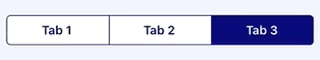
Here’s a sneak peak of what I built, on iOS..

And on Android..

Look at the eh, just like a native control with all the looks and feels and behaviours…
This whole awesome project is hosted up in my Github repo : https://github.com/UdaraAlwis/XFSegmentedControl
Recipe time…
Buckle up, contains a whole bunch of me hacking around pushing the limits of Xamarin.Forms to achieve some impossibru! 😉
So first thing, we need to keep in mind the aspect of having the same look and feel of a native Segmented control, in aspect of both Android and iOS, therefore we’re going to be using a lot of platform specific properties in XAML and code behind.
We are going to have two Buttons inside a Layout, to emulate the two segmented Buttons. The layout is going to be a Xamarin.Forms Frame, since it has the property CornerRadius, which is vital to gain the curved corners appearance for iOS, and Border property, which we can use to draw the border around the element for iOS. As of Android we can disregard both of those properties. Also don’t forget about the IsClippedToBounds property which all the Layout elements has in Xamarin.Forms, allowing you to crop out of bounds elements inside the layout, which will allow us to have that curved corners in iOS without the button borders popping out of it.
So you might say as of the Button we could use a Label or something and then use a Tap Gesture to handle the click event. Nope! I like the perfection of whatever I’m building! 😉 Therefore we’re going to use actual Xamarin.Forms Button control, now hold on…
Now speaking of the Buttons, we can’t use Buttons with text inside, since the default behaviour of a button restricts the visibility of Text inside it. Therefore we’re going to use a little hack I have always used, that is placing one element over another inside a Grid view. So we are going to use a Button without text inside of it, and then a Label on top of it that represents the Text of the Segmented Button. So you’re probably worries about the Button click behaviour since we’re laying out a Label on top of it, but hello don’t worry, that’s where InputTransparent comes into rescue, passing down the touch even down to the Button straight away! So on selection of the Button we shall do the necessary changes to show the IsSelected status.
We are going to assign name identifiers to our elements in this control to handle some of the code behind magic as well, in case you wondered when you see the code! 😀
Also not to mention that we’re going to maintain properties inside the custom control, like Colors, Text, Selected Button Index properties and also an EventHandler to inform the changes of the Segment button selection.
Well that’s pretty much it, with a bit more details to be gotten into later.
XAML time…
We’re going to create a custom control elements that’s going to be independent and reusable anywhere in the project. Let’s call it SimSegmentedControl, thus denoting “Simple Segmented Control”!
<?xml version="1.0" encoding="UTF-8" ?>
<ContentView
    x:Class="XFSegmentedControl.Simple.Controls.SimegmentedControl"
    xmlns="http://xamarin.com/schemas/2014/forms"
    xmlns:x="http://schemas.microsoft.com/winfx/2009/xaml"
    xmlns:system="clr-namespace:System;assembly=netstandard">
    <ContentView.Content>

	<!--  Rest of content goes here (Next code snippet) -->

    </ContentView.Content>
</ContentView>
Now let’s get into the inside elements of our SimSegmentedControl, which is basically the Frame Layout that I explained before.
<Frame
    x:Name="FrameView"
    Padding="0"
    IsClippedToBounds="True">
    <!--  Platform specific customization values for the border  -->
    <Frame.HasShadow>
        <OnPlatform x:TypeArguments="system:Boolean">
            <On Platform="Android" Value="False" />
            <On Platform="iOS" Value="True" />
        </OnPlatform>
    </Frame.HasShadow>
    <Frame.CornerRadius>
        <OnPlatform x:TypeArguments="system:Single">
            <On Platform="Android" Value="0" />
            <On Platform="iOS" Value="5" />
        </OnPlatform>
    </Frame.CornerRadius>
    <Frame.HeightRequest>
        <OnPlatform x:TypeArguments="system:Double">
            <On Platform="Android" Value="50" />
            <On Platform="iOS" Value="35" />
        </OnPlatform>
    </Frame.HeightRequest>
    <!--  Platform specific customization values for the border  -->


    <!--  Segmented Buttons go in here (Next code snippet)  -->

</Frame>
As you can see I have added a whole bunch of platform specific customization values for Android and iOS to achieve the design we’re targeting for, such as CornerRadius and Height.
Then let’s add our Segmented Button elements, just to make it easier let’s identify each of them as “Tab Button” element.
<Grid ColumnSpacing="0">

    <!--  Tab button 1  -->
    <Grid Grid.Column="0" IsClippedToBounds="True">
        <Button
            x:Name="Tab1ButtonView"
            Margin="-2,-3,-2,0"
            Clicked="Tab1Button_OnClicked" />
        <Label
            x:Name="Tab1LabelView"
            FontAttributes="Bold"
            FontSize="Medium"
            HorizontalOptions="CenterAndExpand"
            InputTransparent="True"
            Text="Tab 1"
            VerticalOptions="CenterAndExpand" />
        <BoxView
            x:Name="Tab1BoxView"
            HeightRequest="2"
            InputTransparent="True"
            IsVisible="False"
            VerticalOptions="End" />
    </Grid>
    <!--  Tab button 1  -->

    <!--  Tab button 2  -->
    <Grid Grid.Column="1" IsClippedToBounds="True">
        <Button
            x:Name="Tab2ButtonView"
            Margin="-2,-3,-2,0"
            Clicked="Tab2Button_OnClicked" />
        <Label
            x:Name="Tab2LabelView"
            FontAttributes="Bold"
            FontSize="Medium"
            HorizontalOptions="CenterAndExpand"
            InputTransparent="True"
            Text="Tab 2"
            VerticalOptions="CenterAndExpand" />
        <BoxView
            x:Name="Tab2BoxView"
            HeightRequest="2"
            InputTransparent="True"
            IsVisible="False"
            VerticalOptions="End" />
    </Grid>
    <!--  Tab button 2  -->

    <Grid.ColumnDefinitions>
        <ColumnDefinition Width="*" />
        <ColumnDefinition Width="*" />
    </Grid.ColumnDefinitions>
</Grid>
Voila! behold the two button elements, with all the platform specific customizations, just like how I explained before, Label on top of a Button inside a Grid layout. Also you may have noticed the Margin property that I have used with “-2,-3,-2,0”, which is to stretch out the empty border line of the buttons out of the Grid so it crops out with the IsClippedToBounds property.
And the BoxView is to emulate the bottom line we have in Android look and feel of the Segmented Control.
Code-behind time…
Now this is where we’re basically going to handle all the action in our SegmentedControl!
So I’m not going to spoon feed the whole code in this blog post, since its going to be a pretty lengthy one, so I’ll be cutting out most of the repetitive code which you can easily figure out yourself or just check out on my github repo where I have committed this whole project code.
So like I explained at beginning we’re going to have a bunch of properties that are going to handle all the customization values such as Color, Text, SelectedIndex, EventHandler and so on. And then apply a whole bunch of code behind customization for platform specific look and feels, along with the handling of Segment button click event behavior.
[XamlCompilation(XamlCompilationOptions.Compile)]
public partial class SimSegmentedControl : ContentView
{
    public static readonly BindableProperty PrimaryColorProperty
        = BindableProperty.Create(
            nameof(PrimaryColor),
            typeof(Color),
            typeof(SimSegmentedControl),
            Color.CornflowerBlue);

    public Color PrimaryColor
    {
        get { return (Color)GetValue(PrimaryColorProperty); }
        set { SetValue(PrimaryColorProperty, value); }
    }

    // SecondaryColorProperty

    // Tab1TextProperty

    // Tab2TextProperty

    // SelectedTabIndexProperty

    public event EventHandler<SelectedTabIndexEventArgs> SelectedTabIndexChanged;

    public SimSegmentedControl()
    {
        InitializeComponent();
    }

    /// <summary>
    /// load up the customizations and applying
    /// properties when the element has rendered
    /// </summary>
    protected override void OnParentSet()
    {
        base.OnParentSet();

        // Setting up platform specific properties for Android and iOS
        if (Device.RuntimePlatform == Device.Android)
        {
            Tab1LabelView.FontSize
                = Device.GetNamedSize(NamedSize.Medium, Tab1LabelView);
            Tab2LabelView.FontSize
                = Device.GetNamedSize(NamedSize.Medium, Tab1LabelView);

            Tab1ButtonView.BackgroundColor = PrimaryColor;
            Tab2ButtonView.BackgroundColor = PrimaryColor;

            Tab1BoxView.Color =
            Tab2BoxView.Color =
            Tab1LabelView.TextColor =
            Tab2LabelView.TextColor = SecondaryColor;
        }
        else if (Device.RuntimePlatform == Device.iOS)
        {
            Tab1LabelView.FontSize
                = Device.GetNamedSize(NamedSize.Small, Tab1LabelView);
            Tab2LabelView.FontSize
                = Device.GetNamedSize(NamedSize.Small, Tab1LabelView);

            Tab1ButtonView.BackgroundColor =
            Tab2ButtonView.BackgroundColor = PrimaryColor;

            FrameView.BorderColor =
            Tab1LabelView.TextColor =
            Tab2LabelView.TextColor = SecondaryColor;
        }

        Tab1LabelView.Text = Tab1Text;
        Tab2LabelView.Text = Tab2Text;

        // setting up default values
        SelectTab1();
        SelectedTabIndex = 1;
        SendSelectedTabIndexChangedEvent();
    }

    private void Tab1Button_OnClicked(object sender, EventArgs e)
    {
        SelectTab1();
        SelectedTabIndex = 1;
        SendSelectedTabIndexChangedEvent();
    }

    private void Tab2Button_OnClicked(object sender, EventArgs e)
    {
        SelectTab2();
        SelectedTabIndex = 2;
        SendSelectedTabIndexChangedEvent();
    }

    // SelectTab1()

    // SelectTab2()

    // SendSelectedTabIndexChangedEvent()
}
So we PrimaryColor and SecondaryColor which handles the two main colors that is styling our SimSegmentedControl, which is exactly how it being used in native version of this control as well, just two simple Colors styling the whole element.
Then Tab1Text and Tab2Text property to handle the Text that needs to be displayed in the Segmented buttons.
As you can see OnParentSet (this is when the View is rendered in memory and just about to be displayed on the Page) we’re applying all the platform specific customization for the elements in our SimSegmentedControl. Then you can see we’re setting the Tab1 and Tab2 text properties to our Labels, which is not actually good practice, but I was too lazy to add that in the PropertyChangedEvent handler of those respective bindable properties. After that at the end you can see we’re setting the default values.
Also the SelectedTabIndexChanged EventHandler is there to notify any outside element who wants to be aware of the selected Tab in our SimSegmentedControl, so they can perform whatever the action based on it.
Then let me get into the SelectTab1(), SelectTab2() and SendSelectedTabIndexChangedEvent methods.
private void SelectTab1()
{
    // set up platform specific
    // properties for SelectTab1 event
    if (Device.RuntimePlatform == Device.Android)
    {
        Tab1BoxView.IsVisible = true;
        Tab2BoxView.IsVisible = false;
    }
    else if (Device.RuntimePlatform == Device.iOS)
    {
        Tab1ButtonView.BackgroundColor = SecondaryColor;
        Tab2ButtonView.BackgroundColor = PrimaryColor;

        Tab1LabelView.TextColor = PrimaryColor;
        Tab2LabelView.TextColor = SecondaryColor;
    }
}

private void SelectTab2()
{
    // set up platform specific
    // properties for SelectTab2 event
    if (Device.RuntimePlatform == Device.Android)
    {
        Tab1BoxView.IsVisible = false;
        Tab2BoxView.IsVisible = true;
    }
    else if (Device.RuntimePlatform == Device.iOS)
    {
        Tab1ButtonView.BackgroundColor = PrimaryColor;
        Tab2ButtonView.BackgroundColor = SecondaryColor;

        Tab1LabelView.TextColor = SecondaryColor;
        Tab2LabelView.TextColor = PrimaryColor;
    }
}

/// <summary>
/// Invoke the SelectedTabIndexChanged event
/// for whoever has subscribed so they can
/// use it for any reative action
/// </summary>
private void SendSelectedTabIndexChangedEvent()
{
    var eventArgs = new SelectedTabIndexEventArgs();
    eventArgs.SelectedTabIndex = SelectedTabIndex;

    SelectedTabIndexChanged?.Invoke(this, eventArgs);
}

--------------

public class SelectedTabIndexEventArgs : EventArgs
{
    public int SelectedTabIndex { get; set; }
}
So there you can see in SelectTab1() we’re setting up the necessary customization for the Selected state of our Segmented Button for both Android and iOS, such as the BackgroundColor, TextColor and whatnot. And then in SelectTab2() we’re doing the exact opposite customization, Button 1 -> Unselected and Button 2 -> Selected appearance.
Then in the SendSelectedTabIndexChangedEvent we’re basically broadcasting the selected Tab index of our SimSegmentedControl with the SelectedTabIndex property value.
Time to consume!
Let’s use this awesome SimSegmentedControl in our Page shall we?!!! 😀
<local:SimSegmentedControl
	x:Name="SegmentedControlView"
	PrimaryColor="CornflowerBlue"
	SecondaryColor="White"
	SelectedTabIndexChanged="SegmentedControlView_SelectedTabIndexChanged"
	Tab1Text="Monkeys"
	Tab2Text="Minions">
	<local:SimSegmentedControl.Padding>
		<OnPlatform x:TypeArguments="Thickness">
			<On Platform="Android" Value="0" />
			<On Platform="iOS" Value="10,0,10,10" />
		</OnPlatform>
	</local:SimSegmentedControl.Padding>
</local:SimSegmentedControl>
Easy peasy, you just set the property values such as PriaryColor, SecondaryColor and so on that we created in our SimSegmentedControl and do a bit of customization if you wish to 😉 like I’ve added some padding for iOS!
In case if you’re wondering how to use the SelectedTabIndexChanged, you basically subscribe to that event and perform whatever the action you desire, whether it be changing some values, or swapping some Views or whatever your requirement is!
private void SegmentedControlView_SelectedTabIndexChanged
			(object sender, SelectedTabIndexEventArgs e)
{
	if (e.SelectedTabIndex == 1)
	{
		ContentView1.IsVisible = true;
		ContentView2.IsVisible = false;
	}
	else if (e.SelectedTabIndex == 2)
	{
		ContentView1.IsVisible = false;
		ContentView2.IsVisible = true;
	}
}
Just like that!
Let’s fire it up!
Let’s see this beauty in action now! 😀
Here we go baby! iOS and Android running side by side…


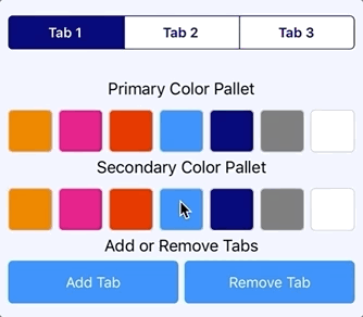
Let’s change up a bit of the colors shall we!


Woot, whatever the color combination you wish! 😉
Improvement suggestions..
Well if you ask me this is not the exact implementation I used for my actual requirement, this is more of a very simple implementation of it.
But there’s many ways to improve this. One would be adding Command for the selected Tab Index changed property handling. Also add both way handling of SelectedTabIndex so that we can set the default selected Tab on the go. Specially add dynamic Tab Buttons to the SimSegmentedControl at run time without just limiting to 2 buttons. 😉
Well your imagination is the limit fellas! 😀
This whole awesome project is hosted up in my Github repo : https://github.com/UdaraAlwis/XFSegmentedControl
Check out the Part 2 of this article: Advanced Segmented Button Control in pure Xamarin.Forms!
Cheers! 😀 Keep on going my fellow devs!
Spread the love…


 ÇøŋfuzëÐ SøurcëÇødë